Key takeaways
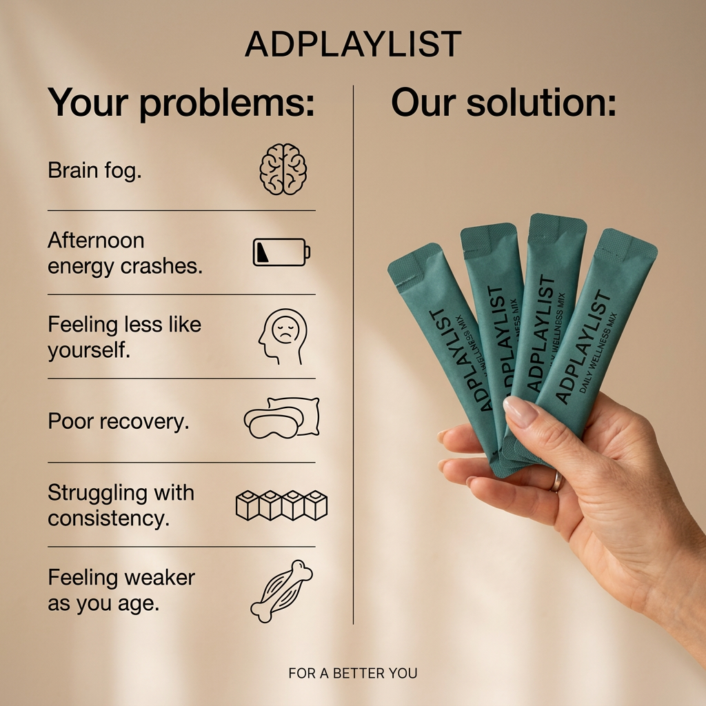
- Format: Problem vs solution comparison
- Best for: Supplement brands winning customers from competitors
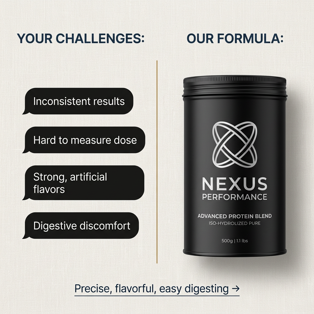
- Hook: Four familiar frustrations in customer-style speech bubbles
- Reuse it: List your audience's top pain points on one side and your product on the other
Available sizes
What is a comparison ad?
A comparison ad sets the product against an alternative, such as a competitor, the old way of doing things or a cheaper option, usually in a two-column layout or table. It helps buyers who are already weighing options see quickly why this one is the better choice.
See all comparison ads →Why this comparison ad works
- 01
Instant recognition
Viewers see their own frustrations listed and feel understood straight away.
- 02
Clear contrast
The divider line creates a simple before-and-after logic without needing photos.
- 03
Premium packaging
The black and silver tub looks high-end and justifies a higher price.
- 04
Summary payoff
The bottom line answers three of the four problems in three words.
Full creative breakdown
Who this ad targets
This ad targets regular gym-goers and athletes aged 20–40 who already use protein powder but are dissatisfied with their current brand. They have experienced bloating, chalky or artificial taste and inconsistent scoops. They are open to paying more for a premium, easier-to-digest formula. It works well for prospecting with fitness and supplement interests and for conquesting audiences who follow competing protein brands.
Copywriting analysis
The copy frames everything around the customer first with "Your Challenges", which puts their problems before the brand. The four bubbles use short, plain language that sounds like real complaints. "Our Formula" then presents the product as the direct answer without needing a long explanation. The closing line, "Precise, flavorful, easy digesting", maps neatly onto the listed problems, although "inconsistent results" is not directly addressed. The arrow suggests a next step and works as a soft CTA. Adding one proof point, such as grams of protein or a lab test, could strengthen credibility.
Visual design
The off-white linen texture gives a premium, tactile feel. Navy headings sit at the top of each column for clear hierarchy. Black speech bubbles on the left visually echo the black tub on the right, linking problem and solution. A thin gold divider adds elegance and separates the two sides. The product is large and centered on the right, lit with soft shadows. Plenty of white space keeps the comparison easy to read on mobile.
How to adapt this template for your brand
- Collect the top four complaints your customers have about competing products.
- Write each as a short, natural phrase inside a speech bubble.
- Split the frame with a thin line and place your product on the other side.
- Add clear column headings like "Your challenges" and "Our formula".
- Close with a one-line summary that answers the problems, plus an arrow.
Tips for health & fitness ads on Meta
Comparison ads perform well in Meta feed because the layout is quick to scan. Use them for conquesting audiences interested in competitor brands. For Stories and Reels, animate each problem appearing and then crossing out before the product appears. Test the order of the pain points, as leading with the biggest frustration often improves click-through. Make sure the landing page repeats the same four problems and solutions.
About this creative
This square ad from Nexus Performance uses a clean split-screen layout on an off-white linen background. On the left, under the heading "Your Challenges:", four black speech bubbles list common frustrations with protein powder: inconsistent results, a dose that is hard to measure, strong artificial flavors and digestive discomfort. A thin gold vertical line divides the frame. On the right, under "Our Formula:", a matte black tub with a silver interlocking logo reads "Nexus Performance – Advanced Protein Blend – Iso-Hydrolized Pure, 500g." At the bottom, an underlined line with an arrow sums up the solution: "Precise, flavorful, easy digesting." The speech bubbles make the problems feel like real customer voices, and the premium black-and-silver packaging signals quality. The structure lets viewers recognize their own pain in seconds and see the product as the fix. Note the label spelling "Hydrolized" may need correcting to "Hydrolyzed".
Meta ad · 1200 × 1200 · Health & Fitness
Protein Powder Ad Template: Your Challenges vs Our Formula
This protein powder ad splits the frame into two columns: four common customer frustrations on the left and a premium black tub on the right. The problem vs solution comparison makes the product the obvious answer. Use this format on Meta to target fitness buyers unhappy with their current protein.
Added
All brand names and logos are property of their owners. Adplaylist is not affiliated with or endorsed by these brands.
Details
Ad copy
Primary text
Inconsistent results, guesswork dosing, artificial flavors, bloating. Nexus Performance Advanced Protein Blend fixes all four: precise, flavorful and easy to digest.
Description
Iso-hydrolyzed protein without the usual problems
On-image text
YOUR CHALLENGES: | Inconsistent results | Hard to measure dose | Strong, artificial flavors | Digestive discomfort | OUR FORMULA: | NEXUS PERFORMANCE | ADVANCED PROTEIN BLEND | ISO-HYDROLIZED PURE | 500g | 1.1 lbs | Precise, flavorful, easy digesting →
Headline ideas for this template
- 1Tired of chalky, bloating protein?
- 2Protein without the usual problems
- 3Finally, a protein that digests easily
- 4Precise dosing, real flavor
- 5Switch to protein that works for you
Meta image ad specs
| Placement | Ratio | Size (px) |
|---|---|---|
| Feed | 1:1 or 4:5 | 1080×1080 / 1080×1350 |
| Marketplace | 1:1 | 1200×1200 |
| Messenger inbox | 1:1 | 1200×1200 |
| Stories & Reels | 9:16 | 1080×1920 |
This template is 1:1. Request 4:5 or 9:16 to cover all placements.