Key takeaways
- Format: Two-column 'Your problems vs Our solution' comparison.
- Best for: Supplements and all-in-one products solving several pain points.
- Hook: A list of relatable symptoms the viewer is likely to recognise.
- Reuse it: Keep the split layout and list your audience's top six frustrations with icons.
Available sizes
What is a comparison ad?
A comparison ad sets the product against an alternative, such as a competitor, the old way of doing things or a cheaper option, usually in a two-column layout or table. It helps buyers who are already weighing options see quickly why this one is the better choice.
See all comparison ads →Why this comparison ad works
- 01
Wide net of pain points
Six problems mean most viewers recognise at least one. Each line is a separate hook.
- 02
Icons speed up reading
Simple line icons let people scan the list in seconds. They also make abstract feelings concrete.
- 03
One answer to many problems
The single product on the right feels like a simple fix. It reduces the effort of solving everything separately.
- 04
Calm, premium aesthetic
Warm beige, soft shadows and teal packaging feel clean and natural. It avoids the hype look of many supplement ads.
Full creative breakdown
Who this ad targets
This ad targets adults aged 30–55, especially busy professionals and parents, who feel tired, foggy and less energetic than they used to. They want a simple daily routine that supports focus, energy, recovery and strength as they age. They are interested in wellness trends, greens powders and functional nutrition, and prefer convenient formats like stick packs. Clean, minimal design appeals to their premium, health-conscious mindset.
Copywriting analysis
The headers 'Your problems' and 'Our solution' frame the ad as a direct conversation. The six problem lines use everyday language rather than medical terms, so they feel relatable: 'afternoon energy crashes' and 'feeling less like yourself' describe moments people actually experience. Each line ends with a full stop, making them feel like honest statements. The list moves from mental to physical concerns, broadening the appeal. The solution side has no copy beyond the packaging, letting the product speak. 'For a better you' closes on a warm, aspirational note.
Visual design
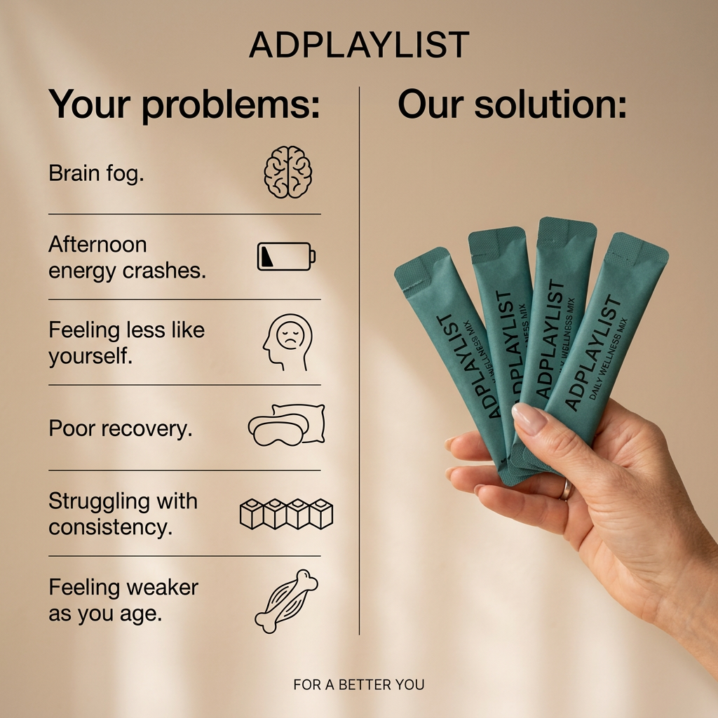
A soft beige background with diagonal window shadows creates a calm, sunlit mood. The left column uses thin dividing lines and black line icons for a clean, editorial feel. A single vertical line splits the frame. The right side shows a natural hand fanning four teal sachets, adding colour contrast and human warmth. Bold black sans serif headers keep hierarchy clear.
How to adapt this template for your brand
- List the six most common problems your product helps with.
- Pair each problem with a simple line icon.
- Split the frame and show your product being held on the solution side.
- Use a calm, natural background with soft lighting.
- Close with a short brand tagline at the bottom.
Tips for health & fitness ads on Meta
On Meta, use this in feed placements and test versions with three versus six problems. Keep health claims general to stay within advertising policies. On TikTok, turn the list into a fast-paced video where each problem appears with a sound cue before the product reveal. For Stories, stack the columns vertically and show the problems first, then the solution.
About this creative
This square image ad for a daily wellness mix uses a two-column problem and solution layout. A thin vertical line divides the frame. On the left, under 'Your problems:', six common complaints are listed with simple line icons: brain fog with a brain, afternoon energy crashes with a low battery, feeling less like yourself with a sad face, poor recovery with an eye mask and pillow, struggling with consistency with stacked cubes, and feeling weaker as you age with a muscle and bone. On the right, under 'Our solution:', a woman's hand holds four teal stick packs labelled Daily Wellness Mix. The warm beige background with soft window shadows feels calm and natural. The brand name sits at the top and the tagline 'For a better you' at the bottom. By listing many relatable symptoms, the ad gives almost every viewer something to recognise, then offers one simple fix.
Meta ad · 1200 × 1200 · Health & Fitness
Supplement Ad Template: Your Problems vs Our Solution
This wellness mix ad splits the frame into 'Your problems', a list of six pain points with line icons, and 'Our solution', a hand holding four teal stick packs. It is a square comparison image for Meta and TikTok, a proven layout for supplements and health products tackling several symptoms at once.
Added
All brand names and logos are property of their owners. Adplaylist is not affiliated with or endorsed by these brands.
Details
Ad copy
Primary text
Brain fog, energy crashes, poor recovery? One daily stick of our wellness mix supports focus, energy and strength so you can feel like yourself again. 💪
Description
Daily wellness mix in easy single-serve sticks.
On-image text
ADPLAYLIST. Your problems: Brain fog. Afternoon energy crashes. Feeling less like yourself. Poor recovery. Struggling with consistency. Feeling weaker as you age. Our solution: ADPLAYLIST Daily Wellness Mix. FOR A BETTER YOU
Headline ideas for this template
- 1Brain fog? Energy crashes? Meet your daily fix.
- 2Six problems. One simple daily mix.
- 3Feel like yourself again
- 4Your daily ritual for focus and energy
- 5Small stick. Big difference.
Meta image ad specs
| Placement | Ratio | Size (px) |
|---|---|---|
| Feed | 1:1 or 4:5 | 1080×1080 / 1080×1350 |
| Marketplace | 1:1 | 1200×1200 |
| Messenger inbox | 1:1 | 1200×1200 |
| Stories & Reels | 9:16 | 1080×1920 |
This template is 1:1. Request 4:5 or 9:16 to cover all placements.
Browse similar by tag