Key takeaways
- Format: Listicle with toggle-switch checklist
- Best for: Supplement brands targeting a specific audience such as women in fitness
- Hook: Three habits on, one still off: what is missing?
- Reuse it: Replace the toggles with your audience's routine and make your product the last switch
Available sizes
What is a listicle ad?
A listicle ad presents the product's benefits or reasons to buy as a short numbered list, like an article headline ("5 reasons…"). The list format is easy to scan in a feed and lets one creative answer several objections at once.
See all listicle ads →Why this listicle ad works
- 01
Familiar UI
Phone toggles are recognized instantly, so the message is understood without effort.
- 02
Self-identification
Women who lift, track macros and rest will tick every box and feel addressed.
- 03
Plateau pain point
"Still feel stuck?" taps into the frustration of hard work without visible results.
- 04
Specific audience
Naming women and muscle definition makes the ad feel tailored, not generic.
Full creative breakdown
Who this ad targets
This ad targets women aged 22–45 who already strength-train, track nutrition and value recovery. They are committed to fitness but frustrated by a plateau in muscle tone or definition. They are research-minded and attracted by phrases like "most studied" and "clinical-grade". Many are new to creatine and may associate it with male bodybuilding, so the women-focused angle reduces that barrier. Ideal for Meta prospecting with fitness and strength training interests.
Copywriting analysis
The headline acknowledges the reader's effort first ("Mastered your routine") before introducing the pain ("still feel stuck?"). This flatters and challenges at the same time. The toggle list uses short, gym-native phrases such as "Macros dialed-in" that show the brand speaks the audience's language. The final toggle turns the desire into a question, inviting a mental yes. The body copy adds authority with "nature's most studied amino acid" and clarifies the outcome: visible muscle tone. "Clinical-grade" and "100% pure" on the label add trust. A minor typo ("definitions") should be fixed.
Visual design
The warm beige background and serif headline create a calm, premium, feminine look that differs from typical aggressive supplement ads. The toggles use translucent white pills with green and red switches, the only bright colors, so the eye goes straight to the contrast. Content flows top-to-bottom: brand, question, checklist, explanation, product. The frosted jar with a navy lid matches the navy brand text, creating visual consistency. Centered alignment keeps it balanced.
How to adapt this template for your brand
- List three habits your target customer already does well.
- Show them as switched-on toggles and add a fourth toggle that is still off.
- Make the off toggle express the result they still want.
- Add one or two lines explaining how your product completes the routine.
- Place the product at the bottom as the natural answer to the checklist.
Tips for health & fitness ads on Meta
Use this ad in Meta feed and Instagram placements targeting women interested in strength training, Pilates or gym culture. For Reels and Stories, animate the toggles switching on one by one and the last one flipping to green when the product appears. Test the headline against a more direct "Creatine for women" version. Combine with creator content explaining creatine myths to warm up cold audiences.
About this creative
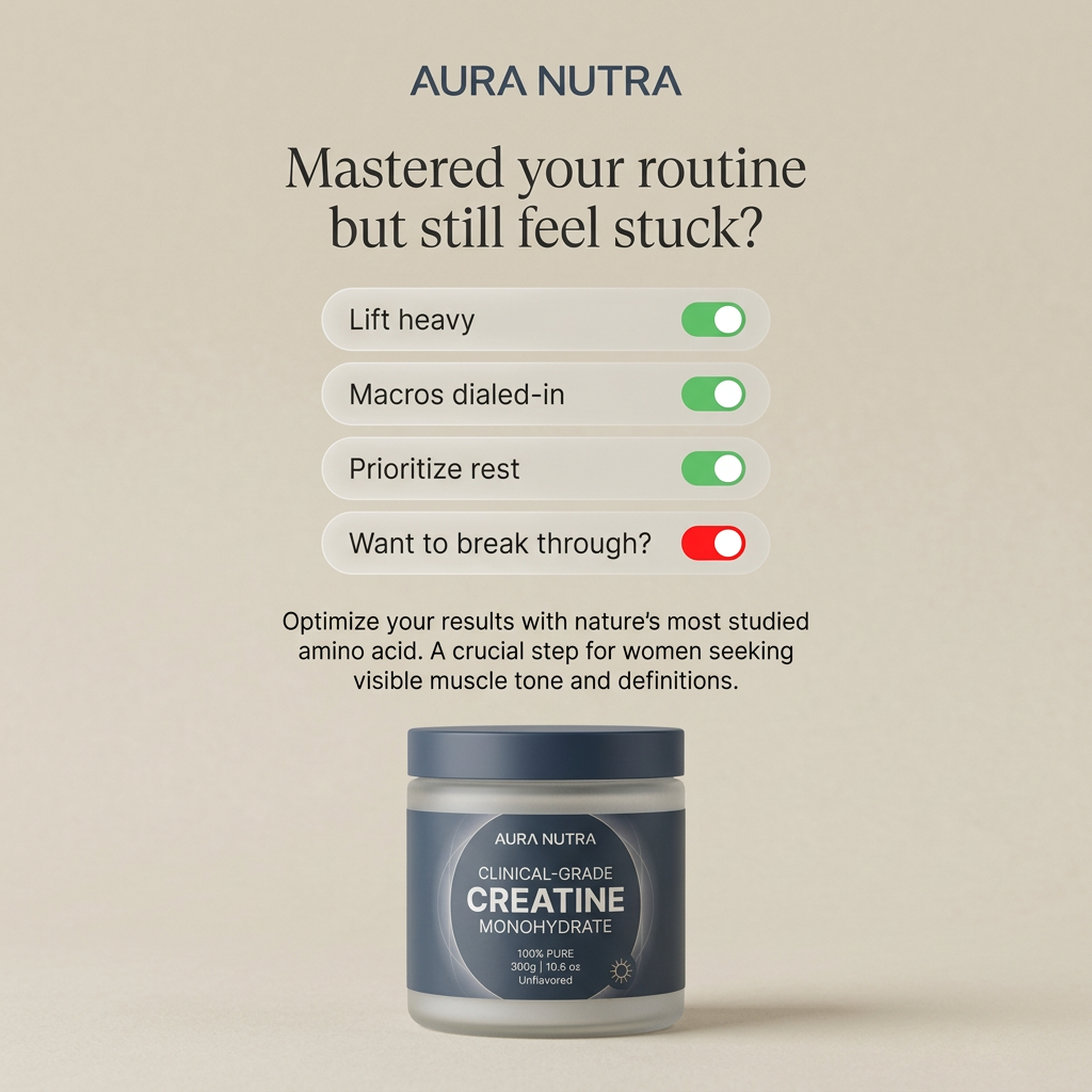
This square ad from Aura Nutra uses a soft beige background and an elegant serif headline: "Mastered your routine but still feel stuck?" Below it, four rounded bars imitate iPhone settings toggles. The first three, "Lift heavy", "Macros dialed-in" and "Prioritize rest", are switched on in green. The fourth, "Want to break through?", shows a red toggle, signalling something is still missing. A short paragraph explains that creatine, described as nature's most studied amino acid, helps women seeking visible muscle tone and definition. At the bottom sits a frosted glass jar with a navy lid and navy label reading "Clinical-Grade Creatine Monohydrate, 100% Pure, 300g, Unflavored." The interface metaphor is instantly familiar and makes the viewer mentally tick off their own habits. The creative addresses a fast-growing audience: women adopting creatine for strength and body composition. Note "definitions" in the body copy should read "definition".
Meta ad · 1200 × 1200 · Health & Fitness
Creatine for Women Ad Template: Still Feel Stuck?
This creatine ad for women uses smartphone-style toggle switches as a checklist: three habits are switched on, but "Want to break through?" is still off. The creatine jar is positioned as the missing step. Use this listicle format on Meta to reach women who already train seriously but feel they have plateaued.
Added
All brand names and logos are property of their owners. Adplaylist is not affiliated with or endorsed by these brands.
Details
Ad copy
Primary text
Lifting heavy, macros dialed in, rest prioritized and still not seeing the definition you want? Aura Nutra clinical-grade creatine is the missing step for women ready to break through.
Description
Clinical-grade creatine for women
On-image text
AURA NUTRA | Mastered your routine but still feel stuck? | Lift heavy | Macros dialed-in | Prioritize rest | Want to break through? | Optimize your results with nature's most studied amino acid. A crucial step for women seeking visible muscle tone and definitions. | AURA NUTRA | CLINICAL-GRADE CREATINE MONOHYDRATE | 100% PURE | 300g | 10.6 oz | Unflavored
Headline ideas for this template
- 1Creatine isn't just for men
- 2The missing step in your routine
- 3Stuck at a plateau? Try this.
- 4Visible tone starts with creatine
- 5Turn your results switch on
Meta image ad specs
| Placement | Ratio | Size (px) |
|---|---|---|
| Feed | 1:1 or 4:5 | 1080×1080 / 1080×1350 |
| Marketplace | 1:1 | 1200×1200 |
| Messenger inbox | 1:1 | 1200×1200 |
| Stories & Reels | 9:16 | 1080×1920 |
This template is 1:1. Request 4:5 or 9:16 to cover all placements.