Key takeaways
- Format: Text-only feature-callout ad with CTA button
- Best for: Direct-response lead gen for local SEO services
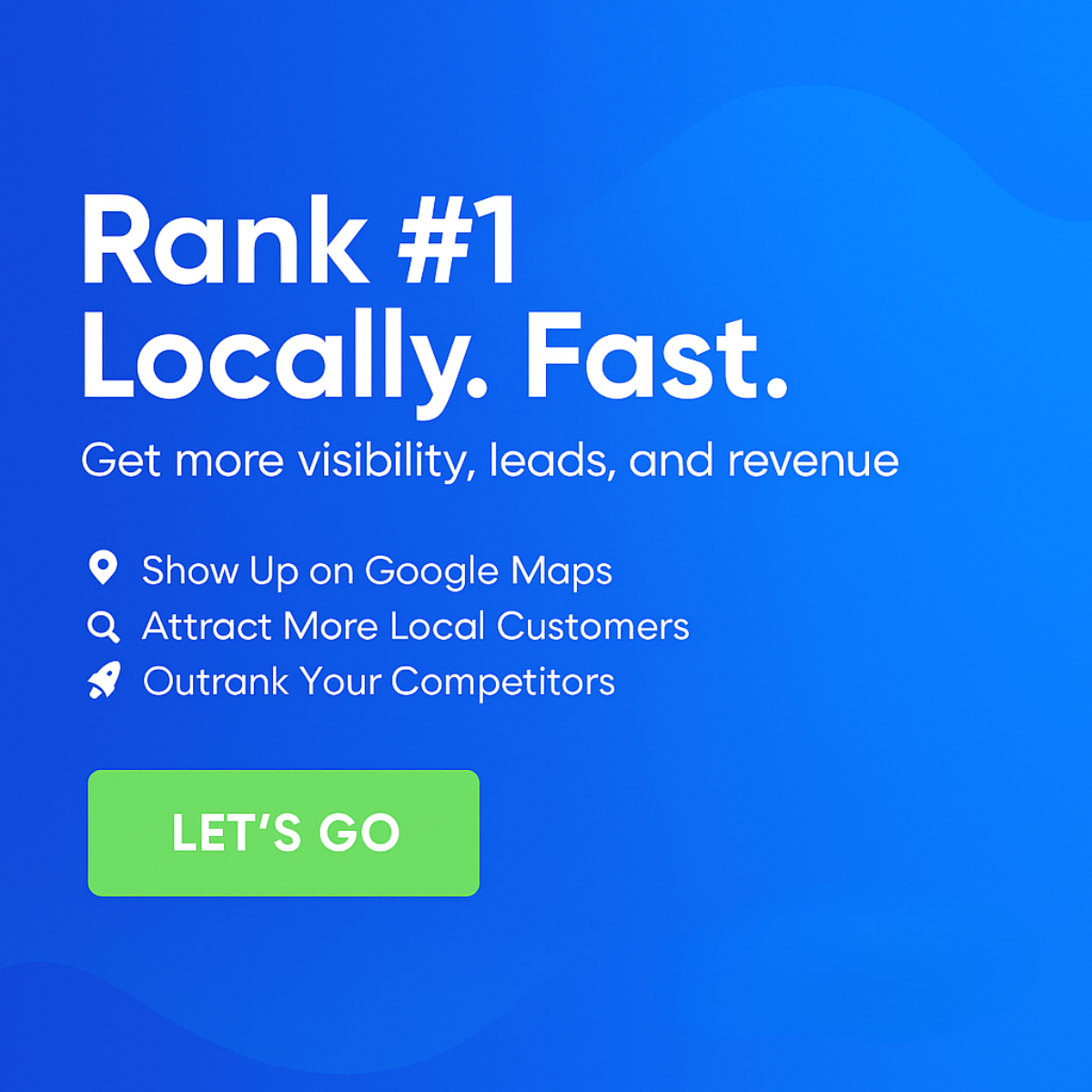
- Hook: 'Rank #1 Locally. Fast.' – speed plus top position
- Reuse it: Keep the layout, change the promise and fix the typo
Available sizes
What is a feature callout ad?
A feature callout ad is a static image that shows a single product with short text labels pointing to its key features or benefits, usually joined to the product by thin lines. It explains several selling points at a glance without a long caption, which is why it's common for supplements, skincare, electronics and kitchenware.
See all feature callouts ads →Why this feature callouts ad works
- 01
Bold promise
#1 plus 'Fast' combines the two things owners want most: top position and quick results.
- 02
Huge type
The oversized headline is readable even as a thumbnail.
- 03
Visible CTA
A contrasting green button makes the next step obvious.
- 04
Low production
Text-only design is easy to localize and test.
Full creative breakdown
Who this ad targets
Owners and marketing managers of US local service businesses such as dentists, orthodontists, plumbers, HVAC companies, roofers, law firms and med spas that depend on 'near me' searches and phone calls. They know Google Maps matters but don't understand why competitors outrank them, and they want more calls without learning SEO themselves. The short, punchy promise suits impatient owners who want quick wins. It works for cold prospecting by industry and city, and for retargeting visitors who checked a free ranking scan.
Copywriting analysis
The headline uses three short sentences that hit like a slogan: rank, locally, fast. It's a strong promise but also a risky one, since 'fast' and '#1' can sound too good to be true without proof. The subline adds the commercial outcome with visibility, leads and revenue. Bullets are action-oriented and cover visibility, customers and competition. The typo 'Custome' must be fixed, as it undermines credibility for an agency selling professionalism. 'LET'S GO' is energetic but vague; 'Get My Free Scan' would better set expectations. Adding a timeframe or proof point would balance the bold claim.
Visual design
The flat blue background and white type give strong contrast and a clean, confident look. Typographic hierarchy is clear: headline, subline, bullets, button. The light green button stands out but its white text has weak contrast. The truncated bullet is a visible error. The design is plain with no imagery, which helps clarity but may blend into other text ads. Good use of left alignment.
How to adapt this template for your brand
- Swap the headline for your strongest local promise (e.g. 'Top 3 on Google Maps in 90 days').
- Replace the three icon callouts with the benefits your clients care about most: calls, leads, reviews.
- Add your logo and a visible CTA button with a clear action like 'Get Free Scan'.
- Recolor to your brand palette but keep high contrast between headline and background.
- Export at 1200×1200 and a 4:5 version, then A/B test headline variations.
Tips for saas & tech ads on Meta
On Meta, run the square in Feed and test a 4:5 crop for extra screen space; keep on-image text large because most viewers scroll on mobile. Pair it with an instant lead form or a free 'ranking scan' offer to lower friction. On Google Display, check that the headline stays legible at small sizes. On LinkedIn, target owners and practice managers by industry and location. Refresh creatives every three to four weeks to avoid ad fatigue.
About this creative
This creative relies entirely on typography and color. A flat royal blue background fills the square, and a massive white headline reads 'Rank #1 Locally. Fast.' across the top half, set in a rounded geometric sans-serif. Below it, a smaller line promises more visibility, leads and revenue. Three white icon bullets follow: a map pin for 'Show Up on Google Maps', a magnifying glass for 'Attract More Local Custome' and a rocket for 'Outrank Your Competitors'. The second bullet is visibly cut off, missing the final letters of 'Customers', which looks like a text box overflow. At the bottom left, a light green rectangular button carries 'LET'S GO' in white capitals. There are no images, maps or people; the message is carried by the bold promise of speed and the #1 position. The style is very direct-response, built for quick reading in a busy feed.
Meta ad · 1200 × 1200 · SaaS & Tech
Local SEO Ad Template: Rank #1 Locally. Fast. (Flat Blue)
This square text-led local SEO ad uses a huge 'Rank #1 Locally. Fast.' headline on flat blue, three icon callouts and a green 'Let's Go' button. It is a simple feature-callout format that agencies can reuse for direct-response lead generation on Meta and Google Display.
Added
All brand names and logos are property of their owners. Adplaylist is not affiliated with or endorsed by these brands.
Details
Ad copy
Primary text
Want to rank #1 on Google Maps without waiting months? We help local businesses show up first, attract more local customers and outrank competitors fast. Get more visibility, leads and revenue. Let's go.
Description
More visibility, leads and revenue
On-image text
Rank #1 Locally. Fast. | Get more visibility, leads, and revenue | Show Up on Google Maps | Attract More Local Custome | Outrank Your Competitors | LET'S GO
Headline ideas for this template
- 1Rank #1 on Google Maps in Weeks
- 2Outrank Your Local Competitors
- 3Be the First Name on Google Maps
- 4Faster Local Rankings, More Calls
- 5Top of Google Maps, Without the Wait
Meta image ad specs
| Placement | Ratio | Size (px) |
|---|---|---|
| Feed | 1:1 or 4:5 | 1080×1080 / 1080×1350 |
| Marketplace | 1:1 | 1200×1200 |
| Messenger inbox | 1:1 | 1200×1200 |
| Stories & Reels | 9:16 | 1080×1920 |
This template is 1:1. Request 4:5 or 9:16 to cover all placements.