Key takeaways
- Format: Dashboard-style product shot showing a scan score
- Best for: Free ranking scan or audit lead magnets
- Hook: A big '2.14' score that begs the question 'what's mine?'
- Reuse it: Insert the prospect's own scan score and add CTA text
Available sizes
What is a product shot ad?
A product shot ad puts the product itself at the centre of the frame, usually on a clean or styled background with little text. It works best when the packaging or product is distinctive enough to stop the scroll and the viewer already understands what it does.
See all product shot ads →Why this product shot ad works
- 01
Number as hook
A large precise score like 2.14 stops the scroll and feels data-backed.
- 02
Productized service
Presenting SEO as a scan result makes an intangible service feel like software.
- 03
Curiosity gap
Viewers naturally want to know their own score, driving clicks to a free scan.
- 04
Clean aesthetic
The minimal white style signals a modern, trustworthy tool.
Full creative breakdown
Who this ad targets
Owners and marketing managers of US local service businesses such as dentists, orthodontists, plumbers, HVAC companies, roofers, law firms and med spas that depend on 'near me' searches and phone calls. They know Google Maps matters but don't understand why competitors outrank them, and they want more calls without learning SEO themselves. It especially fits data-minded owners who respond to scores and dashboards. It works for cold prospecting by industry and city, and for retargeting visitors who checked a free ranking scan.
Copywriting analysis
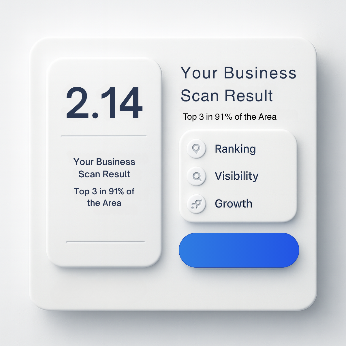
The copy relies almost entirely on data: a single score and the claim 'Top 3 in 91% of the Area'. That statistic is the real persuasive line because it translates the score into a meaningful outcome. The labels Ranking, Visibility and Growth are generic one-word benefits that add little. The biggest issue is repetition: the title and statistic appear twice, which wastes space and looks like a template error. The button has no text, so there is no call to action on the image. Fix by keeping one title, explaining the score ('average map rank') and adding 'Scan My Business' to the button.
Visual design
The neumorphic white-on-grey style feels clean and premium, with soft shadows creating depth. The navy 2.14 is the clear focal point, and the blue button provides the only strong color accent. Hierarchy is weakened by the duplicated headings, and the empty button looks broken. Generous whitespace keeps it calm, but it may blend into a light-mode feed without a bolder color.
How to adapt this template for your brand
- Replace the score with a real (or representative) average rank from your scan tool.
- Write a short label under the score explaining what it means, e.g. 'Top 3 in 91% of your area'.
- Remove duplicated text so each block has one job.
- Put clear CTA text on the button, such as 'Scan My Business'.
- Add your logo and test light vs. brand-colored backgrounds.
Tips for saas & tech ads on Meta
On Meta, run the square in Feed and test a 4:5 crop for extra screen space; keep on-image text large because most viewers scroll on mobile. Pair it with an instant lead form or a free 'ranking scan' offer to lower friction. On Google Display, check that the headline stays legible at small sizes. On LinkedIn, target owners and practice managers by industry and location. Refresh creatives every three to four weeks to avoid ad fatigue.
About this creative
This creative mimics a software dashboard in a soft, neumorphic white style. A large card on the left shows the number 2.14 in heavy navy type, with 'Your Business Scan Result' and 'Top 3 in 91% of the Area' beneath it. On the right, the same title and statistic are repeated in larger type, followed by a raised panel listing three icon rows: Ranking with a map pin, Visibility with a magnifying glass and Growth with a rocket. A bright blue pill button sits at the bottom right but carries no text. The whole layout floats on a light grey background with subtle shadows that give it a tactile, premium look. The concept is to make a local SEO audit feel like a tangible product: a score the owner can understand at a glance. However, the duplicated copy and blank button suggest an unfinished template that needs editing before going live.
Meta ad · 1200 × 1200 · SaaS & Tech
Local SEO Ad Template: Business Scan Result Score Card
This square ad presents a local SEO scan result like an app dashboard, with a 2.14 average rank and 'Top 3 in 91% of the area' as proof. It is a product-shot format suited to agencies and tools offering a free Google Maps visibility scan as a lead magnet.
Added
All brand names and logos are property of their owners. Adplaylist is not affiliated with or endorsed by these brands.
Details
Ad copy
Primary text
How visible is your business on Google Maps right now? Our free scan shows your average ranking across your whole service area, like this client who now ranks top 3 in 91% of their area. Get your free business scan in minutes.
Description
Free business visibility scan
On-image text
2.14 | Your Business Scan Result | Top 3 in 91% of the Area | Your Business Scan Result | Top 3 in 91% of the Area | Ranking | Visibility | Growth
Headline ideas for this template
- 1What's Your Google Maps Score?
- 2Get Your Free Local Visibility Scan
- 3Are You in the Top 3 Across Your Area?
- 4See Where You Rank, Street by Street
- 5Your Ranking Score in 60 Seconds
Meta image ad specs
| Placement | Ratio | Size (px) |
|---|---|---|
| Feed | 1:1 or 4:5 | 1080×1080 / 1080×1350 |
| Marketplace | 1:1 | 1200×1200 |
| Messenger inbox | 1:1 | 1200×1200 |
| Stories & Reels | 9:16 | 1080×1920 |
This template is 1:1. Request 4:5 or 9:16 to cover all placements.