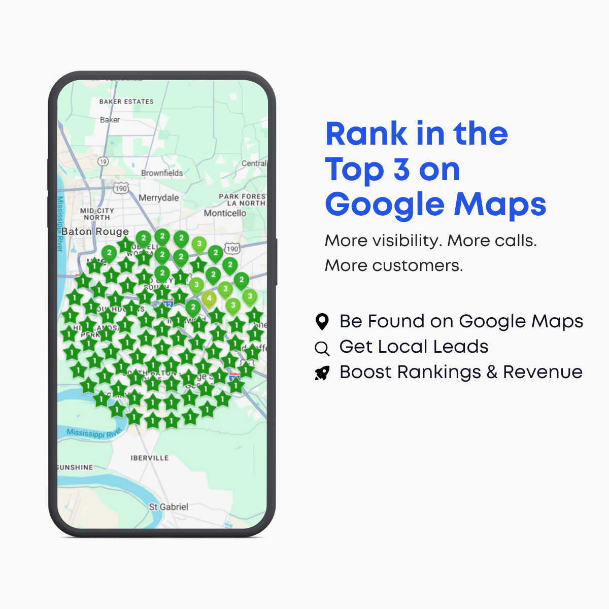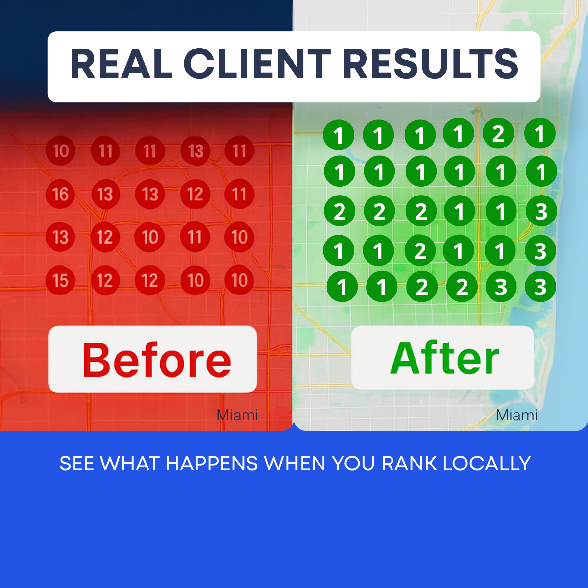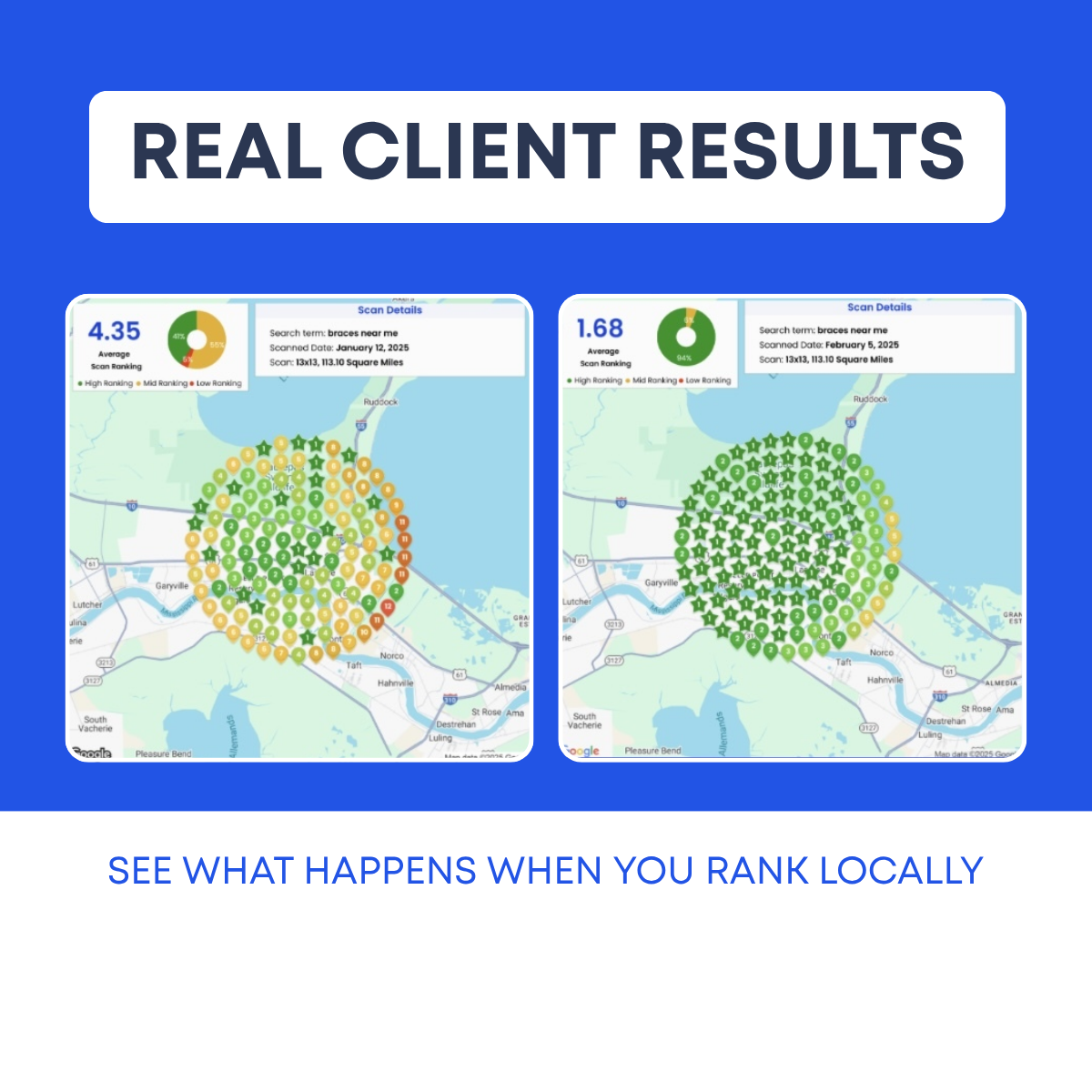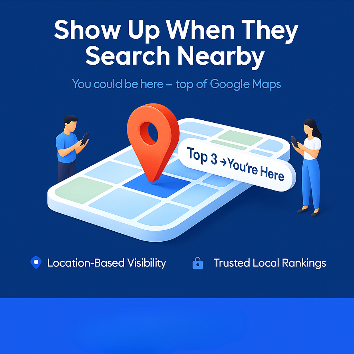
Key takeaways
- Format: Before/after geo-grid with outcome headline
- Best for: Showing dramatic ranking turnarounds to owners
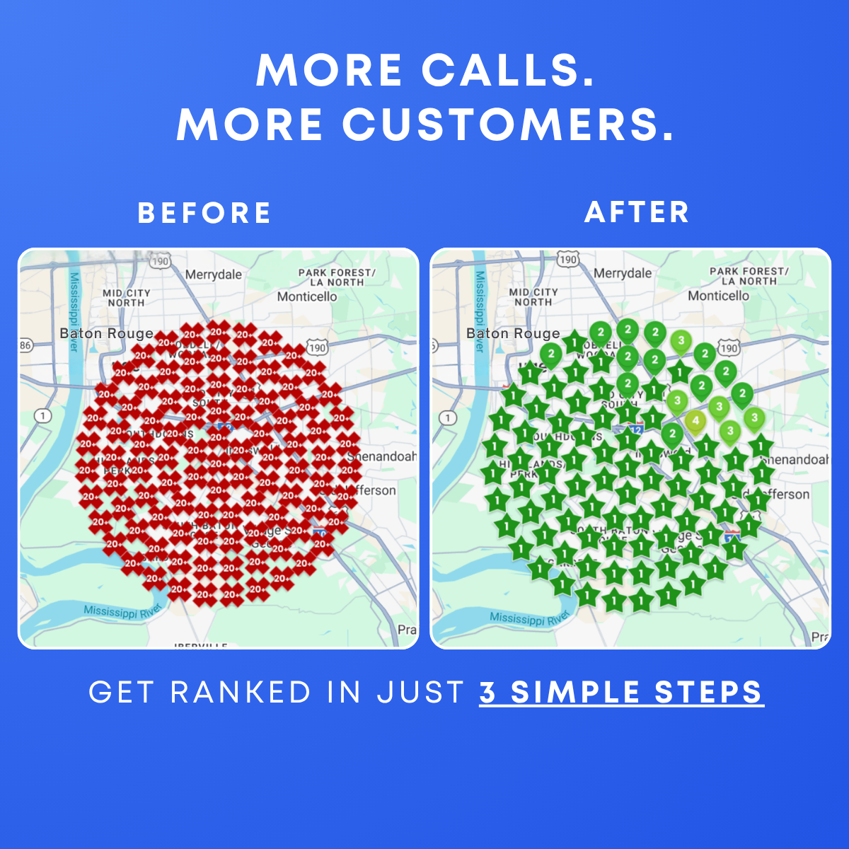
- Hook: A sea of red '20+' turning into green #1 stars
- Reuse it: Use your most dramatic client turnaround and city
Available sizes
What is a before and after ad?
A before and after ad shows the same subject in two states side by side, so the result of using the product is visible at a glance. It's common in skincare, cleaning, fitness and home improvement, but claims shown must be realistic and typical to stay within ad platform policies.
See all before / after ads →Why this before / after ad works
- 01
Outcome headline
'More calls. More customers.' sells the business result, not SEO.
- 02
Extreme contrast
Going from 20+ everywhere to #1 shows maximum transformation.
- 03
Same-map comparison
Identical map views make the change undeniable.
- 04
Simple process
'3 simple steps' reduces the perceived effort and complexity.
Full creative breakdown
Who this ad targets
Owners and marketing managers of US local service businesses such as dentists, orthodontists, plumbers, HVAC companies, roofers, law firms and med spas that depend on 'near me' searches and phone calls. They know Google Maps matters but don't understand why competitors outrank them, and they want more calls without learning SEO themselves. The dramatic turnaround speaks to owners who currently feel invisible on Google Maps. It works for cold prospecting by industry and city, and for retargeting visitors who checked a free ranking scan.
Copywriting analysis
The headline skips SEO jargon entirely and leads with what owners actually want: calls and customers. Two short sentences with parallel structure make it punchy and memorable. The 'Before' and 'After' labels are simple, letting the maps tell the story. The footer 'Get ranked in just 3 simple steps' works as both a CTA and an objection handler, promising an easy process; underlining the key phrase draws the eye. It does create an expectation that the landing page must fulfill by showing those steps. Adding the timeframe or the industry would make it even more persuasive.
Visual design
The blue gradient feels modern and ties the composition together. Red versus green is again the core visual device and reads instantly. Two map cards are well aligned with consistent rounded corners and white borders. Headline spacing is wide and clean. The bottom area has spare room that could fit a logo. Small map labels are not readable at feed size, but they don't need to be.
How to adapt this template for your brand
- Pull a real before/after geo-grid scan from your rank tracker for one client and keyword.
- Place the scans side by side with clear 'Before' and 'After' labels and matching map areas.
- Add the average rank or % of grid in top 3 as a headline number.
- Include the keyword, city and time frame to make the result credible.
- Add a CTA line such as 'Get your free ranking scan' and test against a callout version.
Tips for saas & tech ads on Meta
On Meta, run the square in Feed and test a 4:5 crop for extra screen space; keep on-image text large because most viewers scroll on mobile. Pair it with an instant lead form or a free 'ranking scan' offer to lower friction. On Google Display, check that the headline stays legible at small sizes. On LinkedIn, target owners and practice managers by industry and location. Refresh creatives every three to four weeks to avoid ad fatigue.
About this creative
This ad pairs an outcome headline with a dramatic before and after. On a blue gradient background, white spaced capitals read 'MORE CALLS. MORE CUSTOMERS.' at the top. Below, 'BEFORE' and 'AFTER' labels sit above two rounded map screenshots of the same part of Baton Rouge, with Merrydale, Monticello, Shenandoah and the Mississippi River visible. The before map is covered in a dense circle of dark red diamond markers, each reading '20+', meaning the business did not appear in the top twenty anywhere in the grid. The after map shows the same circle filled with green star pins marked 1, with a handful of 2s, 3s and one 4 on the northeastern edge. At the bottom, a white line reads 'GET RANKED IN JUST 3 SIMPLE STEPS', with the last three words bolded and underlined. The before state is extreme, making the transformation feel dramatic, and the process promise lowers perceived effort.
Meta ad · 1200 × 1200 · SaaS & Tech
Before/After Local SEO Ad Template: From 20+ to #1 (Baton Rouge)
This square before/after ad shows a Baton Rouge geo-grid covered in red '20+' markers next to the same area filled with green #1 stars. Headlined 'More Calls. More Customers.', it is a results-led format for local SEO agencies selling Google Maps rankings.
Added
All brand names and logos are property of their owners. Adplaylist is not affiliated with or endorsed by these brands.
Details
Ad copy
Primary text
Before: ranking 20+ everywhere in Baton Rouge, so customers never saw them. After: #1 across almost the entire city. More calls, more customers. Get ranked in just 3 simple steps. Book your free strategy call.
Description
Get ranked in 3 simple steps
On-image text
MORE CALLS. MORE CUSTOMERS. | BEFORE | AFTER | GET RANKED IN JUST 3 SIMPLE STEPS
Headline ideas for this template
- 1From 20+ to #1 on Google Maps
- 2Get Ranked in 3 Simple Steps
- 3More Calls Start With Better Rankings
- 4Invisible to #1 Across Your City
- 5See How We Turned Red Into Green
Meta image ad specs
| Placement | Ratio | Size (px) |
|---|---|---|
| Feed | 1:1 or 4:5 | 1080×1080 / 1080×1350 |
| Marketplace | 1:1 | 1200×1200 |
| Messenger inbox | 1:1 | 1200×1200 |
| Stories & Reels | 9:16 | 1080×1920 |
This template is 1:1. Request 4:5 or 9:16 to cover all placements.