Key takeaways
- Format: Text-led feature-callout ad on gradient background
- Best for: Direct-response local SEO lead gen
- Hook: 'Rank #1 Locally. Fast.' – a bold speed promise
- Reuse it: Keep the structure, test it against the flat version
Available sizes
What is a feature callout ad?
A feature callout ad is a static image that shows a single product with short text labels pointing to its key features or benefits, usually joined to the product by thin lines. It explains several selling points at a glance without a long caption, which is why it's common for supplements, skincare, electronics and kitchenware.
See all feature callouts ads →Why this feature callouts ad works
- 01
Strong promise
Combining #1 rankings with speed targets owners' biggest frustration with SEO.
- 02
Polished background
The gradient and waves feel more premium than flat color.
- 03
Clear CTA
A bright green button provides an obvious next step.
- 04
Easy A/B test
Same copy as the flat variant makes it ideal to test design impact.
Full creative breakdown
Who this ad targets
Owners and marketing managers of US local service businesses such as dentists, orthodontists, plumbers, HVAC companies, roofers, law firms and med spas that depend on 'near me' searches and phone calls. They know Google Maps matters but don't understand why competitors outrank them, and they want more calls without learning SEO themselves. The confident tone appeals to competitive owners who want to beat local rivals. It works for cold prospecting by industry and city, and for retargeting visitors who checked a free ranking scan.
Copywriting analysis
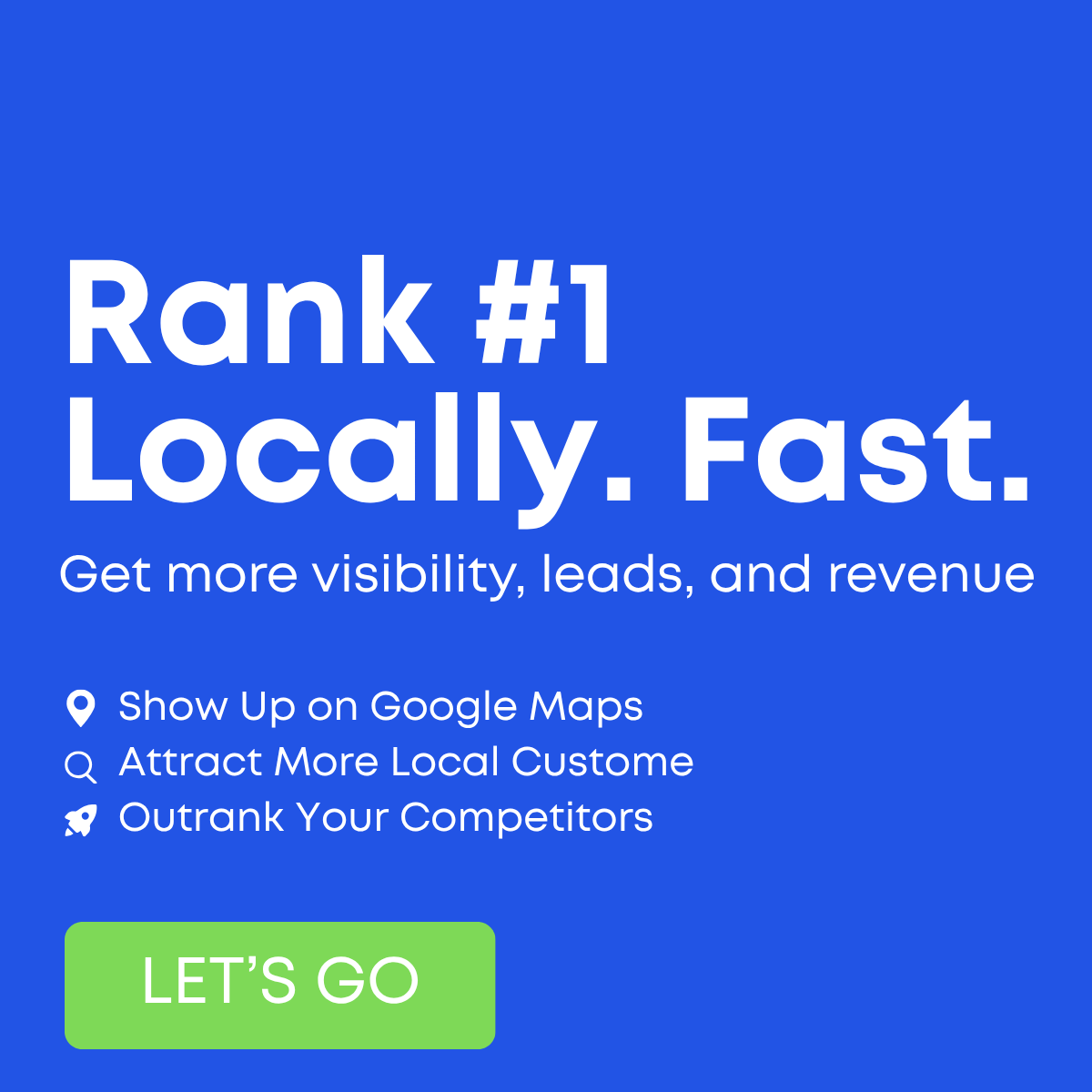
The copy matches the flat variant: a three-beat headline promising #1 rankings, locality and speed, then a subline listing visibility, leads and revenue. Here the bullets are complete, so 'Attract More Local Customers' reads correctly and the ad feels more professional. The bullets cover visibility, customer acquisition and competition, a well-rounded benefit set. The main weakness remains the lack of proof; bold claims like '#1' and 'Fast' work best with a number or timeframe. 'LET'S GO' is high-energy but doesn't say what happens next. 'Get My Free Ranking Scan' would set clearer expectations and likely lift conversion.
Visual design
The gradient with soft wave shapes adds depth and a modern SaaS feel compared to the flat version. White typography is crisp and hierarchy is clear. The green button pops against the blue, with bold white text that's more readable than the flat variant's. Left alignment leaves the right side empty, which could hold a small proof element or logo. Overall clean and professional.
How to adapt this template for your brand
- Swap the headline for your strongest local promise (e.g. 'Top 3 on Google Maps in 90 days').
- Replace the three icon callouts with the benefits your clients care about most: calls, leads, reviews.
- Add your logo and a visible CTA button with a clear action like 'Get Free Scan'.
- Recolor to your brand palette but keep high contrast between headline and background.
- Export at 1200×1200 and a 4:5 version, then A/B test headline variations.
Tips for saas & tech ads on Meta
On Meta, run the square in Feed and test a 4:5 crop for extra screen space; keep on-image text large because most viewers scroll on mobile. Pair it with an instant lead form or a free 'ranking scan' offer to lower friction. On Google Display, check that the headline stays legible at small sizes. On LinkedIn, target owners and practice managers by industry and location. Refresh creatives every three to four weeks to avoid ad fatigue.
About this creative
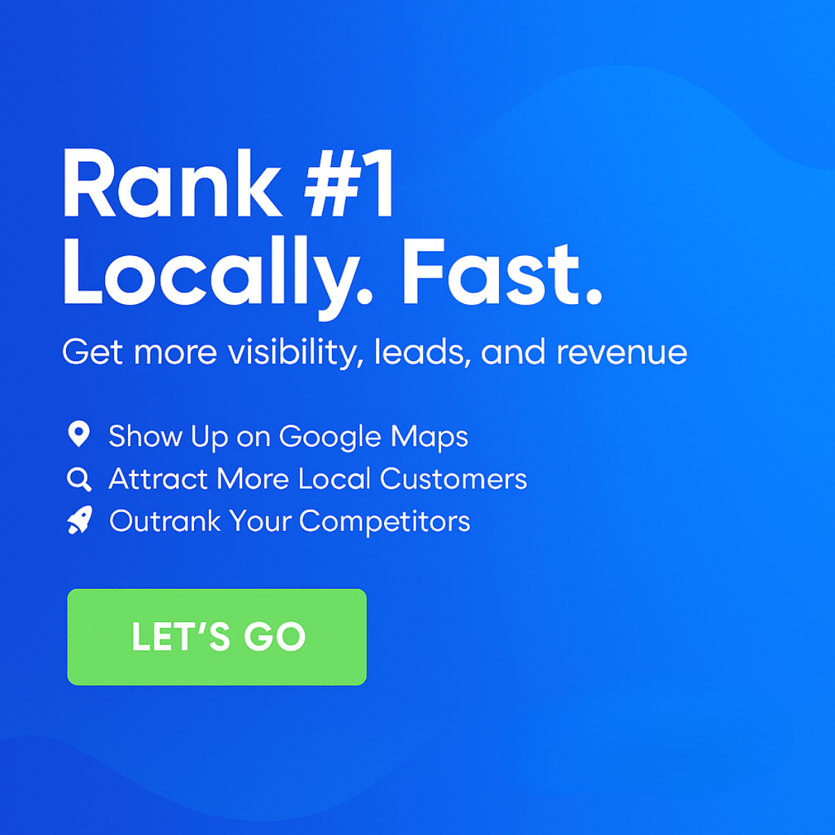
This is a refined version of the flat 'Rank #1 Locally. Fast.' creative. The background is a smooth blue gradient, lighter at the top right, with subtle darker wave shapes curving across the top and bottom corners for depth. A large white headline reads 'Rank #1 Locally. Fast.' over two lines, followed by 'Get more visibility, leads, and revenue' in a lighter weight. Three white icon bullets sit below: a pin for 'Show Up on Google Maps', a magnifying glass for 'Attract More Local Customers' and a rocket for 'Outrank Your Competitors'. Unlike the flat version, the second bullet is complete and correctly spelled. A bright green rounded button with 'LET'S GO' in bold white capitals anchors the bottom left. The layout is entirely left-aligned with generous margins, leaving the right side as open gradient space. There are no images or data; the creative relies on a confident promise and a clear CTA.
Meta ad · 1200 × 1200 · SaaS & Tech
Local SEO Ad Template: Rank #1 Locally. Fast. (Gradient Blue)
This square local SEO ad uses a bold 'Rank #1 Locally. Fast.' headline on a soft blue gradient with wave shapes, three icon callouts and a green 'Let's Go' button. It is a polished feature-callout format agencies can use for direct-response campaigns on Meta.
Added
All brand names and logos are property of their owners. Adplaylist is not affiliated with or endorsed by these brands.
Details
Ad copy
Primary text
Your competitors are taking the calls you should be getting. We help local businesses rank #1 on Google Maps fast, attract more local customers and outrank the competition. More visibility, leads and revenue. Let's go.
Description
More visibility, leads and revenue
On-image text
Rank #1 Locally. Fast. | Get more visibility, leads, and revenue | Show Up on Google Maps | Attract More Local Customers | Outrank Your Competitors | LET'S GO
Headline ideas for this template
- 1Rank #1 on Google Maps, Fast
- 2Beat Your Competitors on Google Maps
- 3Get More Calls From Local Searches
- 4Be #1 When Customers Search Nearby
- 5Faster Rankings. More Revenue.
Meta image ad specs
| Placement | Ratio | Size (px) |
|---|---|---|
| Feed | 1:1 or 4:5 | 1080×1080 / 1080×1350 |
| Marketplace | 1:1 | 1200×1200 |
| Messenger inbox | 1:1 | 1200×1200 |
| Stories & Reels | 9:16 | 1080×1920 |
This template is 1:1. Request 4:5 or 9:16 to cover all placements.