Key takeaways
- Format: Single product shot with a three-line negation headline.
- Best for: Accessory and EDC brands selling one standout physical attribute.
- Hook: Rejecting "minimalist" and "hyper-compact" before claiming the superlative.
- Reuse it: Swap the two dismissed words for your category's buzzwords and keep the faded-to-bold stack.
Available sizes
What is a product shot ad?
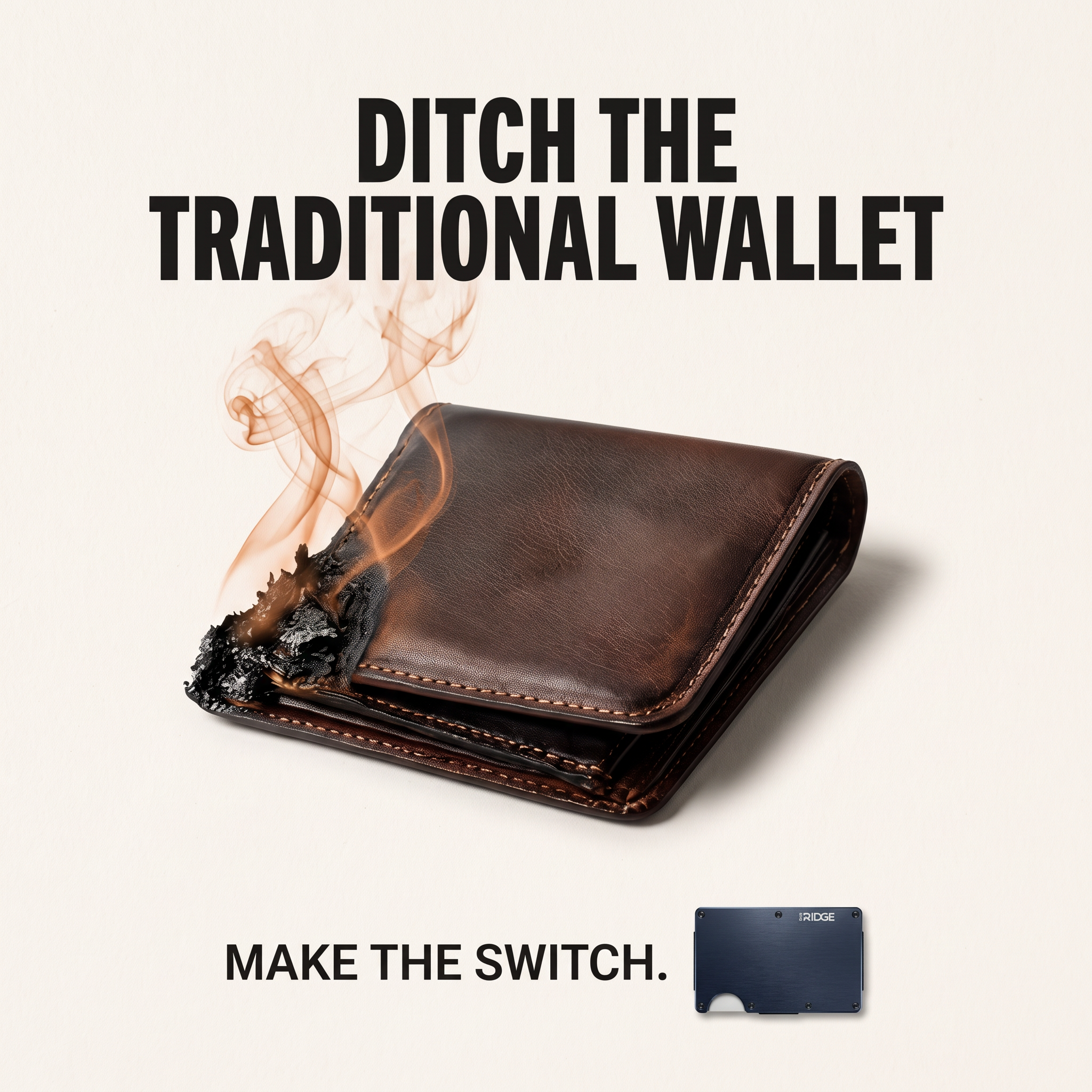
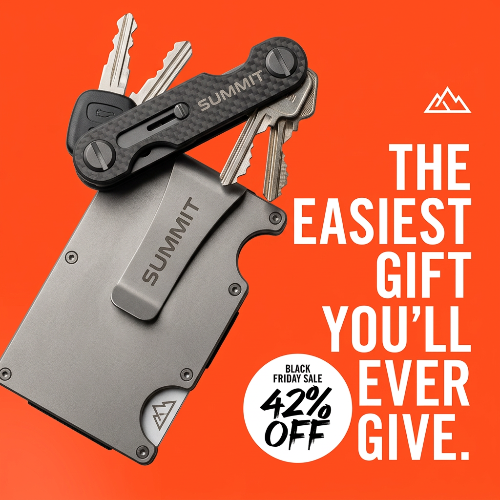
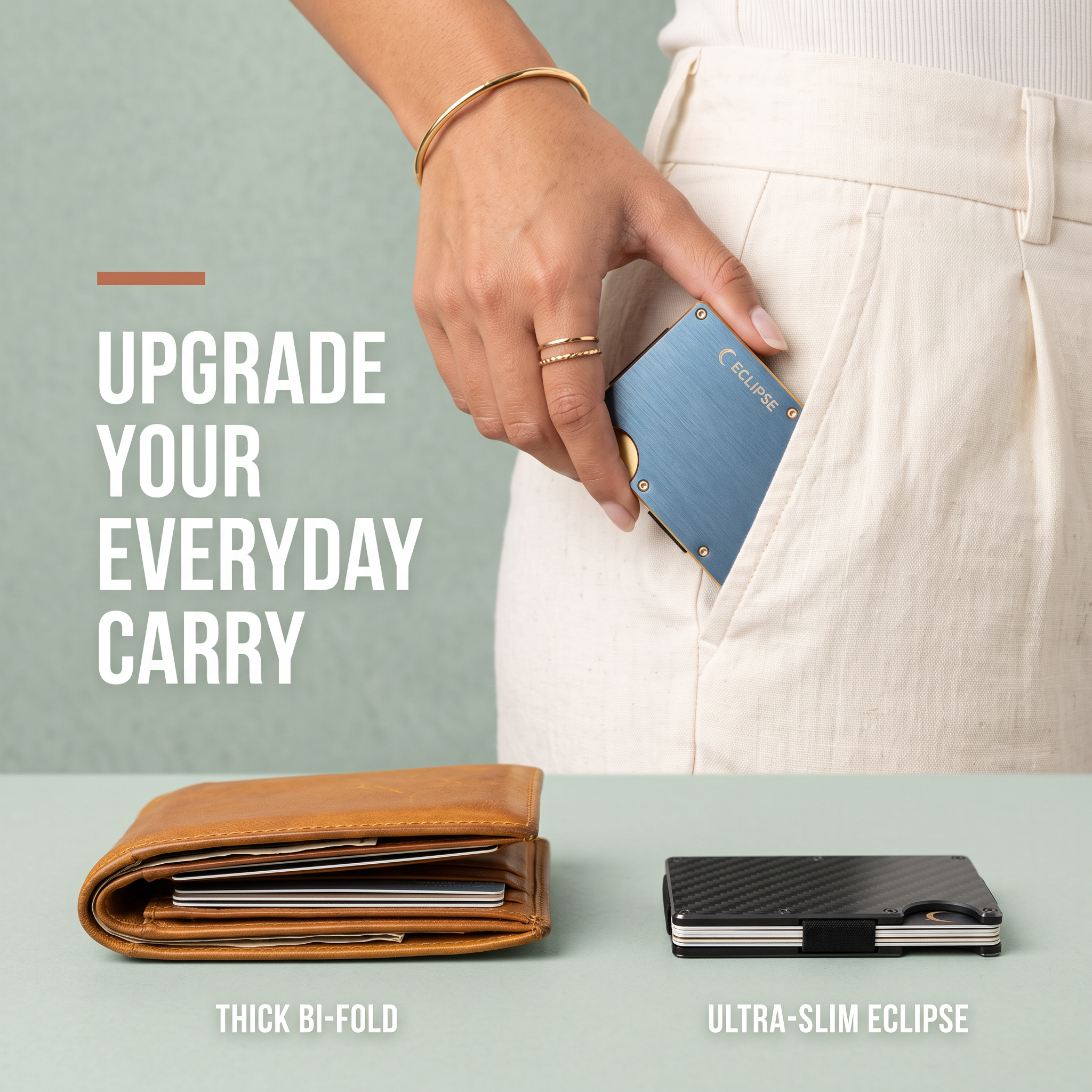
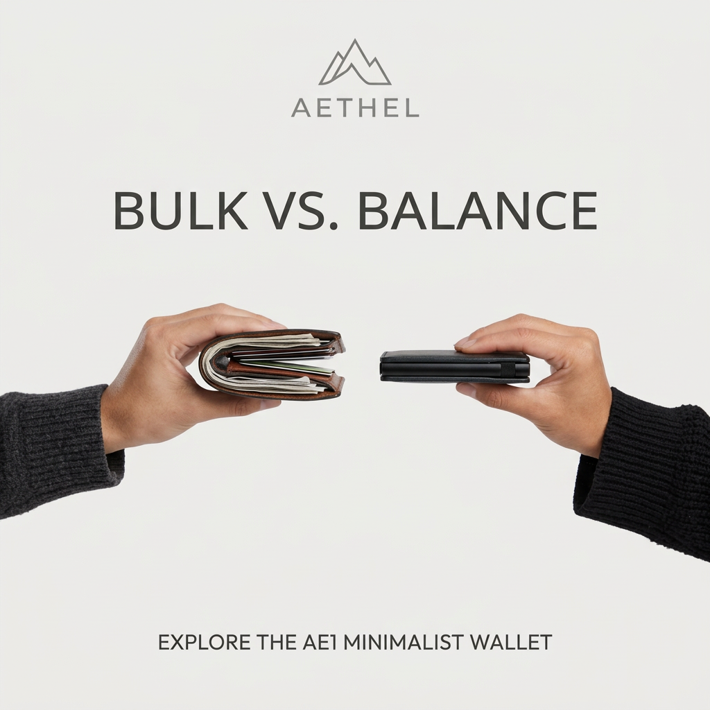
A product shot ad puts the product itself at the centre of the frame, usually on a clean or styled background with little text. It works best when the packaging or product is distinctive enough to stop the scroll and the viewer already understands what it does.
See all product shot ads →Why this product shot ad works
- 01
Negation builds tension
Dismissing two familiar category terms makes the reader wait for the real claim. The payoff line lands harder because the setup created a small gap to close.
- 02
Typography does the ranking
Faded colours for the rejected words and bold black for the claim tell the story visually, even for people who only skim.
- 03
Product proves the claim
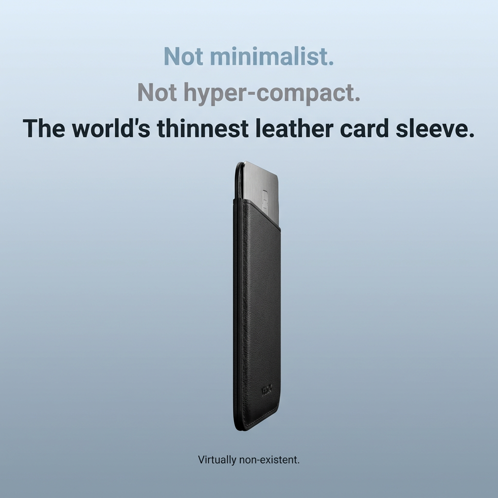
Showing the sleeve edge-on with a card sticking out lets viewers judge thinness themselves instead of just reading about it.
- 04
Premium restraint
No price, badge or clutter signals a high-end brand and keeps the ad from feeling like a discount offer.
Full creative breakdown
Who this ad targets
This ad targets style-conscious professionals, mostly men aged 25–45, who carry few cards and hate pocket bulk. They already know the minimalist wallet category and are likely tired of brands all claiming to be slim. The ad speaks to people upgrading from a bulky bifold or a cheap card holder, who value design and materials and are willing to pay more for a product that feels refined. It also suits gift buyers looking for a sleek accessory.
Copywriting analysis
The copy is built on a classic "not this, not that, but this" structure. "Not minimalist" and "Not hyper-compact" take the category's overused words and push them aside, which positions the product above competitors without naming any. The third line uses a superlative, "the world's thinnest", which is bold and memorable but needs proof to avoid ad-platform or consumer pushback. The closing line, "Virtually non-existent", adds a playful exaggeration that reinforces the benefit: you won't feel it. The copy is short enough to read in two seconds, and every word supports a single idea, thinness.
Visual design
The layout is centred and vertical, matching the tall, narrow product. Generous negative space around the sleeve makes it feel lighter and thinner. The blue-to-slate gradient is cool and calm, borrowing from consumer-tech advertising rather than traditional leather goods. Colour is used as hierarchy in the headline: muted for rejected ideas, dark for the claim. Lighting is soft with subtle reflections on the metal card, adding a sense of quality. The tiny footer text keeps the bottom of the frame quiet.
How to adapt this template for your brand
- Identify your product's single strongest physical attribute (thinness, weight, size, durability).
- List two words competitors use for that attribute and turn them into "Not ___." lines.
- Write a bold payoff line with your superlative claim, and make sure you can substantiate it.
- Shoot the product at an angle that visibly proves the attribute, on a clean gradient backdrop.
- Add a short, playful footer line and test it against a version with a price or offer.
Tips for jewelry & accessories ads on Meta
On Meta, this works best in Feed and Explore where the clean design stands out from busy lifestyle content; add a 1:1 and a 4:5 version. Put the price and material details in the primary text rather than on the image. For Google Display and Performance Max, supply the headline as text assets and the product image without copy as well. Superlative claims like "world's thinnest" can trigger review, so keep proof (measurements) on the landing page.
About this creative
This square ad for a leather card sleeve uses a stripped-back product-shot layout. The top third holds a three-line stacked headline: two faded lines ("Not minimalist." in muted blue and "Not hyper-compact." in grey) followed by a bold black payoff line, "The world's thinnest leather card sleeve." The tonal fade guides the eye downward and visually dismisses the competitor vocabulary. Below, a black leather sleeve is shown in a slim three-quarter profile, standing upright with a brushed-metal card sliding out the top, which demonstrates both function and thinness in one frame. A small embossed logo sits near the bottom of the sleeve. The background is a smooth gradient from pale sky blue to slate grey, giving a premium, almost tech-product feel. A tiny line of supporting text, "Virtually non-existent.", closes the ad. There are no prices, badges or CTAs on the image, so the creative relies entirely on the claim and the product silhouette.
Meta ad · 1200 × 1200 · Jewelry & Accessories
Leather Card Sleeve Ad: The "Not X, Not Y" Product Shot
This square product-shot ad sells a slim leather card sleeve with a three-line negation headline that rejects familiar category words before landing the claim. One floating product on a soft blue-grey gradient keeps all attention on thinness. Use it for accessories, gadgets or any product where one physical attribute is the whole story.
Added
All brand names and logos are property of their owners. Adplaylist is not affiliated with or endorsed by these brands.
Details
Ad copy
Primary text
Forget minimalist wallets. Our leather card sleeve is so thin you'll forget it's in your pocket. Full-grain leather, room for your essentials, zero bulk.
Description
Virtually non-existent. Shop the slimmest carry.
On-image text
Not minimalist. | Not hyper-compact. | The world's thinnest leather card sleeve. | Virtually non-existent.
Headline ideas for this template
- 1Not slim. Not compact. Barely there.
- 2The card sleeve you'll forget you're carrying
- 3Thinner than you think possible
- 4Your cards, minus the bulk
- 5Less wallet. More pocket.
Meta image ad specs
| Placement | Ratio | Size (px) |
|---|---|---|
| Feed | 1:1 or 4:5 | 1080×1080 / 1080×1350 |
| Marketplace | 1:1 | 1200×1200 |
| Messenger inbox | 1:1 | 1200×1200 |
| Stories & Reels | 9:16 | 1080×1920 |
This template is 1:1. Request 4:5 or 9:16 to cover all placements.