Key takeaways
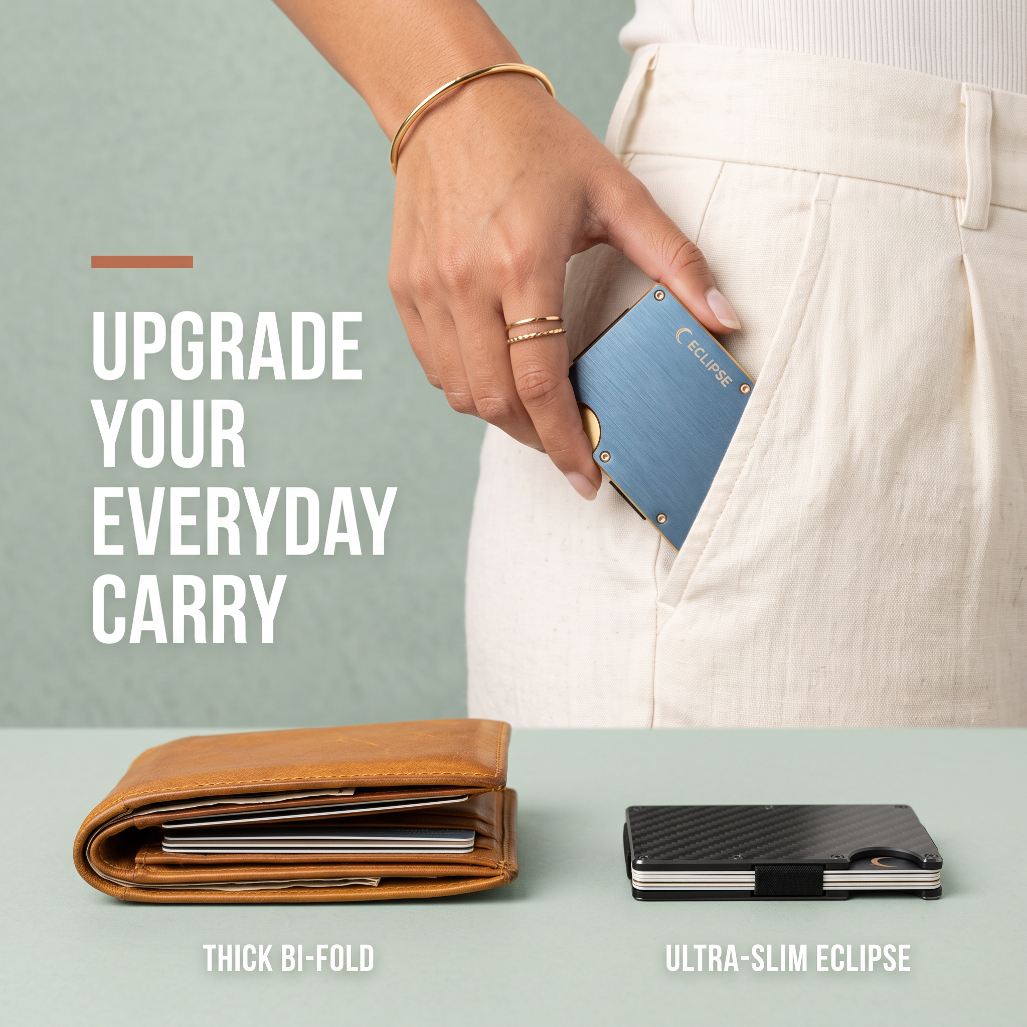
- Format: Side-by-side comparison of the old way versus your product.
- Best for: Minimalist products that win on size, weight or simplicity.
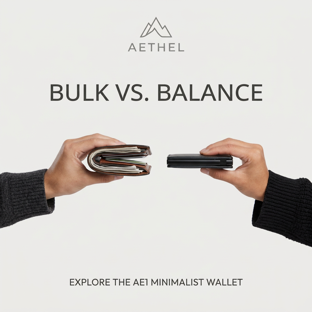
- Hook: A bulging wallet next to a slim one in the same frame.
- Reuse it: Hold the problem product and your product side by side in matching hands.
Available sizes
What is a comparison ad?
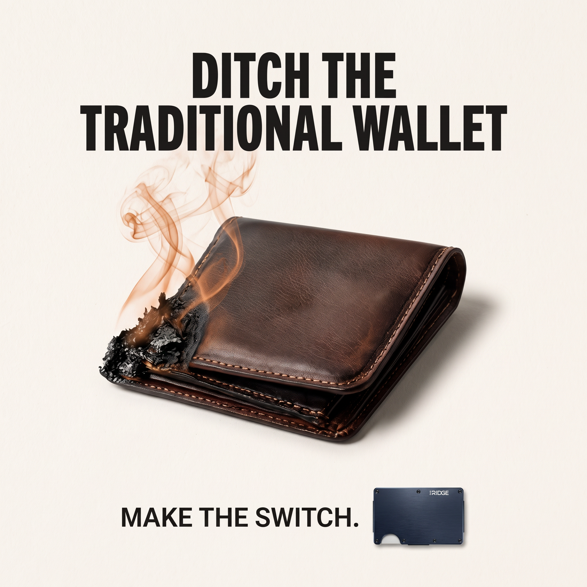
A comparison ad sets the product against an alternative, such as a competitor, the old way of doing things or a cheaper option, usually in a two-column layout or table. It helps buyers who are already weighing options see quickly why this one is the better choice.
See all comparison ads →Why this comparison ad works
- 01
Instant visual contrast
The size difference is clear in a split second. No explanation is needed to understand the benefit.
- 02
Relatable pain point
Most people recognise the overstuffed wallet. Seeing it triggers a moment of self-recognition and mild embarrassment.
- 03
Alliterative headline
“Bulk vs. balance” is short, rhythmic and memorable. It reframes minimalism as a lifestyle choice, not just a smaller wallet.
- 04
Design matches promise
The empty space and neutral palette embody minimalism. The ad looks like the product feels.
Full creative breakdown
Who this ad targets
This ad targets men and women aged 22 to 45 who carry a bulky wallet and are drawn to minimalism, everyday carry and clean design. Many are tech-savvy professionals who pay mostly by phone or card and no longer need to carry much cash. The creative suits interest audiences around minimalism, EDC, gadgets and men's accessories, plus gift shoppers looking for a practical present.
Copywriting analysis
The copy is extremely concise. The headline “Bulk vs. balance” uses alliteration and a versus structure to set up a clear choice. Using “balance” instead of “slim” gives the product an emotional, lifestyle meaning — order, calm and control. The bottom line “Explore the AE1 minimalist wallet” names the product and category plainly and works as a soft call to action. The brand name is small and understated, consistent with a premium minimalist tone. Primary text can add the practical proof the image leaves out, such as card capacity, materials or RFID protection.
Visual design
The layout is symmetrical, with two arms entering from left and right to meet in the centre. The off-white background and charcoal sleeves keep attention on the wallets. The brown bulky wallet adds warm colour and visual mess, while the black slim wallet is clean and sharp. Thin, light grey typography gives an airy, modern feel. Generous negative space above and below makes the comparison the clear focal point.
How to adapt this template for your brand
- Identify the bulky, outdated version of your product that buyers currently use.
- Photograph both versions in matching hands from opposite sides of the frame.
- Keep the background plain and the sleeves neutral so the products stand out.
- Write a short versus headline that reframes your benefit emotionally.
- Add a small call to action naming your product at the bottom.
Tips for jewelry & accessories ads on Meta
On Meta, use this as a prospecting creative in Feed and Reels, and test a short video where cards are moved from the bulky wallet into the slim one. Keep primary text short with one strong proof point. On TikTok, the comparison works well as a before-and-after transformation set to trending audio. The simple design also suits Google Display placements, where it stays legible at small sizes.
About this creative
This Aethel ad is a minimalist comparison creative on a clean off-white background. At the top sits a simple mountain-peak logo and the brand name in grey spaced capitals. Below, a large thin grey headline reads “Bulk vs. balance”. The centre of the ad shows two arms in charcoal knit sleeves reaching in from opposite sides. The left hand pinches a brown leather bifold so overstuffed with cash and cards that it bulges open. The right hand holds the Aethel AE1, a slim black wallet barely thicker than a few cards. The two wallets almost touch in the middle, making the size difference impossible to miss. A small uppercase line at the bottom invites viewers to “Explore the AE1 minimalist wallet”. Lots of empty space and a neutral palette make the ad feel calm and premium, matching the product's minimalist promise.
Meta ad · 1200 × 1200 · Jewelry & Accessories
Minimalist Wallet Ad Template: Bulk vs Balance
This square comparison ad for Aethel shows two hands: one holding a fat, overstuffed brown wallet and the other a sleek black minimalist wallet. The headline “Bulk vs. balance” frames the choice. It is a simple, powerful template for products that win on size, weight or simplicity.
Added
All brand names and logos are property of their owners. Adplaylist is not affiliated with or endorsed by these brands.
Details
Ad copy
Primary text
Your wallet shouldn't need its own pocket. The Aethel AE1 holds your everyday cards and cash in a fraction of the space. Ditch the bulk and find your balance.
Description
Explore the AE1 minimalist wallet
On-image text
AETHEL | BULK VS. BALANCE | EXPLORE THE AE1 MINIMALIST WALLET
Headline ideas for this template
- 1Bulk vs. balance
- 2Your wallet shouldn't need its own pocket
- 3Carry less. Feel lighter.
- 4The last wallet you'll ever need
- 5Ditch the bulk for good
Meta image ad specs
| Placement | Ratio | Size (px) |
|---|---|---|
| Feed | 1:1 or 4:5 | 1080×1080 / 1080×1350 |
| Marketplace | 1:1 | 1200×1200 |
| Messenger inbox | 1:1 | 1200×1200 |
| Stories & Reels | 9:16 | 1080×1920 |
This template is 1:1. Request 4:5 or 9:16 to cover all placements.
Browse similar by tag