Key takeaways
- Format: Lifestyle hero on top, labelled product comparison underneath.
- Best for: Slim or minimalist products that beat a bulky incumbent.
- Hook: 'Upgrade your everyday carry' frames the old wallet as outdated.
- Reuse it: Put your product next to the familiar alternative and label both.
Available sizes
What is a comparison ad?
A comparison ad sets the product against an alternative, such as a competitor, the old way of doing things or a cheaper option, usually in a two-column layout or table. It helps buyers who are already weighing options see quickly why this one is the better choice.
See all comparison ads →Why this comparison ad works
- 01
Visual proof of thinness
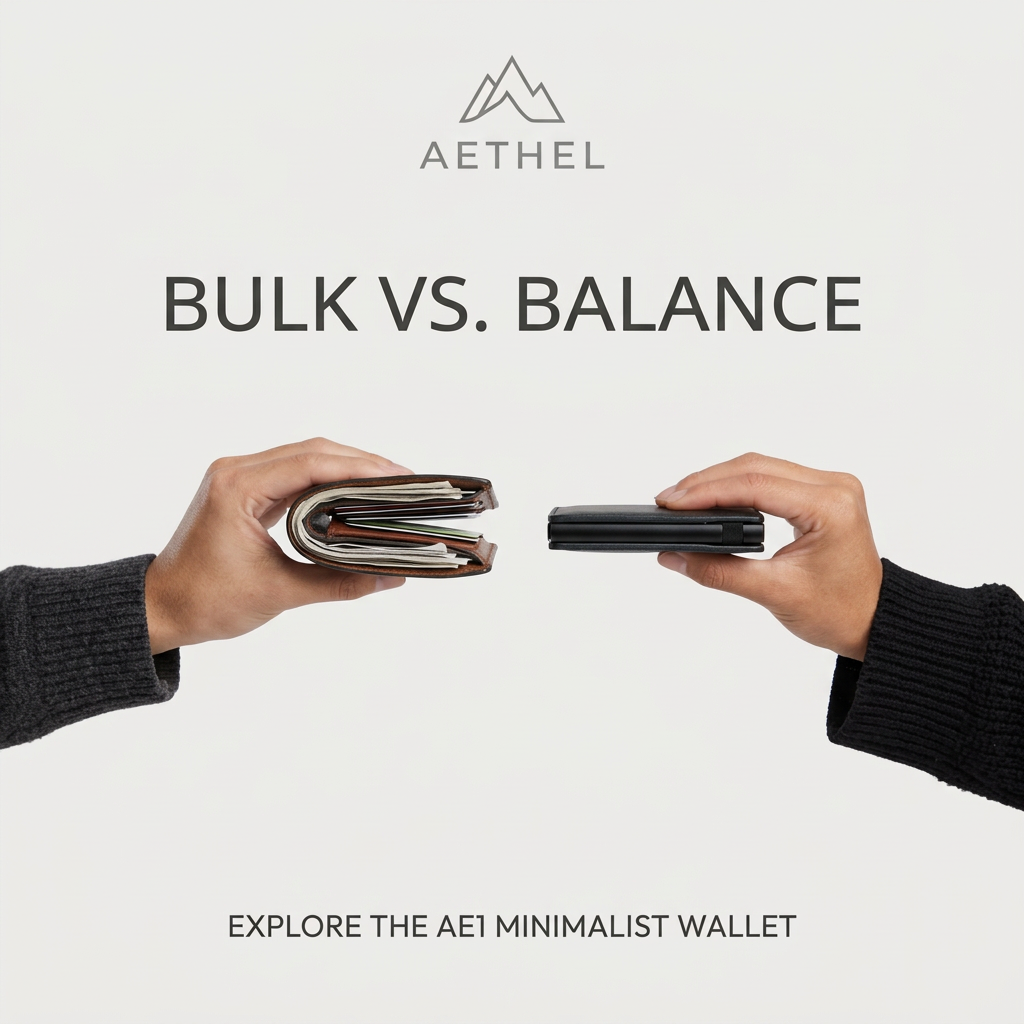
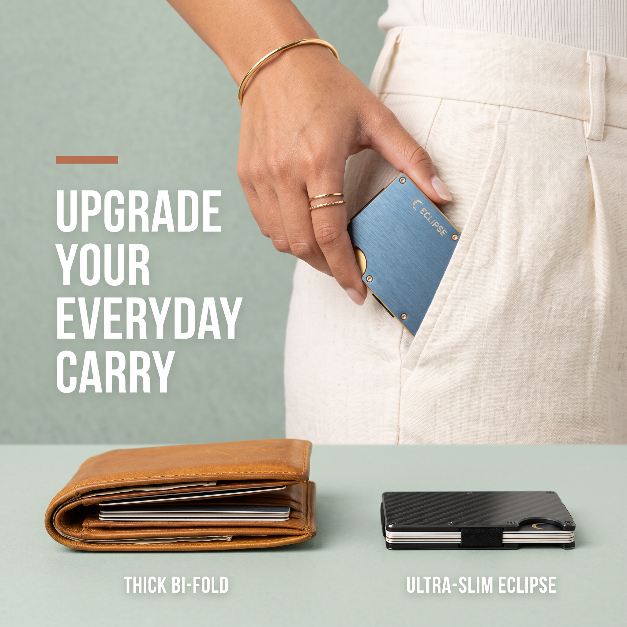
Placing the bulky bi-fold next to the slim wallet shows the benefit without needing a single spec.
- 02
Aspirational use moment
The hand slipping the wallet into a tailored pocket sells the feeling of a clean, unbothered silhouette.
- 03
Labels remove ambiguity
Short captions under each wallet make the comparison readable in a split second.
- 04
Premium neutral palette
Sage, cream and brushed metal position the wallet as a design object rather than a gadget.
Full creative breakdown
Who this ad targets
Style-conscious adults aged roughly 25–45 who care about a clean silhouette and minimalist everyday carry. Both men and women who are frustrated by bulky wallets, overloaded pockets or back pain from sitting on a bi-fold. They likely follow EDC, minimalism and menswear or capsule-wardrobe content. The female hand broadens the appeal beyond the typical male wallet buyer, also making it a natural gifting ad.
Copywriting analysis
The headline 'Upgrade your everyday carry' uses the EDC community's own vocabulary and frames the purchase as an upgrade rather than a replacement, implying the current wallet is a downgrade. The comparison labels do the persuasion: 'Thick' is a mildly negative word, while 'Ultra-slim' is aspirational, and the brand name is attached only to the winner. The copy avoids feature lists and numbers, trusting the image as proof. This keeps the on-image text to under ten words, ideal for mobile.
Visual design
The layout is stacked: a lifestyle zone on top and a product comparison strip at the bottom, separated by the table edge. Large white condensed type on the sage wall creates strong contrast, with a small terracotta bar adding warmth. The comparison objects sit at equal size and height so the thickness difference is honest and obvious. Soft, diffused light and a muted palette of sage, cream, tan and blue keep it calm and premium.
How to adapt this template for your brand
- Identify the bulky or outdated alternative your buyers currently use.
- Shoot both products side by side at the same angle and scale.
- Add short labels: a negative word for the old option, your brand for the new one.
- Add a lifestyle shot showing the product being used effortlessly.
- Write an 'upgrade' headline that frames the switch as a step up.
Tips for jewelry & accessories ads on Meta
On Meta, this works in feed and carousel; use the comparison as card one and close-up product shots on later cards. Target interests like minimalism, EDC and menswear, plus gift-shopper audiences in Q4. On TikTok, turn it into a video: empty a fat wallet, then load the slim one and slide it into a pocket. Keep the comparison labels inside the safe zones.
About this creative
A square ad for Eclipse, a minimalist metal card wallet. The top half is a lifestyle shot against a sage-green wall: a woman's hand with gold rings and a bangle slides a brushed blue aluminium Eclipse wallet into the front pocket of cream linen trousers. On the left, large white condensed capitals read 'Upgrade your everyday carry' beneath a short terracotta accent bar. The bottom third is a tabletop comparison on a pale green surface: on the left, a worn tan leather bi-fold stuffed with cards and receipts; on the right, a compact black carbon-fibre Eclipse wallet with a metal band holding a neat card stack. White labels underneath read 'Thick bi-fold' and 'Ultra-slim Eclipse'. The ad pairs aspiration (an elegant, effortless pocket) with proof (the visible thickness difference), and the calm neutral palette signals a premium, design-led product.
Meta ad · 1200 × 1200 · Jewelry & Accessories
Slim Wallet Ad Template: Bi-Fold vs Eclipse Comparison
This square accessories ad for the Eclipse minimalist wallet combines a lifestyle shot with a side-by-side comparison. A hand slides the slim metal wallet into linen trousers while a bulky leather bi-fold sits next to the Eclipse on the table below. It is a strong template for any product that wins on size or simplicity.
Added
All brand names and logos are property of their owners. Adplaylist is not affiliated with or endorsed by these brands.
Details
Ad copy
Primary text
Your bulky bi-fold is ruining your pockets. The ultra-slim Eclipse holds all your cards and cash – and slides right in. Upgrade your everyday carry.
Description
Holds your cards and cash. Fits any pocket.
On-image text
Upgrade your everyday carry. Thick bi-fold. Ultra-slim Eclipse. ECLIPSE
Headline ideas for this template
- 1Lose the bulk, keep the cards.
- 2Your pocket called. It wants an upgrade.
- 3Thick wallet out. Slim wallet in.
- 4Everything you need, half the thickness.
- 5The last wallet you'll ever switch to.
Meta image ad specs
| Placement | Ratio | Size (px) |
|---|---|---|
| Feed | 1:1 or 4:5 | 1080×1080 / 1080×1350 |
| Marketplace | 1:1 | 1200×1200 |
| Messenger inbox | 1:1 | 1200×1200 |
| Stories & Reels | 9:16 | 1080×1920 |
This template is 1:1. Request 4:5 or 9:16 to cover all placements.
Browse similar by tag