Key takeaways
- Format: Lifestyle scene with product UI visible on a device.
- Best for: Learning apps, online courses and subscription tools.
- Hook: A smiling adult learner proving that piano at home is achievable.
- Reuse it: Put your app's UI on a device inside a real-use scene with a happy user.
Available sizes
What is a lifestyle ad?
A lifestyle ad shows the product being used in a real setting by the kind of person who buys it. Instead of listing features, it sells the feeling or outcome of owning the product, which makes it a strong fit for fashion, home, travel and wellness brands.
See all lifestyle ads →Why this lifestyle ad works
- 01
Shows the outcome
The smiling player sells the feeling of progress, which matters more to beginners than features.
- 02
UI as proof
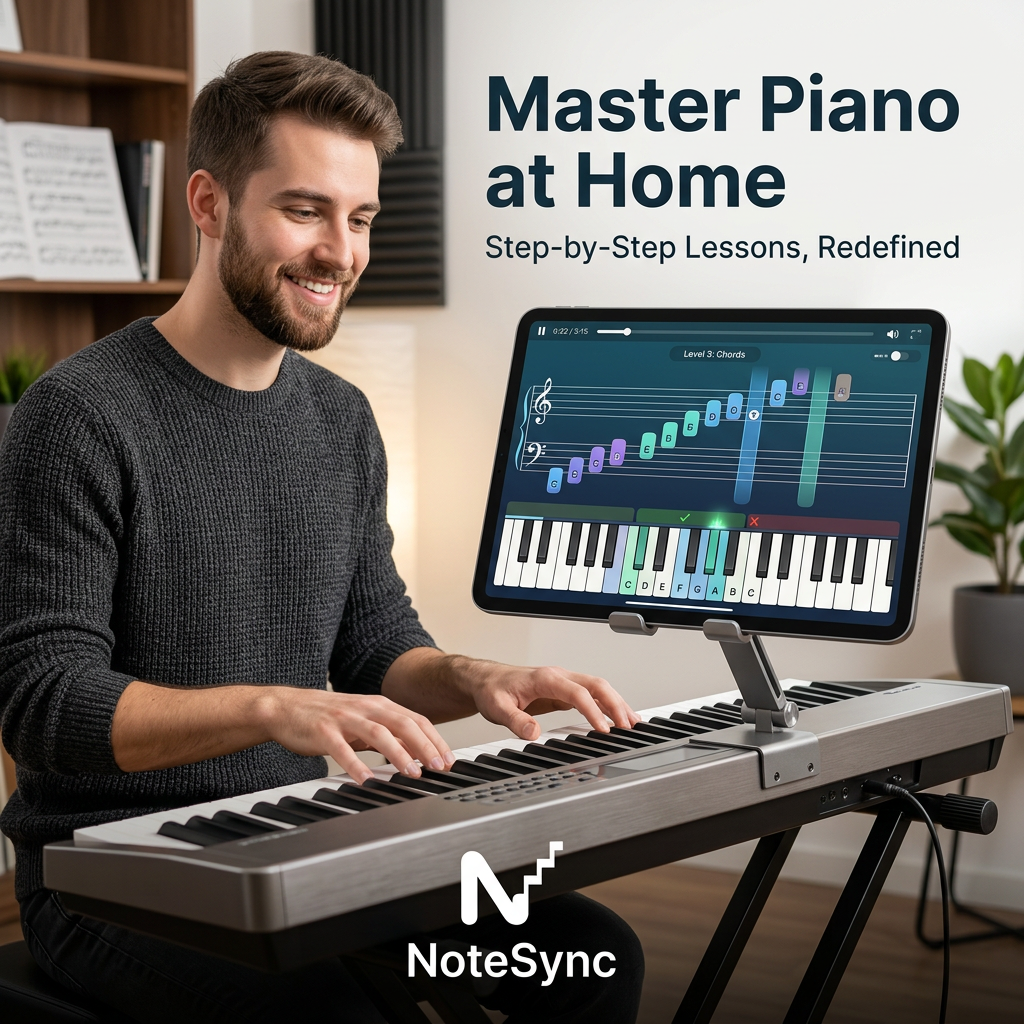
The tablet screen shows coloured notes, levels and feedback, so viewers understand how the app teaches without reading a feature list.
- 03
Removes the teacher barrier
"At Home" tackles the main objection of cost and scheduling for in-person lessons.
- 04
Relatable setting
A realistic home studio makes the scene feel attainable rather than staged for professionals.
Full creative breakdown
Who this ad targets
The ad targets adults aged 25–45 who always wanted to learn piano but never had time, money or confidence for lessons. Many own or are thinking of buying a digital keyboard. They are comfortable with apps and like self-paced learning. The adult model signals that it's not just for kids, which widens appeal to returning learners and hobbyists. Secondary audiences include parents researching learning tools and gift buyers.
Copywriting analysis
The headline "Master Piano at Home" combines an ambitious outcome (master) with a convenience benefit (at home). It is short, scannable and keyword-rich for search and app-store intent. The subline "Step-by-Step Lessons, Redefined" reduces fear by promising structure, while "Redefined" hints at a modern, tech-led approach. The in-app label "Level 3: Chords" quietly signals progression. The copy is benefit-led but light on specifics; testing a version with a free trial or time claim ("in 10 minutes a day") could boost clicks. Brand name placement at the bottom keeps the message first.
Visual design
The image is a warm, photographic lifestyle scene with soft natural lighting. The subject sits on the left and the tablet on the right, creating a balanced diagonal that leads to the headline in the top right. The dark navy headline contrasts cleanly against the white wall. The app UI uses bright purples, greens and blues that pop against the neutral room. The silver keyboard and logo anchor the bottom. Props like sheet music and plants add authenticity without clutter.
How to adapt this template for your brand
- Stage a real-use scene with your target user enjoying the product in their own space.
- Show your app or software UI clearly on a device, with readable progress or feedback elements.
- Write a headline that pairs an ambitious outcome with a convenience benefit.
- Add a reassuring subline about structure, speed or ease.
- Place your logo where it does not compete with the headline and test a free-trial variant.
Tips for education & e-learning ads on Meta
On Meta and TikTok, turn this into a short video showing the notes lighting up as the user plays; motion sells interactive apps. Use app install objectives with "Download" or "Try free" CTAs. Keep the headline in the top area away from TikTok UI overlays. For Google App campaigns, provide the image plus separate headline text assets. Test adult versus younger learners to find which audience converts.
About this creative
This lifestyle ad for the NoteSync piano app shows a bearded man in a dark knit sweater smiling as he plays a silver digital keyboard in a cosy home studio. A tablet mounted on the keyboard displays the app: a grand staff with colour-coded notes moving towards a play line, a "Level 3: Chords" label, and an on-screen keyboard highlighting which keys to press, with green checkmarks and a red cross for feedback. The top-right corner holds the bold dark-navy headline "Master Piano at Home" with the subline "Step-by-Step Lessons, Redefined". Bookshelves with sheet music, acoustic panels and a plant create a warm, aspirational setting. The white NoteSync logo, featuring a stair-step N, sits at the bottom centre over the keyboard. The scene combines emotion (enjoyment), product UI (how it works) and context (at home), making the value proposition clear without needing extra copy.
Meta ad · 1200 × 1200 · Education & E-learning
NoteSync Piano App Ad: Lifestyle Learning at Home
This square lifestyle ad promotes NoteSync, a piano learning app, by showing a happy learner playing a digital keyboard while a tablet displays interactive sheet music and on-screen keys. The headline promises mastery at home. Use this format for apps, online courses and subscriptions that need to show the product in real use.
Added
All brand names and logos are property of their owners. Adplaylist is not affiliated with or endorsed by these brands.
Details
Ad copy
Primary text
Always wanted to play piano? NoteSync turns your keyboard into a personal teacher with step-by-step lessons and real-time feedback on every note. Start learning at home today.
Description
Step-by-step lessons with real-time feedback.
On-image text
Master Piano at Home | Step-by-Step Lessons, Redefined | Level 3: Chords | NoteSync
Headline ideas for this template
- 1Learn piano at home, one step at a time
- 2Your keyboard, now a personal teacher
- 3Play your first song this week
- 4Piano lessons without the lesson fees
- 5Finally learn the piano you always wanted to play
Meta image ad specs
| Placement | Ratio | Size (px) |
|---|---|---|
| Feed | 1:1 or 4:5 | 1080×1080 / 1080×1350 |
| Marketplace | 1:1 | 1200×1200 |
| Messenger inbox | 1:1 | 1200×1200 |
| Stories & Reels | 9:16 | 1080×1920 |
This template is 1:1. Request 4:5 or 9:16 to cover all placements.