Key takeaways
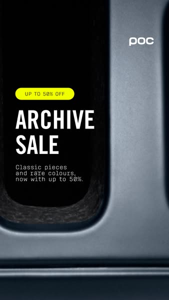
- Format: Moody macro background with a white headline and small neon badge.
- Best for: Premium brands wanting a sale ad that feels editorial.
- Hook: Dark, mysterious close-up with an UP TO 50% OFF badge.
- Reuse it: Pair any texture close-up with a bold headline and a bright badge.
Available sizes
What is an offer ad?
An offer ad leads with a deal, such as a percentage off, free shipping or a first-order discount, as the main hook. It's built to convert people who already know the brand or are close to buying, and works best with a clear deadline or condition.
See all offer / discount ads →Why this offer / discount ad works
- 01
Mystery creates curiosity
The abstract close-up makes people pause to work out what they are looking at. That extra second increases attention on the offer.
- 02
Premium mood for a discount
Dark tones and soft light feel high-end. The sale reads as an exclusive event rather than a clearance.
- 03
One bright accent
The small yellow badge is the only bright element. The eye goes straight to the discount, then down to the headline.
- 04
Strong headline hierarchy
Large condensed ARCHIVE SALE, then a small monospaced body line. The reading order is clear even in a fast scroll.
Full creative breakdown
Who this ad targets
The ad targets style-conscious cyclists and outdoor enthusiasts who follow POC and appreciate design-led brands. They respond to editorial visuals more than to loud promotions. It suits retargeting of site visitors and Instagram followers, and lookalike audiences of past buyers. The rare colours message especially appeals to riders who want something different from the current collection and to deal-seekers who prefer premium brands.
Copywriting analysis
The copy repeats the same structure as POC's other Archive Sale ads, which keeps the campaign consistent across creatives. The badge puts the discount first, UP TO 50% OFF, so the value is clear before the headline is read. ARCHIVE SALE in large condensed type gives the event a name and a premium feel. The body line adds heritage with classic pieces and scarcity with rare colours. As in the other variant, the line ends with up to 50% and no off, which feels unfinished and should be fixed. The dark visual leaves the copy to explain what is being sold; a short product reference such as helmets and goggles could help colder audiences.
Visual design
The design uses a full-bleed macro photograph with deep blacks and cool blue-grey tones. The textured edge of the opening adds tactile detail and quality. Text is placed in the left-centre, white on dark for strong contrast, while the yellow pill badge adds a single hi-vis accent linked to the rest of the campaign. The small white logo top right keeps branding subtle. The look is cinematic and closer to a fashion campaign than a retail promotion.
How to adapt this template for your brand
- Shoot a dark, close-up detail of your product's material or construction.
- Place a large condensed headline in white over the darkest part of the image.
- Add the discount in a small, bright pill badge above the headline.
- Write one short line with heritage or scarcity and the offer.
- Keep the logo small in a corner and test against a bright product-led variant.
Tips for cycling gear ads on Meta
This ad is designed for Meta Stories and Reels. Keep the headline and badge in the middle 70% of the frame to avoid interface overlays. Run it as an A/B test against the brighter yellow-panel Archive Sale ad to find out whether mood or clarity performs better. A subtle slow zoom or light sweep across the surface would turn it into an effective short video for Reels.
About this creative
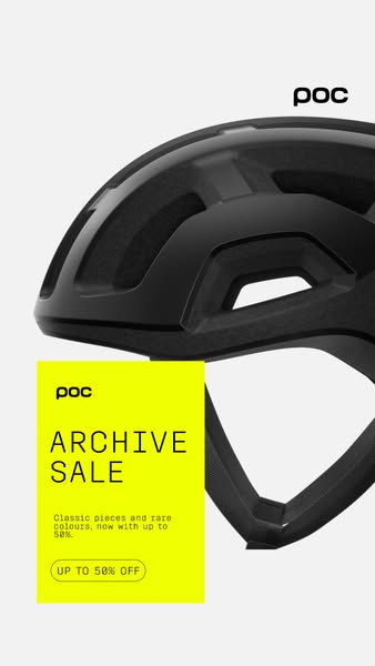
This 9:16 vertical creative uses a dark, atmospheric macro shot as its background. It appears to show a close-up of a helmet or goggle part: a smooth blue-grey shell surface framing a deep black opening with a fine, textured foam or mesh edge. The lighting is low and soft, and the overall mood is moody and premium. A white POC wordmark sits in the top right. On the left, a rounded neon yellow badge contains UP TO 50% OFF in black. Directly below, the headline ARCHIVE SALE appears in large, condensed white capitals across two lines. Under the headline, a monospaced white line says that classic pieces and rare colours are now available with up to 50%. Unlike the brighter Archive Sale variant with the yellow panel, this version lets the image set an exclusive tone and uses yellow only as a small accent. It feels more like a fashion campaign than a typical clearance ad.
Meta ad · 338 × 600 · Cycling Gear
POC Archive Sale Dark Close-Up Story Ad
This vertical POC ad runs the Archive Sale message over a dark macro close-up of a product detail, with a small neon yellow badge reading UP TO 50% OFF. It shows a moodier, more editorial way to present a discount and is a useful alternative template to bright, product-led sale creatives.
Added
All brand names and logos are property of their owners. Adplaylist is not affiliated with or endorsed by these brands.
Details
Ad copy
Primary text
Classic pieces and rare colours from the POC archive, now with up to 50% off. Limited stock – find your piece before it's gone.
Description
Rare colours. Limited stock.
On-image text
POC | UP TO 50% OFF | ARCHIVE SALE | Classic pieces and rare colours, now with up to 50%.
Headline ideas for this template
- 1Up to 50% Off the POC Archive
- 2Rare Colours, Final Run
- 3Open the Archive
- 4Classic Pieces, New Prices
- 5Limited Stock – Archive Sale Now On
Meta image ad specs
| Placement | Ratio | Size (px) |
|---|---|---|
| Feed | 1:1 or 4:5 | 1080×1080 / 1080×1350 |
| Marketplace | 1:1 | 1200×1200 |
| Messenger inbox | 1:1 | 1200×1200 |
| Stories & Reels | 9:16 | 1080×1920 |
This template is 1:1. Request 4:5 or 9:16 to cover all placements.