Key takeaways
- Format: Vertical offer ad with a cropped product and a neon offer panel.
- Best for: Premium brands clearing older stock without looking cheap.
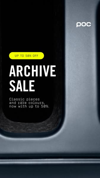
- Hook: ARCHIVE SALE plus up to 50% off – exclusive and generous at once.
- Reuse it: Keep the coloured panel and pill button; swap product and percentage.
Available sizes
What is an offer ad?
An offer ad leads with a deal, such as a percentage off, free shipping or a first-order discount, as the main hook. It's built to convert people who already know the brand or are close to buying, and works best with a clear deadline or condition.
See all offer / discount ads →Why this offer / discount ad works
- 01
Clearance reframed as exclusive
Archive sounds collectable, not leftover. Rare colours adds scarcity and gives people a reason to act before items sell out.
- 02
High-visibility colour block
The neon yellow panel stops the scroll and echoes hi-vis cycling gear. It separates the offer clearly from the product image.
- 03
A big but honest discount
Up to 50% off is a strong number that pulls attention. The up to wording keeps the claim accurate across mixed discounts.
- 04
Button-like pill
The rounded outline around the offer looks tappable. It nudges viewers towards the swipe-up or Shop Now action.
Full creative breakdown
Who this ad targets
The ad targets cyclists who like POC but have been waiting for a better price, as well as deal-seekers interested in premium cycling brands. It suits both existing customers and lookalike audiences of past buyers. The rare colours angle also appeals to collectors and riders who want something less common than the current season's range. Mobile-first Story placements suggest a younger, social-heavy segment of road and gravel riders.
Copywriting analysis
ARCHIVE SALE is the core idea and it is cleverly chosen. Instead of clearance or outlet, archive borrows from fashion and design, where archive pieces are valued and sought after. The body line pairs classic pieces with rare colours, adding heritage and scarcity in a few words. The repeated discount, up to 50%, appears twice so it is not missed. The body line itself ends abruptly with 50% and no off, which reads like a small copy error; tightening it would look more polished. The pill-shaped UP TO 50% OFF works as a visual call to action. Overall the copy balances premium tone and a hard offer, which is exactly what a high-end brand needs in a sale.
Visual design
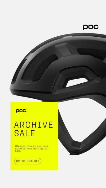
The layout splits into two zones: a large, cropped black helmet at the top right and a neon yellow offer panel at the bottom left that overlaps it. The cropping makes the product feel close and dynamic. Thin, wide capitals for the headline and a monospaced font for the body give a modern, technical look. The white background and small black logo keep the design clean so the yellow panel has maximum impact.
How to adapt this template for your brand
- Crop a large, high-quality product image so it bleeds off one edge of a 9:16 canvas.
- Add a bright brand-safe colour block in the lower third for the offer.
- Name the sale in a way that adds value, e.g. ARCHIVE, VAULT or LAST EDITION.
- Write one short line that combines heritage or scarcity with the discount.
- Repeat the offer inside a pill-shaped outline to act as a visual button.
Tips for cycling gear ads on Meta
Built for Meta Stories and Reels, this ad should keep key text out of the top and bottom 14% of the frame to avoid the interface; the current panel sits close to the bottom, so check the safe zone. Run it to past buyers and site visitors first, then broaden to lookalikes. Add a Shop Now sticker or CTA and link directly to the archive collection page. A short animated version with the panel sliding in can lift attention further.
About this creative
This vertical 9:16 creative is built for Stories and Reels. A matte black POC road helmet is shown large and cropped by the right edge of the frame, so its vents and smooth shell fill the upper half of the screen. The background is clean white, and the black POC wordmark sits in the top right corner. In the lower left, a bright neon yellow rectangle overlaps the helmet. Inside it, a small POC logo sits above the large, thin capital headline ARCHIVE SALE. Below that, a short monospaced line explains that classic pieces and rare colours are now available with up to 50% off. At the bottom of the panel, a rounded pill outline holds the text UP TO 50% OFF, which looks like a button. The contrast between the dark helmet and the high-visibility yellow is striking and fits cycling's hi-vis culture. The word archive reframes old stock as collectable, which protects the brand while still delivering a strong discount message.
Meta ad · 338 × 600 · Cycling Gear
POC Archive Sale Story Ad – Up to 50% Off
This vertical POC ad promotes the Archive Sale with a cropped black helmet and a neon yellow offer panel promising up to 50% off. It shows how a premium brand can run a clearance sale while keeping the feel exclusive, and it works as a template for Stories and Reels discount campaigns.
Added
All brand names and logos are property of their owners. Adplaylist is not affiliated with or endorsed by these brands.
Details
Ad copy
Primary text
The Archive Sale is on. Classic POC pieces and rare colours, now with up to 50% off – once they're gone, they're gone.
Description
Classic pieces and rare colours.
On-image text
POC | POC | ARCHIVE SALE | Classic pieces and rare colours, now with up to 50%. | UP TO 50% OFF
Headline ideas for this template
- 1Archive Sale – Up to 50% Off
- 2Rare Colours, Rare Prices
- 3Classic POC, Now Half Price
- 4Last Chance for Archive Pieces
- 5Dig Into the POC Archive
Meta image ad specs
| Placement | Ratio | Size (px) |
|---|---|---|
| Feed | 1:1 or 4:5 | 1080×1080 / 1080×1350 |
| Marketplace | 1:1 | 1200×1200 |
| Messenger inbox | 1:1 | 1200×1200 |
| Stories & Reels | 9:16 | 1080×1920 |
This template is 1:1. Request 4:5 or 9:16 to cover all placements.
Browse similar by tag