Key takeaways
- Format: Single product shot on a neutral background with a one-word tag.
- Best for: Premium sports eyewear brands running sale or catalogue retargeting.
- Hook: The word SALE on an otherwise calm, premium product image.
- Reuse it: Swap the product and tag, keep the four-corner text grid.
Available sizes
What is a product shot ad?
A product shot ad puts the product itself at the centre of the frame, usually on a clean or styled background with little text. It works best when the packaging or product is distinctive enough to stop the scroll and the viewer already understands what it does.
See all product shot ads →Why this product shot ad works
- 01
The product is the hero
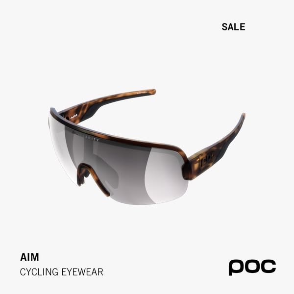
With no props or background noise, the eye goes straight to the lens shape and tortoiseshell frame. Shoppers can judge the style in a second.
- 02
A quiet discount signal
One small SALE tag tells people there is a deal without cheapening the brand. It avoids the loud red badges premium buyers often distrust.
- 03
Consistent four-corner layout
Tag top right, name bottom left and logo bottom right repeat across POC's whole range. Recognition builds every time the format shows up.
- 04
Clear product naming
AIM plus CYCLING EYEWEAR names the model and category together. Viewers who know the line recognise it, and new viewers still understand the offer.
Full creative breakdown
Who this ad targets
The ad speaks to road cyclists and gravel riders who already know POC or have browsed its eyewear. These are performance-minded riders, usually 25 to 55, who are willing to pay for quality gear but are happy to wait for a reduction. The minimal sale message suggests it is used in retargeting or catalogue campaigns aimed at people who viewed the AIM page, added it to their basket or bought other POC products before.
Copywriting analysis
The copy is reduced to three elements: a status tag, a product name and a category. SALE is the only persuasive word, and its job is simply to change the reason to click from browsing to buying now. AIM is short, active and fits the idea of focus and precision on the bike. CYCLING EYEWEAR does the explaining for anyone who does not know the model, which keeps the ad usable for cold audiences. No price or urgency line keeps the premium tone. The weakness is that a first-time viewer gets no reason to choose AIM over a competitor, so the primary text and headline have to carry benefits such as field of view and fit.
Visual design
The design relies on a light, neutral background and a single high-resolution render of the glasses. The three-quarter angle shows the lens width, the nose piece and the textured arm in one view. Typography is a clean grotesque sans serif in black, bold for the name and the tag and regular for the category. Generous white space and the fixed four-corner grid make the ad feel like a page from a premium catalogue rather than a promotion.
How to adapt this template for your brand
- Shoot or render your product at a three-quarter angle on a plain light background.
- Place a one or two word status tag (SALE, NEW, BEST SELLER) in the top right corner.
- Add the product name in bold and the category line below it in the bottom left.
- Put your logo in the bottom right and keep the rest of the canvas empty.
- Use the primary text to add one clear benefit and the discount details.
Tips for cycling gear ads on Meta
On Meta this layout works best in catalogue and Advantage+ shopping campaigns, where the clean square crop fits both feed and carousel cards. Because the image carries no price, use the headline or catalogue overlay to show the discounted price automatically. Test it against a version with a percentage in the tag to see if your audience needs a stronger push. Keep the text small, as the design already leaves plenty of room for Meta's product overlays.
About this creative
The creative is a square product shot of the POC AIM cycling sunglasses, shown at a three-quarter angle so both the wide shield lens and the arm are visible. The frame has a matte tortoiseshell finish in brown and amber, and the single-piece lens has a grey, slightly mirrored tint that reflects the soft studio light. The glasses float in the centre on an off-white, almost light grey background with no shadow or props. In the top right corner a small bold label reads SALE. Bottom left, the product name AIM sits in bold capitals above the category line CYCLING EYEWEAR in a lighter weight. The black POC wordmark anchors the bottom right corner. The layout is identical to the rest of POC's square catalogue ads, which gives the brand a consistent, premium look in the feed. There is no price, no percentage and no lifestyle context; the product and a single word do all the selling, which suits an audience that already knows the brand.
Meta ad · 338 × 600 · Cycling Gear
POC AIM Cycling Eyewear Sale Ad
This square POC ad shows the AIM cycling eyewear as a clean product shot on a light grey background, with a small SALE tag in the corner. It is a good example of understated discount advertising for premium sports eyewear and works well as a template for catalogue and retargeting campaigns.
Added
All brand names and logos are property of their owners. Adplaylist is not affiliated with or endorsed by these brands.
Details
Ad copy
Primary text
Clear vision for every ride. The POC AIM cycling eyewear is now on sale – a wide shield lens and lightweight frame built for long days on the road.
Description
Wide field of view. Lightweight fit.
On-image text
SALE | AIM | CYCLING EYEWEAR | POC
Headline ideas for this template
- 1AIM Eyewear – Now on Sale
- 2See More of the Road for Less
- 3Wide-View Cycling Glasses, Reduced
- 4Your Next Pair of Riding Glasses Is on Sale
- 5Lightweight Shield Lens – Limited Sale
Meta image ad specs
| Placement | Ratio | Size (px) |
|---|---|---|
| Feed | 1:1 or 4:5 | 1080×1080 / 1080×1350 |
| Marketplace | 1:1 | 1200×1200 |
| Messenger inbox | 1:1 | 1200×1200 |
| Stories & Reels | 9:16 | 1080×1920 |
This template is 1:1. Request 4:5 or 9:16 to cover all placements.
Browse similar by tag