Key takeaways
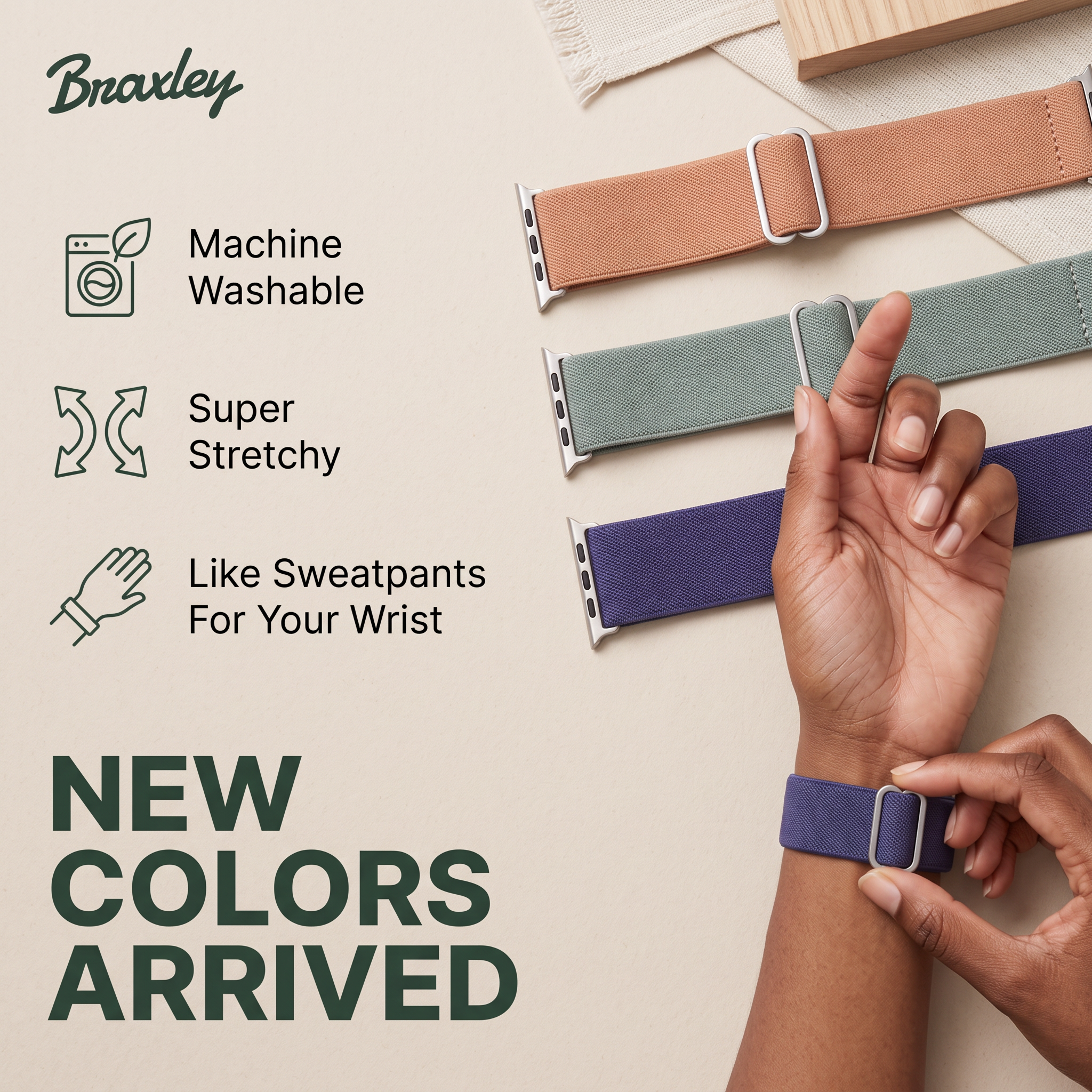
- Format: Three icon-led feature callouts next to a product flat lay.
- Best for: Accessory and apparel brands announcing new colors or variants.
- Hook: 'Like Sweatpants For Your Wrist' makes comfort instantly relatable.
- Reuse it: Swap in your three key benefits with icons and lay out every new variant.
Available sizes
What is a feature callout ad?
A feature callout ad is a static image that shows a single product with short text labels pointing to its key features or benefits, usually joined to the product by thin lines. It explains several selling points at a glance without a long caption, which is why it's common for supplements, skincare, electronics and kitchenware.
See all feature callouts ads →Why this feature callouts ad works
- 01
Benefits in three glances
Each callout is two to five words with a matching icon, so shoppers get the value without reading a paragraph.
- 02
A metaphor that sticks
Comparing the band to sweatpants instantly communicates soft, relaxed comfort and adds a touch of humour.
- 03
Shows all colors at once
The diagonal flat lay displays each new shade clearly, helping viewers pick a favourite before they click.
- 04
Product in use
The hand adjusting the band on a wrist proves the easy fit and helps people picture it on themselves.
Full creative breakdown
Who this ad targets
The ad targets Apple Watch owners, mostly women aged 25 to 50, who wear their watch all day and find standard sport bands sweaty, stiff or boring. They value comfort and like to match accessories to outfits or seasons. Existing Braxley customers are a key audience too, since the 'New Colors Arrived' message invites repeat purchases. The soft, natural styling suggests shoppers who prefer understated, everyday aesthetics over flashy tech accessories.
Copywriting analysis
The copy is built around scannable benefits. 'Machine Washable' answers a hygiene worry most people have about fabric bands, while 'Super Stretchy' explains the fit. The standout line, 'Like Sweatpants For Your Wrist', turns an abstract feeling into a familiar, cosy image and gives the brand personality. The headline 'NEW COLORS ARRIVED' is pure news, which works well for retargeting and existing customers who already know the product. What is missing is a price or offer, so the primary text and landing page need to carry that. For cold audiences, testing a headline that names the product would add clarity.
Visual design
The palette is limited to cream, forest green and the three band colors, so the products become the most vivid element. A clear left-right split puts information on the left and visuals on the right. Thin line icons keep the look light and premium. The heavy all-caps headline at the bottom anchors the composition, and props like linen and wood add texture and warmth without clutter.
How to adapt this template for your brand
- Choose a neutral textured background and one brand color for logo, icons and headline.
- Pick your three strongest benefits and pair each with a simple line icon.
- Include one relatable metaphor as a benefit to add personality.
- Shoot a diagonal flat lay of all new variants plus one in-use shot on a person.
- Add a big news headline like 'New colors arrived' and retarget it to past buyers first.
Tips for jewelry & accessories ads on Meta
On Meta, use this square in feed and test a carousel where each card shows one new color up close. Retarget past customers and site visitors with the 'New colors' angle, and use a product-name headline for cold audiences. Avoid using Apple's logo or implying an official partnership; 'for Apple Watch' compatibility wording is generally the safe phrasing. A short Reel showing the stretch in action can lift engagement.
About this creative
The creative is set on a soft cream paper background with a natural linen cloth and a wooden block in the top right corner, giving it a calm, crafted feel. The Braxley script logo in deep forest green sits in the top left. Below, three thin line icons in the same green pair with short black feature labels: a washing machine with a leaf for 'Machine Washable', curved arrows for 'Super Stretchy', and a hand with a cuff for 'Like Sweatpants For Your Wrist'. On the right, three fabric Apple Watch bands in peach, sage green and deep purple lie diagonally, each with a silver adjuster buckle and watch connector. A hand with a darker skin tone reaches across them, and another hand below adjusts the purple band on a wrist, showing the fit in use. The bottom left carries the launch message in huge, heavy green capitals: 'NEW COLORS ARRIVED', stacked over three lines.
Meta ad · 1200 × 1200 · Jewelry & Accessories
Braxley Watch Band Ad: Icon Feature Callouts
This Braxley ad promotes stretchy, washable Apple Watch bands in new colors. It uses a feature callout format with three line icons on the left and a flat lay of bands plus a hand adjusting one on the right. Use it as a template for accessory launches and new color drops.
Added
All brand names and logos are property of their owners. Adplaylist is not affiliated with or endorsed by these brands.
Details
Ad copy
Primary text
Meet the most comfortable Apple Watch band you'll ever wear. Super stretchy, machine washable and now in three new colors. Like sweatpants for your wrist.
Description
Stretchy, washable Apple Watch bands
On-image text
Braxley | Machine Washable | Super Stretchy | Like Sweatpants For Your Wrist | NEW COLORS ARRIVED
Headline ideas for this template
- 1The comfiest band your Apple Watch will ever wear
- 2Three new colors, zero sweaty wrists
- 3Toss it in the wash, wear it all day
- 4Sweatpants comfort, now for your wrist
- 5Your new everyday watch band is here
Meta image ad specs
| Placement | Ratio | Size (px) |
|---|---|---|
| Feed | 1:1 or 4:5 | 1080×1080 / 1080×1350 |
| Marketplace | 1:1 | 1200×1200 |
| Messenger inbox | 1:1 | 1200×1200 |
| Stories & Reels | 9:16 | 1080×1920 |
This template is 1:1. Request 4:5 or 9:16 to cover all placements.
Browse similar by tag