Key takeaways
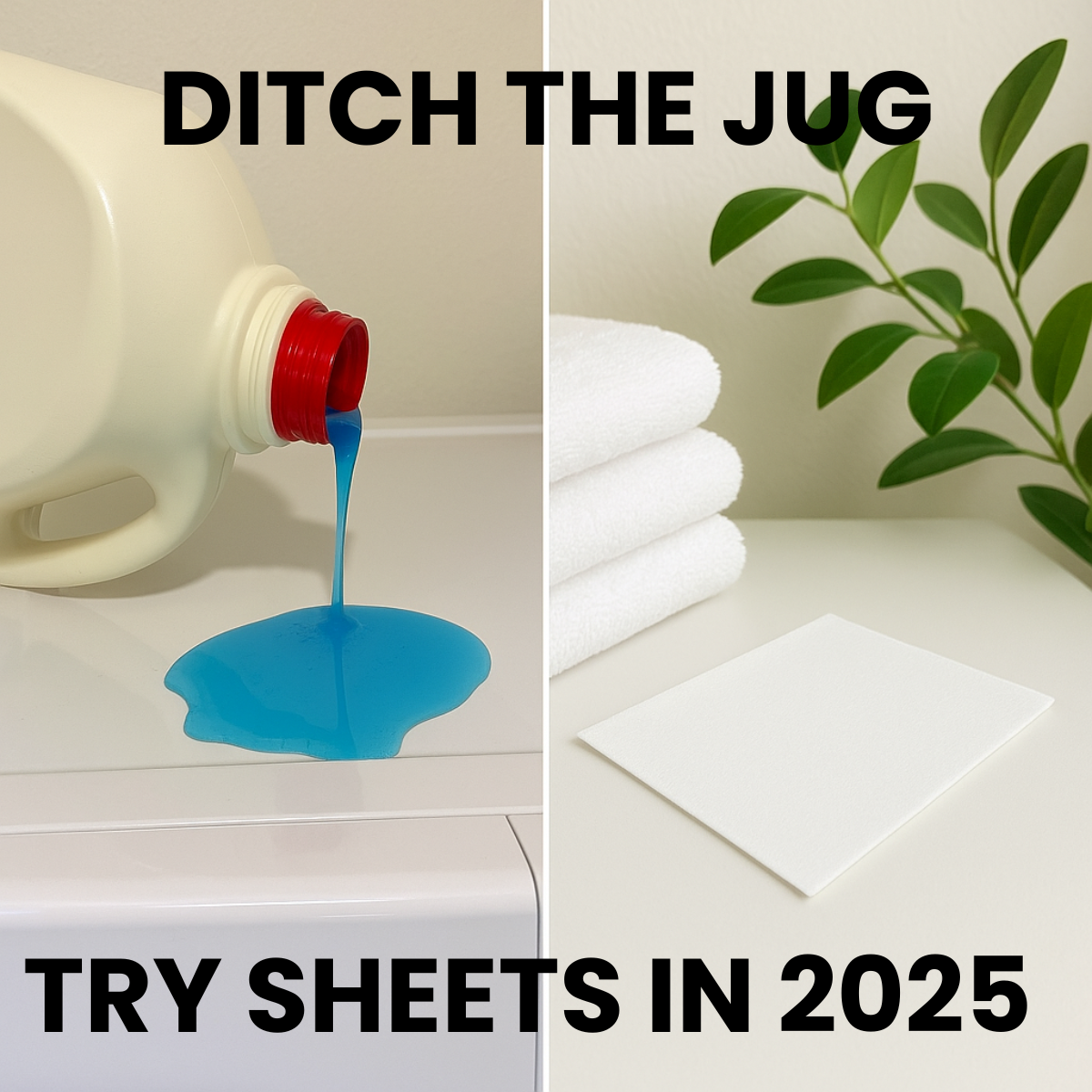
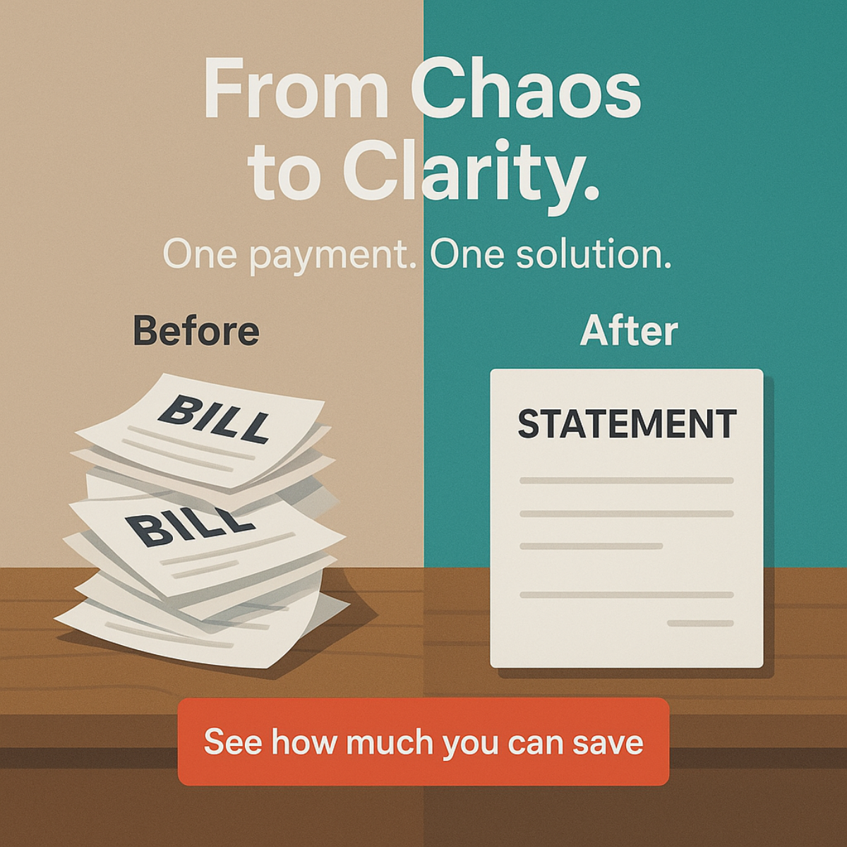
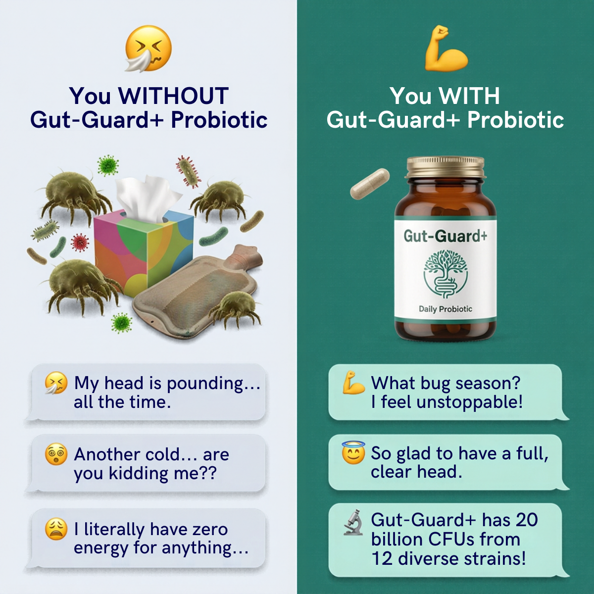
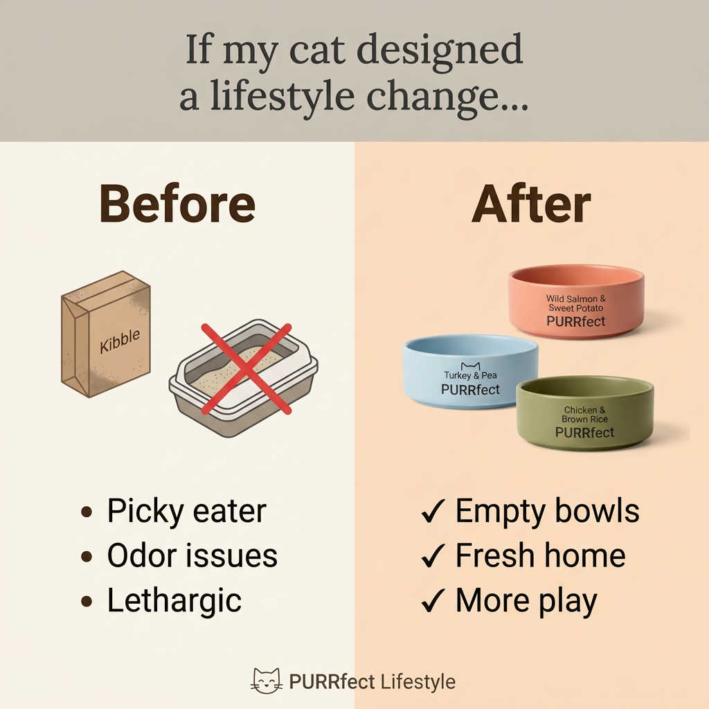
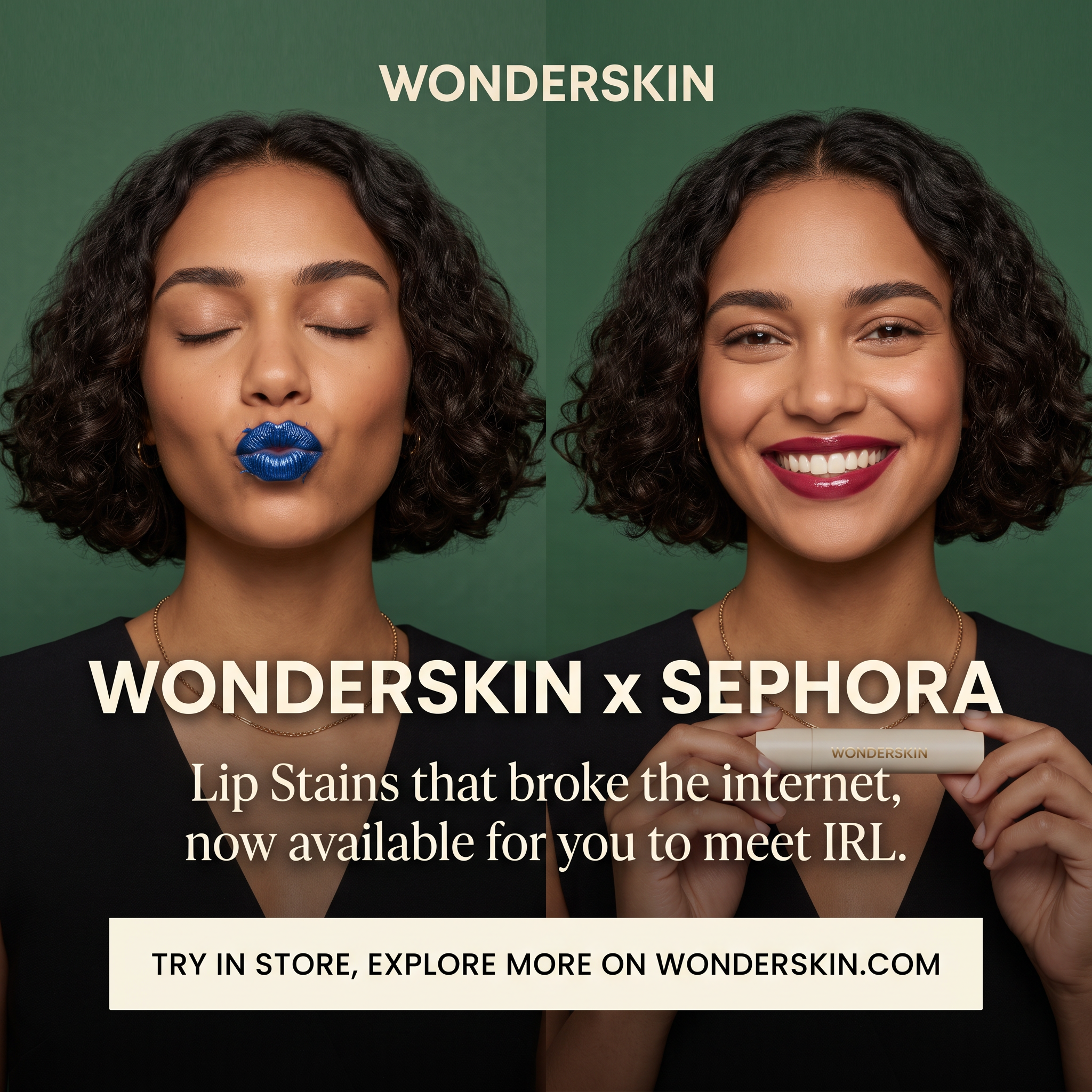
- Format: Split-screen before/after of the same model.
- Best for: Beauty products with a surprising or visual transformation.
- Hook: Blue lips turning into berry red sparks curiosity instantly.
- Reuse it: Show your product's 'weird' middle step next to the beautiful result.
Available sizes
What is a before and after ad?
A before and after ad shows the same subject in two states side by side, so the result of using the product is visible at a glance. It's common in skincare, cleaning, fitness and home improvement, but claims shown must be realistic and typical to stay within ad platform policies.
See all before / after ads →Why this before / after ad works
- 01
Curiosity-driven contrast
Blue lips are unexpected, so people stop to figure out how they become the red result on the right.
- 02
Borrowed retail credibility
Naming Sephora gives instant trust and tells fans of the viral product where they can finally try it.
- 03
Social proof in the copy
'Broke the internet' reminds viewers this is a proven, talked-about product rather than a new unknown.
- 04
Same model, fair comparison
Using the same person, lighting and pose makes the transformation believable and easy to compare.
Full creative breakdown
Who this ad targets
The ad targets beauty enthusiasts, mostly women aged 18 to 40, who follow makeup trends on TikTok and Instagram and may have seen the viral peel-off lip stain videos. Many were curious but hesitant to buy online, so the Sephora launch speaks to shoppers who prefer to swatch and test in store. It also reaches Sephora regulars who discover brands in-store, and people looking for long-wear lip color that survives eating, drinking and masks.
Copywriting analysis
The copy works as a launch announcement. 'WONDERSKIN x SEPHORA' uses the collab format familiar from fashion drops, signalling news and status. The serif line does two jobs: 'broke the internet' leans on viral fame as social proof, and 'meet IRL' playfully frames the in-store launch as finally meeting an online celebrity. The CTA banner covers both buying paths, try in store or explore online, which suits an omnichannel goal. The copy never explains how the product works, relying on the image and prior awareness. For cold audiences, a short line like 'peel off for all-day color' would add clarity.
Visual design
The split layout is the hero: mirrored portraits create a clean visual comparison. The deep green background complements both the blue and the berry lips while matching a premium, editorial tone. Cream text echoes the product packaging. Pairing a bold sans-serif headline with a refined serif subline balances impact and elegance. The solid cream CTA bar adds a clear end point and keeps the URL legible.
How to adapt this template for your brand
- Photograph the same model in identical light and framing for both the before and after states.
- Make the 'before' an unusual, eye-catching step of your product rather than a dull starting point.
- Pick a background color that flatters both states and fits your brand.
- Add a bold news headline, like a retail partner or launch, across the middle.
- Close with a solid CTA banner that lists where people can buy or try it.
Tips for beauty & skincare ads on Meta
On Meta, use this square for feed and add a 9:16 version for Reels and Stories, keeping text clear of the top and bottom safe zones. On TikTok, the strongest version is a video of the actual peel-off moment, since that was what went viral; use the static as a follow-up. Location targeting near Sephora stores and store-visit objectives can support the in-store goal. Avoid exaggerated before/after edits, as beauty claims must reflect real results.
About this creative
The creative is a split-screen portrait on a deep forest green backdrop. The same woman with curly shoulder-length hair appears on both sides. On the left, her eyes are closed and her lips pucker into a kiss, covered in a metallic cobalt blue layer: the peel-off stage of the lip stain. On the right, she smiles broadly with rich berry red lips, the final result, while holding a cream-coloured Wonderskin tube with gold lettering. The Wonderskin wordmark sits centred at the top in cream capitals. Across the middle, a bold headline reads 'WONDERSKIN x SEPHORA', announcing the retail partnership. Below it, an elegant serif line says the lip stains that broke the internet are now available to meet IRL. At the bottom, a cream banner with dark capitals reads 'TRY IN STORE, EXPLORE MORE ON WONDERSKIN.COM'. A dark vignette at the bottom keeps the text readable over the black tops.
Meta ad · 1200 × 1200 · Beauty & Skincare
Wonderskin x Sephora Ad: Before and After Lip Stain
This Wonderskin ad announces its viral peel-off lip stain landing at Sephora. It uses a before/after format: one portrait with the blue peel-off layer, one with the final berry color. Use it as a template for beauty products with a visible transformation or a new retail launch.
Added
All brand names and logos are property of their owners. Adplaylist is not affiliated with or endorsed by these brands.
Details
Ad copy
Primary text
The peel-off lip stain that went viral is now at Sephora. Swipe on, let it set, peel it off and reveal long-lasting color. Try it in store or shop online.
Description
The viral lip stain, now in store
On-image text
WONDERSKIN | WONDERSKIN x SEPHORA | Lip Stains that broke the internet, now available for you to meet IRL. | TRY IN STORE, EXPLORE MORE ON WONDERSKIN.COM | WONDERSKIN (on product)
Headline ideas for this template
- 1The viral peel-off lip stain is now at Sephora
- 2Swipe on blue, peel off perfect
- 3Finally try the lip stain everyone's talking about
- 4Color that lasts through coffee, dinner and more
- 5Meet the internet's favourite lip stain IRL
Meta image ad specs
| Placement | Ratio | Size (px) |
|---|---|---|
| Feed | 1:1 or 4:5 | 1080×1080 / 1080×1350 |
| Marketplace | 1:1 | 1200×1200 |
| Messenger inbox | 1:1 | 1200×1200 |
| Stories & Reels | 9:16 | 1080×1920 |
This template is 1:1. Request 4:5 or 9:16 to cover all placements.
Browse similar by tag