Key takeaways
- Format: Before/after transformation with one product, two states.
- Best for: Awareness ads for personalization and customization products.
- Hook: Plain vs. playful: the arrow makes the change instantly obvious.
- Reuse it: Swap the phone for a laptop, water bottle or guitar case.
Available sizes
What is a before and after ad?
A before and after ad shows the same subject in two states side by side, so the result of using the product is visible at a glance. It's common in skincare, cleaning, fitness and home improvement, but claims shown must be realistic and typical to stay within ad platform policies.
See all before / after ads →Why this before / after ad works
- 01
Instant transformation
The before/after layout shows the value of stickers in one glance. Viewers understand the benefit without reading anything.
- 02
Short, emotional headline
“Make it fun” is three words and speaks to a feeling, not a feature. It invites the viewer to imagine their own phone.
- 03
Relatable object
Almost everyone owns a phone, so the creative feels personal. It makes custom stickers relevant to a mass audience.
- 04
Nostalgic sticker designs
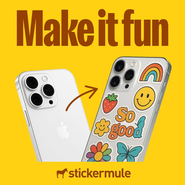
Retro rainbow, smiley and flower motifs feel trendy and friendly. They show the range of designs you can print.
Full creative breakdown
Who this ad targets
This ad targets young adults and Gen Z consumers who like to personalize their belongings, especially phone owners with clear cases. It also speaks to creators, small brands and hobbyists who want to print their own sticker designs. Interest targeting could include stickers, phone accessories, DIY, illustration, Etsy shopping and aesthetic lifestyle content. Because the message is emotional rather than technical, it works best in cold prospecting, broad audiences and lookalikes of past sticker buyers.
Copywriting analysis
The copy is almost entirely carried by the headline “Make it fun”. It is an imperative, short and positive, which suits a scroll-stopping social ad. It does not explain the product; it trusts the visuals to show it. That makes the ad feel confident rather than salesy. The only other words are the stickers themselves, where “So good” works as a hidden second line of copy that reinforces quality and satisfaction. For performance, the primary text should do the heavy lifting: add the practical benefits like free shipping, fast turnaround and free proofs. A weak point is the missing CTA on the image, so the button and primary text must carry the action.
Visual design
The design uses a high-contrast mustard-yellow background with a dark brown headline in a condensed bold typeface, giving a warm, retro feel. The two phones are angled slightly, which adds movement, and the hand-drawn arrow guides the eye from left to right, matching natural reading order. The sticker cluster is colourful against the white phone, so it becomes the focal point. The logo is small but centred at the bottom, which keeps branding present without competing with the transformation.
How to adapt this template for your brand
- Pick an everyday object your product transforms (laptop, bottle, notebook, shop window).
- Shoot the object plain on the left and transformed on the right, at a slight angle.
- Add a hand-drawn arrow between the two states to guide the eye.
- Write a two to four word emotional headline in a bold, condensed font.
- Use one solid, bright background colour and place your logo small at the bottom centre.
Tips for printing services ads on Meta
On Meta, run this square creative in Feed and Explore placements, where 1:1 holds attention without cropping. Keep the headline and logo inside the centre 80% so nothing gets cut by UI overlays. Pair it with a short primary text and a clear Shop Now button. Test it in Advantage+ campaigns against a 9:16 version for Stories and Reels, and refresh the creative every two to three weeks to avoid ad fatigue with high-frequency audiences.
About this creative
This square Sticker Mule ad uses a bold mustard-yellow background and a huge brown headline that says “Make it fun”. Below it, two phones are shown side by side. On the left is a plain white phone, clean but boring. A hand-drawn brown arrow points to the right, where the same phone is covered in retro-style stickers: a rainbow, a smiley face, a strawberry, a flower, a butterfly and a bubbly “So good” lettering sticker. The Sticker Mule logo with its mule icon sits centred at the bottom. There is no price, offer or feature list; the creative relies fully on the visual transformation to make the point. The colour palette of the stickers echoes 70s nostalgia, which adds warmth and a playful mood. The ad works as an awareness or inspiration piece that shows exactly what the product does in under a second, without needing any explanation.
Meta ad · 338 × 600 · Printing Services
Phone Sticker Ad Template: Sticker Mule Before/After Ad
This Sticker Mule ad uses a classic before/after layout to sell custom die cut stickers. A plain white phone sits next to the same phone covered in colourful stickers, with a simple arrow between them. It is a strong template for any product that transforms everyday objects through personalization.
Added
All brand names and logos are property of their owners. Adplaylist is not affiliated with or endorsed by these brands.
Details
Ad copy
Primary text
Your phone called. It's bored. 📱✨ Turn a plain phone into something that's actually yours with custom die cut stickers from Sticker Mule. Upload any design, get a free proof and receive your stickers fast with free shipping.
Description
Custom printing that kicks ass. Free shipping, 4 day turnaround.
On-image text
Make it fun | stickermule | Sticker designs: So good
Headline ideas for this template
- 1Your phone deserves better
- 2Plain is boring. Make it yours.
- 3From blank to brilliant
- 4Stick your style on everything
- 5Make it fun, make it yours
Meta image ad specs
| Placement | Ratio | Size (px) |
|---|---|---|
| Feed | 1:1 or 4:5 | 1080×1080 / 1080×1350 |
| Marketplace | 1:1 | 1200×1200 |
| Messenger inbox | 1:1 | 1200×1200 |
| Stories & Reels | 9:16 | 1080×1920 |
This template is 1:1. Request 4:5 or 9:16 to cover all placements.