Key takeaways
- Format: Product demo with a feature callout and angled headline.
- Best for: Proving durability, waterproofing or toughness visually.
- Hook: Water drops on the sticker prove the claim before you read it.
- Reuse it: Show your product in the conditions it is built to survive.
Available sizes
What is a feature callout ad?
A feature callout ad is a static image that shows a single product with short text labels pointing to its key features or benefits, usually joined to the product by thin lines. It explains several selling points at a glance without a long caption, which is why it's common for supplements, skincare, electronics and kitchenware.
See all feature callouts ads →Why this feature callouts ad works
- 01
Visual proof of the claim
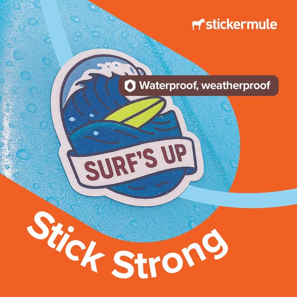
The water droplets demonstrate waterproofing directly. Seeing is more convincing than reading a feature list.
- 02
Theme matches benefit
A surf sticker on a wet surface ties the design to water naturally. The concept feels coherent and memorable.
- 03
Icon-led callout
The shield and drop icon makes the feature scannable. It adds a functional, trustworthy tone.
- 04
Dynamic angled headline
The rotated “Stick Strong” text adds movement. It breaks the grid and catches the eye in the feed.
Full creative breakdown
Who this ad targets
This ad targets people who put stickers on items exposed to the elements: water bottles, surfboards, skateboards, coolers, bikes and car bumpers. It suits outdoor and action-sport fans aged 18 to 40, as well as brands making merch for festivals, events and outdoor gear. Useful interest targeting includes surfing, hiking, camping, skateboarding and outdoor brands. It also works for B2B audiences like breweries or surf shops that need durable branded stickers.
Copywriting analysis
“Stick Strong” fits the brand's two-word series and focuses on durability. It is direct and confident, and the pun on “strong” works for both adhesion and toughness. The callout “Waterproof, weatherproof” is functional copy that answers the most common buyer worry: will it peel or fade? Using two parallel words makes it rhythmic and easy to remember. The sticker itself, “Surf's Up”, works as a secondary message that adds a fun, outdoor tone. There is no price or urgency on the image, so the primary text should reinforce the benefit with specific situations like rain, dishwashers or sunlight, and close with a clear CTA.
Visual design
The visual uses complementary blue and orange, giving strong contrast. The wet surface is shot in macro, so the droplets look real and tactile, which strengthens the waterproof message. A diagonal teardrop shape and the sweeping curve create movement that mirrors water and waves. The dark callout pill sits close to the sticker to tie the feature to the product. The angled white headline at the bottom adds energy and balances the logo at the top right.
How to adapt this template for your brand
- Show your product in the conditions it is built for: water, mud, sun or snow.
- Shoot in macro so the conditions, like droplets, are clearly visible.
- Add one icon-led callout naming the key resistance feature.
- Write a two word headline that combines your brand verb with the benefit.
- Angle the headline slightly to add energy and break the grid.
Tips for printing services ads on Meta
On Meta, run this square creative in Feed and Explore placements, where 1:1 holds attention without cropping. Keep the headline and logo inside the centre 80% so nothing gets cut by UI overlays. Pair it with a short primary text and a clear Shop Now button. Test it in Advantage+ campaigns against a 9:16 version for Stories and Reels, and refresh the creative every two to three weeks to avoid ad fatigue with high-frequency audiences.
About this creative
This square ad shows a round die cut sticker with a blue wave, a yellow surfboard and a ribbon banner reading “Surf's Up”. The sticker sits on a glossy light blue surface, likely a water bottle or surfboard, which is covered in water droplets. The wet surface takes up a diagonal teardrop shape over a bright orange background, with a pale blue curved line sweeping through the layout. A dark brown pill callout with a small shield-and-drop icon says “Waterproof, weatherproof”, placed right next to the sticker. At the bottom, the headline “Stick Strong” is set at an angle in large white type, adding energy. The white Sticker Mule logo sits top right. The ad turns a technical feature into a visual demonstration: the droplets prove the sticker survives water, and the surf theme connects that toughness to outdoor, active lifestyles.
Meta ad · 338 × 600 · Printing Services
Waterproof Sticker Ad Template: Sticker Mule Stick Strong
This Sticker Mule ad proves durability with a “Surf's Up” sticker on a wet blue surface covered in water droplets. A “Waterproof, weatherproof” callout and the bold “Stick Strong” headline make it a strong feature-callout template for any product that needs to show resistance or toughness.
Added
All brand names and logos are property of their owners. Adplaylist is not affiliated with or endorsed by these brands.
Details
Ad copy
Primary text
Rain, sea or dishwasher, our stickers stay put. 🌊 Sticker Mule custom stickers are waterproof, weatherproof and built to stick strong. Design online, approve your free proof and get them shipped free.
Description
Custom printing that kicks ass. 4 day turnaround, free shipping.
On-image text
Stick Strong | Waterproof, weatherproof | stickermule | Sticker design: Surf's Up
Headline ideas for this template
- 1Built for rain, sun and surf
- 2Stickers that survive anything
- 3Waterproof by design
- 4Wet? No problem.
- 5Made to stick, made to last
Meta image ad specs
| Placement | Ratio | Size (px) |
|---|---|---|
| Feed | 1:1 or 4:5 | 1080×1080 / 1080×1350 |
| Marketplace | 1:1 | 1200×1200 |
| Messenger inbox | 1:1 | 1200×1200 |
| Stories & Reels | 9:16 | 1080×1920 |
This template is 1:1. Request 4:5 or 9:16 to cover all placements.