Key takeaways
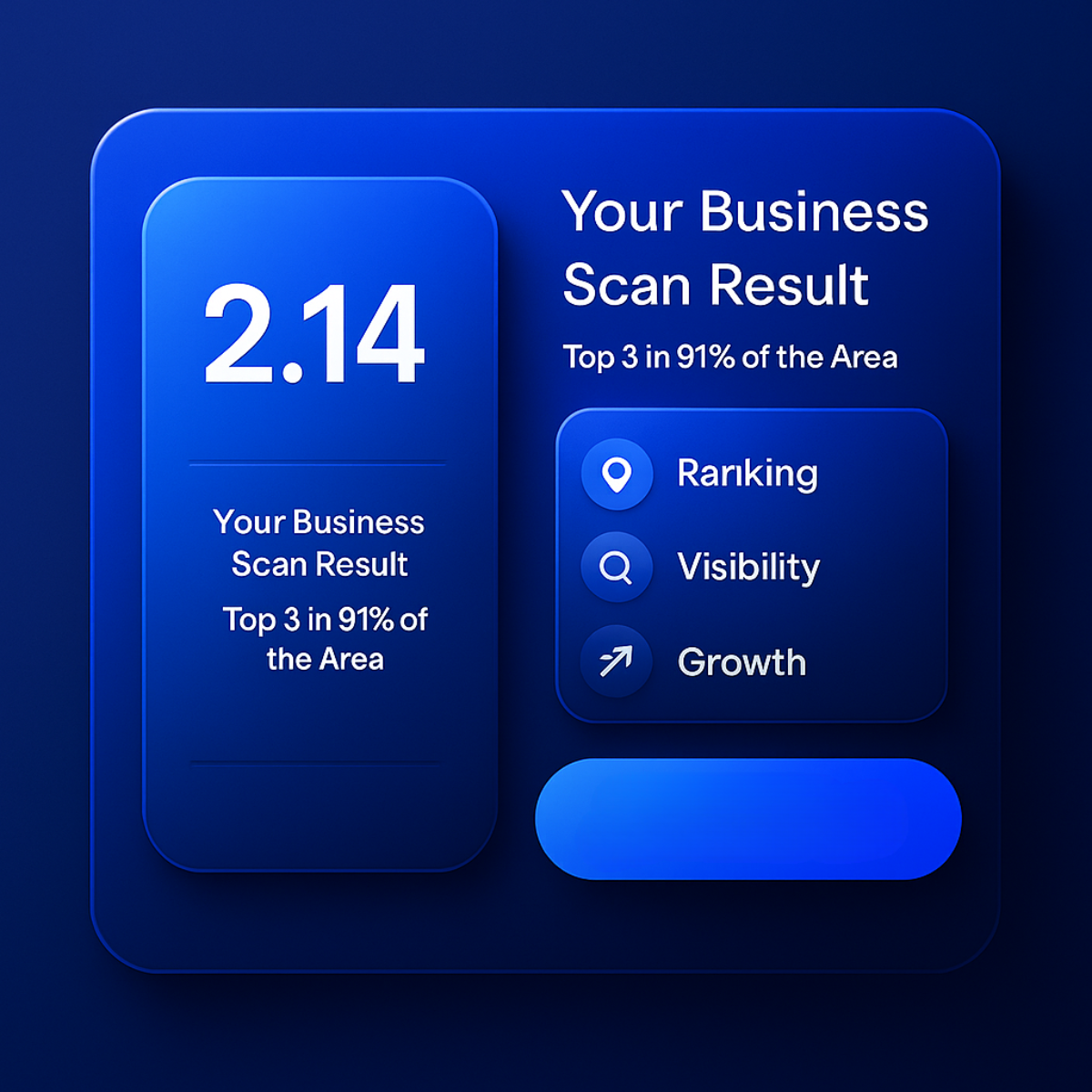
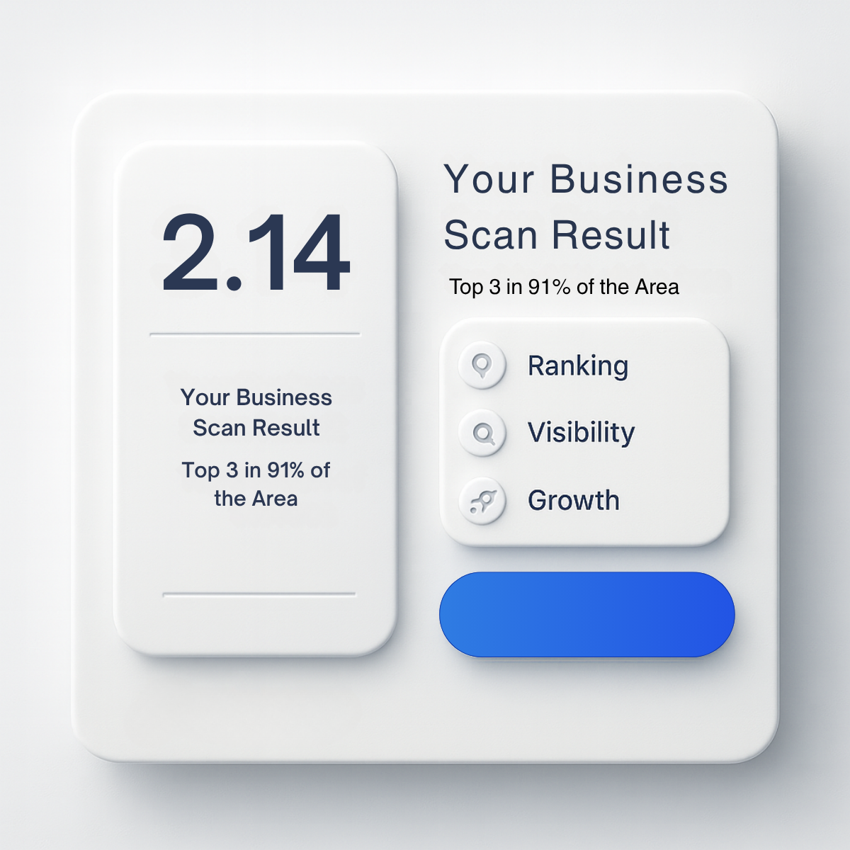
- Format: Neumorphic dashboard card showing a scan score.
- Best for: Local SEO tools and agencies promoting a free scan report.
- Hook: A specific score that invites viewers to get their own.
- Reuse it: Show your real report output as a clean 3D UI card.
Available sizes
What is a product shot ad?
A product shot ad puts the product itself at the centre of the frame, usually on a clean or styled background with little text. It works best when the packaging or product is distinctive enough to stop the scroll and the viewer already understands what it does.
See all product shot ads →Why this product shot ad works
- 01
Specific numbers feel real
A precise figure like 2.14 reads as data, not marketing. It suggests a real tool produced it.
- 02
Shows the deliverable
Viewers see what they will receive before clicking. That lowers the uncertainty of signing up for a free scan.
- 03
Premium soft UI style
The neumorphic look signals a modern software product. It helps a service feel like a polished, trustworthy app.
- 04
Three simple benefits
Ranking, Visibility and Growth summarize the value in three words. Icons make the list scannable in under a second.
Full creative breakdown
Who this ad targets
This ad targets small and mid-sized local business owners who are curious about data and like to see numbers before committing. It also appeals to marketing managers at multi-location brands who already track rankings and want a quick benchmark. They respond well to dashboards and app-style visuals. It works best as a mid-funnel ad shown to people who visited the website or engaged with earlier awareness creatives, since the 2.14 metric needs some context.
Copywriting analysis
The copy is minimal and almost entirely data. The headline Your Business Scan Result positions the viewer as the owner of the result, making it feel personal even though it is a sample. Top 3 in 91% of the Area translates the abstract score into a benefit: being in the map pack across most of a service area. The three labels Ranking, Visibility and Growth are short nouns that hint at a full report without promising specifics. The weakness is repetition: the same title and claim appear twice, wasting space that could hold a call to action. The blue button is empty, so the creative relies fully on the Meta headline and CTA to drive the click.
Visual design
The design uses a monochrome light grey palette with soft drop shadows and raised edges typical of neumorphism. Depth comes from layering a big card, a tall score panel and a smaller benefits card. Navy text keeps contrast high, and the single saturated blue gradient pill becomes the focal action point. Rounded corners and circular icons create a friendly, app-like feel. Generous padding gives the layout a calm, premium look that stands out against busy feeds.
How to adapt this template for your brand
- Replace 2.14 with a real metric from your own report and add a short label explaining it.
- Remove the duplicated title so the left panel shows only the score and claim.
- Add a clear label to the blue button, such as Scan My Business.
- Swap the three benefits for the sections your report actually contains.
- Add your logo in the top corner of the main card for brand recall.
Tips for saas & tech ads on Meta
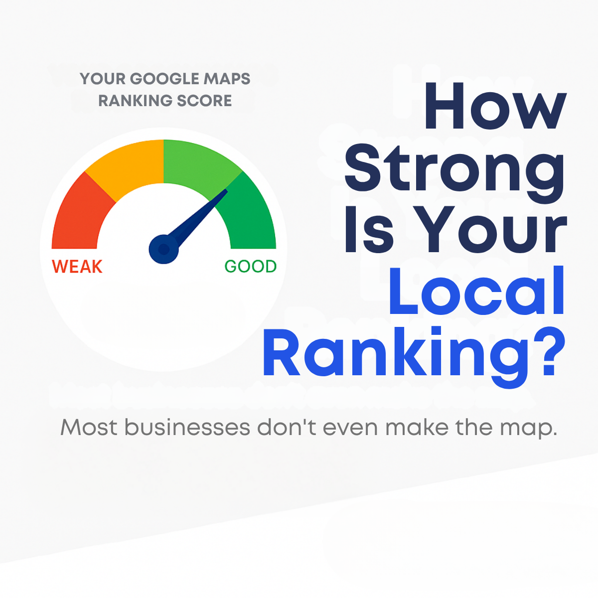
This creative suits Meta retargeting and Google Display, where a product-style visual stands out from photo ads. Send clicks to a scan landing page where the user enters their business name and sees a result in seconds. On Meta, use a Get Quote or Sign Up CTA and explain the score in the primary text. Test it against the gauge creative to see whether data or curiosity drives cheaper leads.
About this creative
The ad is a single neumorphic interface card on a light grey background, rendered with soft shadows so it looks like a physical object. On the left, a tall rounded panel shows a large navy number, 2.14, above a thin divider and the lines Your Business Scan Result and Top 3 in 91% of the Area. On the right, the same title is repeated in larger type with the coverage claim below it. Under that sits a smaller raised card listing three items, Ranking, Visibility and Growth, each with a circular icon of a map pin, magnifying glass and rocket. At the bottom right is an empty blue gradient pill that reads as a button but carries no label. The overall look is clean, premium and app-like. The number refers to an average map ranking position, a metric local SEO tools use, though the ad does not explain it. The duplicated text and blank button suggest an AI-generated draft.
Meta ad · 1200 × 1200 · SaaS & Tech
Local SEO Ad Template: Business Scan Result Score Card
This square ad presents a local SEO scan result as a soft neumorphic dashboard, with a large 2.14 average rank and a Top 3 in 91% of the area claim. It is a product shot style creative for agencies and SaaS tools that want to show the output of their ranking report.
Added
All brand names and logos are property of their owners. Adplaylist is not affiliated with or endorsed by these brands.
Details
Ad copy
Primary text
What does your local visibility actually look like? Our free business scan shows your average Google Maps rank and how much of your area you dominate. Run your scan and see your score.
Description
Ranking, visibility and growth in one report
On-image text
2.14 | Your Business Scan Result | Top 3 in 91% of the Area | Ranking | Visibility | Growth
Headline ideas for this template
- 1What's Your Local Visibility Score?
- 2Scan Your Business in 30 Seconds
- 3See Your Average Google Maps Rank
- 4Are You Top 3 Across Your Area?
- 5Free Local Ranking Report
Meta image ad specs
| Placement | Ratio | Size (px) |
|---|---|---|
| Feed | 1:1 or 4:5 | 1080×1080 / 1080×1350 |
| Marketplace | 1:1 | 1200×1200 |
| Messenger inbox | 1:1 | 1200×1200 |
| Stories & Reels | 9:16 | 1080×1920 |
This template is 1:1. Request 4:5 or 9:16 to cover all placements.
Browse similar by tag