Key takeaways
- Format: Simplified product UI with a hand-drawn annotation.
- Best for: B2B SaaS tools for managers, HR and project planning.
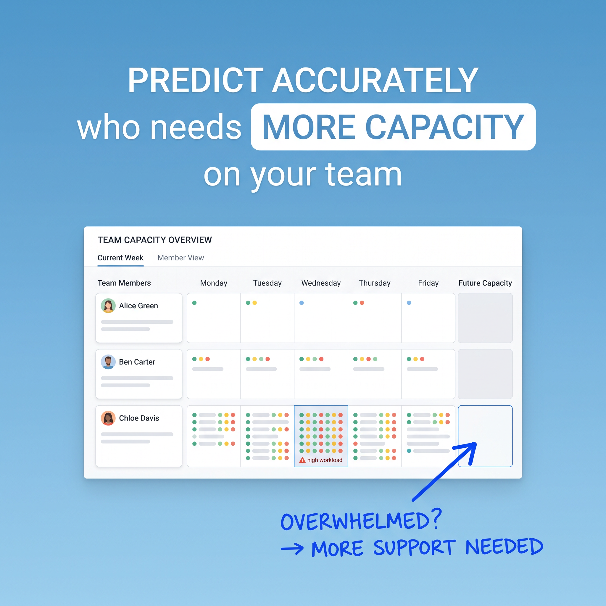
- Hook: The highlighted 'more capacity' promise plus one visibly overloaded teammate.
- Reuse it: Show your UI with one problem flagged and annotate it by hand.
Available sizes
What is a feature callout ad?
A feature callout ad is a static image that shows a single product with short text labels pointing to its key features or benefits, usually joined to the product by thin lines. It explains several selling points at a glance without a long caption, which is why it's common for supplements, skincare, electronics and kitchenware.
See all feature callouts ads →Why this feature callouts ad works
- 01
Shows the product working
The UI demonstrates exactly what the tool does, so viewers understand it without a demo.
- 02
One clear story
Contrasting three team members makes the overloaded one stand out instantly.
- 03
Human annotation
The handwritten note feels like a manager's insight, making the software feel empathetic, not cold.
- 04
Highlighted key phrase
Boxing 'MORE CAPACITY' draws the eye to the core benefit in the headline.
Full creative breakdown
Who this ad targets
Team leads, engineering and project managers, agency owners, operations heads and HR leaders responsible for workload allocation in teams of 5–200 people. They worry about burnout, missed deadlines and uneven workloads, and currently rely on spreadsheets or gut feeling. They are evaluating resource planning or project management software and value forecasting and visibility. LinkedIn targeting by job title and company size fits well.
Copywriting analysis
The headline promises prediction ('Predict accurately'), which is more valuable than simple tracking, and frames the outcome around people ('who needs more capacity on your team'). Highlighting 'MORE CAPACITY' in a box creates a focal point and keyword for skimmers. The handwritten 'Overwhelmed? → More support needed' adds an emotional, empathetic layer, positioning the tool as a way to care for the team rather than to monitor it. Fictional names make the dashboard relatable and realistic. The copy stays jargon-free, which broadens its appeal beyond operations specialists.
Visual design
A soft blue gradient background keeps it calm and trustworthy. White headline type with one highlighted phrase in a white pill draws focus. The UI card is simplified, with coloured dots in green, yellow, red and blue representing tasks, so density is readable without detail. A blue border highlights the overloaded cell. The marker-style blue arrow and handwriting break the grid, adding personality and guiding the eye to the insight.
How to adapt this template for your brand
- Take a simplified screenshot of your product showing one clear problem state.
- Use fictional, friendly names and remove clutter so the problem stands out.
- Write a headline promising the outcome and highlight the key phrase in a box.
- Add a hand-drawn arrow and short note explaining what the viewer should notice.
- Use a soft brand-colour gradient background to keep it clean and calm.
Tips for saas & tech ads on LinkedIn
On LinkedIn, target managers, team leads and HR roles at companies with 20+ employees; use a document ad or carousel to show more product screens, and offer a demo or free trial. On Meta, retarget website visitors and pricing-page viewers. Test the annotation copy, for example 'Burnout risk' vs 'Overwhelmed?', to see which framing drives more demo bookings.
About this creative
A square B2B ad for a team capacity planning tool on a soft sky-blue gradient. At the top, large white text reads 'Predict accurately who needs MORE CAPACITY on your team', with 'MORE CAPACITY' set in blue inside a white rounded highlight box. The centre shows a clean product UI card titled 'Team Capacity Overview' with tabs for Current Week and Member View. Three team members are listed: Alice Green has a light week with a few coloured dots, Ben Carter has a moderate, balanced load, and Chloe Davis has a packed schedule, with Wednesday highlighted in blue and a red warning icon labelled 'high workload'. Columns run Monday to Friday plus Future Capacity. In the bottom right, a hand-drawn blue arrow points to Chloe's empty future capacity cell, with marker-style text: 'Overwhelmed? → More support needed'. The contrast between clean UI and scribbled note makes the insight feel human and immediate.
LinkedIn ad · 1200 × 1200 · SaaS & Tech
Capacity Planning Ad Template: SaaS Product UI Ad
This square B2B SaaS ad shows a simplified team capacity dashboard where one member's overloaded Wednesday is flagged as high workload. A hand-drawn arrow and note add a human touch. It is a strong template for software that turns data into clear decisions for managers.
Added
All brand names and logos are property of their owners. Adplaylist is not affiliated with or endorsed by these brands.
Details
Ad copy
Primary text
Spot burnout before it happens. See your team's workload at a glance and know exactly who needs support this week – and next.
Description
Team capacity planning made simple.
On-image text
Predict accurately who needs MORE CAPACITY on your team. Team capacity overview. Current week. Member view. Team members. Monday, Tuesday, Wednesday, Thursday, Friday, Future capacity. Alice Green. Ben Carter. Chloe Davis. High workload. Overwhelmed? → More support needed
Headline ideas for this template
- 1See burnout coming before it arrives.
- 2Know who's overloaded – this week and next.
- 3Balance your team's workload in minutes.
- 4Stop guessing. Start planning capacity.
- 5Your team's workload, finally visible.
Meta image ad specs
| Placement | Ratio | Size (px) |
|---|---|---|
| Feed | 1:1 or 4:5 | 1080×1080 / 1080×1350 |
| Marketplace | 1:1 | 1200×1200 |
| Messenger inbox | 1:1 | 1200×1200 |
| Stories & Reels | 9:16 | 1080×1920 |
This template is 1:1. Request 4:5 or 9:16 to cover all placements.