Key takeaways
- Format: Dark product shot with award-style #1 reveal.
- Best for: Advertorial and comparison-page traffic for DTC household brands.
- Hook: Curiosity: one brand beat all the others – which one and why?
- Reuse it: Swap the pack, keep the dark backdrop, big #1 and red Read Why button.
Available sizes
What is a product shot ad?
A product shot ad puts the product itself at the centre of the frame, usually on a clean or styled background with little text. It works best when the packaging or product is distinctive enough to stop the scroll and the viewer already understands what it does.
See all product shot ads →Why this product shot ad works
- 01
Winner framing
Calling a product the brand that beat them all borrows authority from an implied test, which lowers purchase risk before the click.
- 02
Unboxing tension
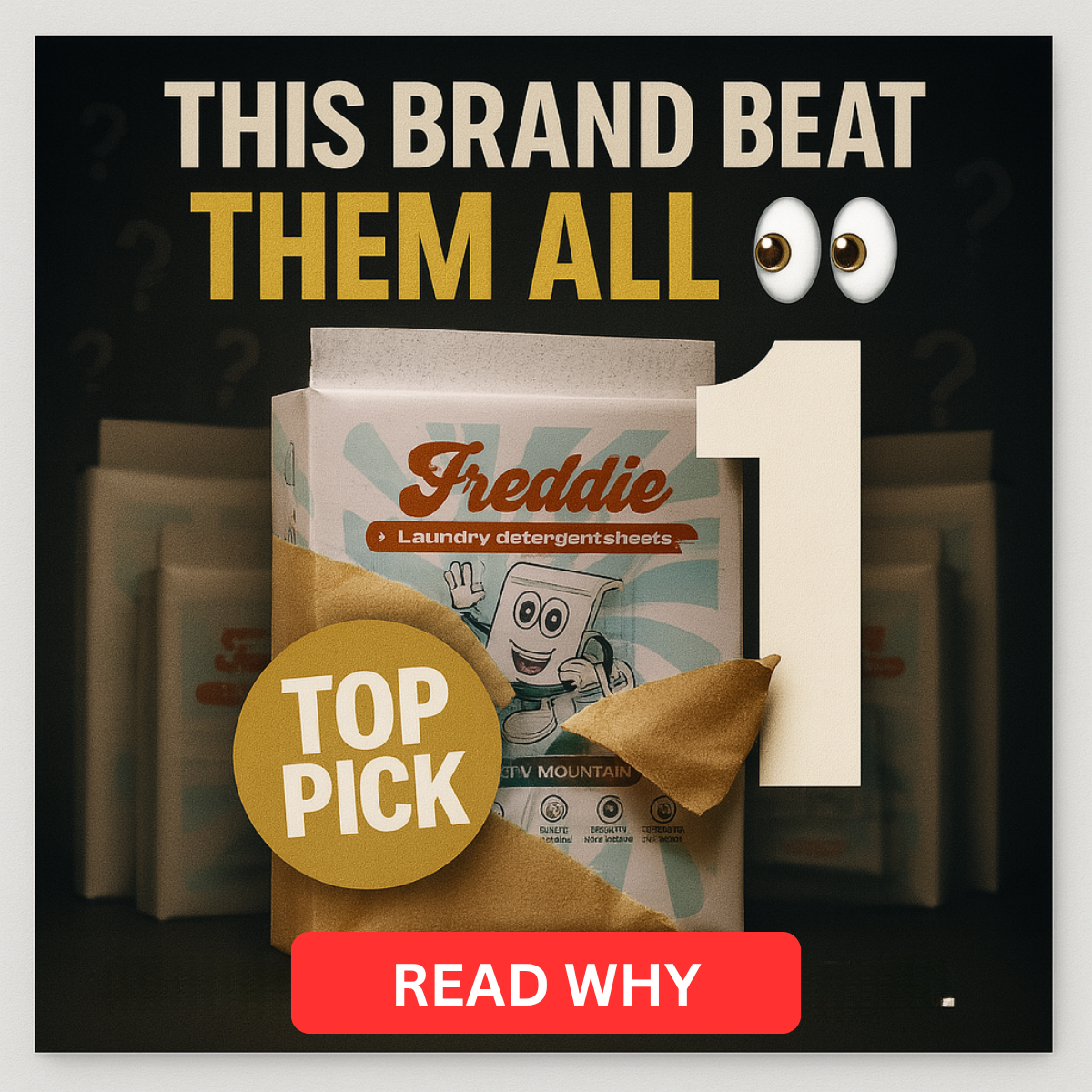
The pack ripping through paper creates a reveal moment that stops the scroll and makes the product the hero.
- 03
High contrast
The light pack, gold badge and red button pop against the black background, standing out in a bright, busy feed.
- 04
Button-style CTA
A painted-on Read Why button signals exactly what happens next and frames the click as reading, not buying.
Full creative breakdown
Who this ad targets
The ad targets US households, mostly women aged 25–55, who do laundry regularly and are curious about switching from liquid detergent or pods to sheets. They are comparison shoppers who read reviews and want reassurance before trying a new format. Many are eco-curious and like the idea of less plastic, but value cleaning performance first. The advertorial angle also suits cold audiences who don't know the brand yet and need a credible third-party-style reason to care.
Copywriting analysis
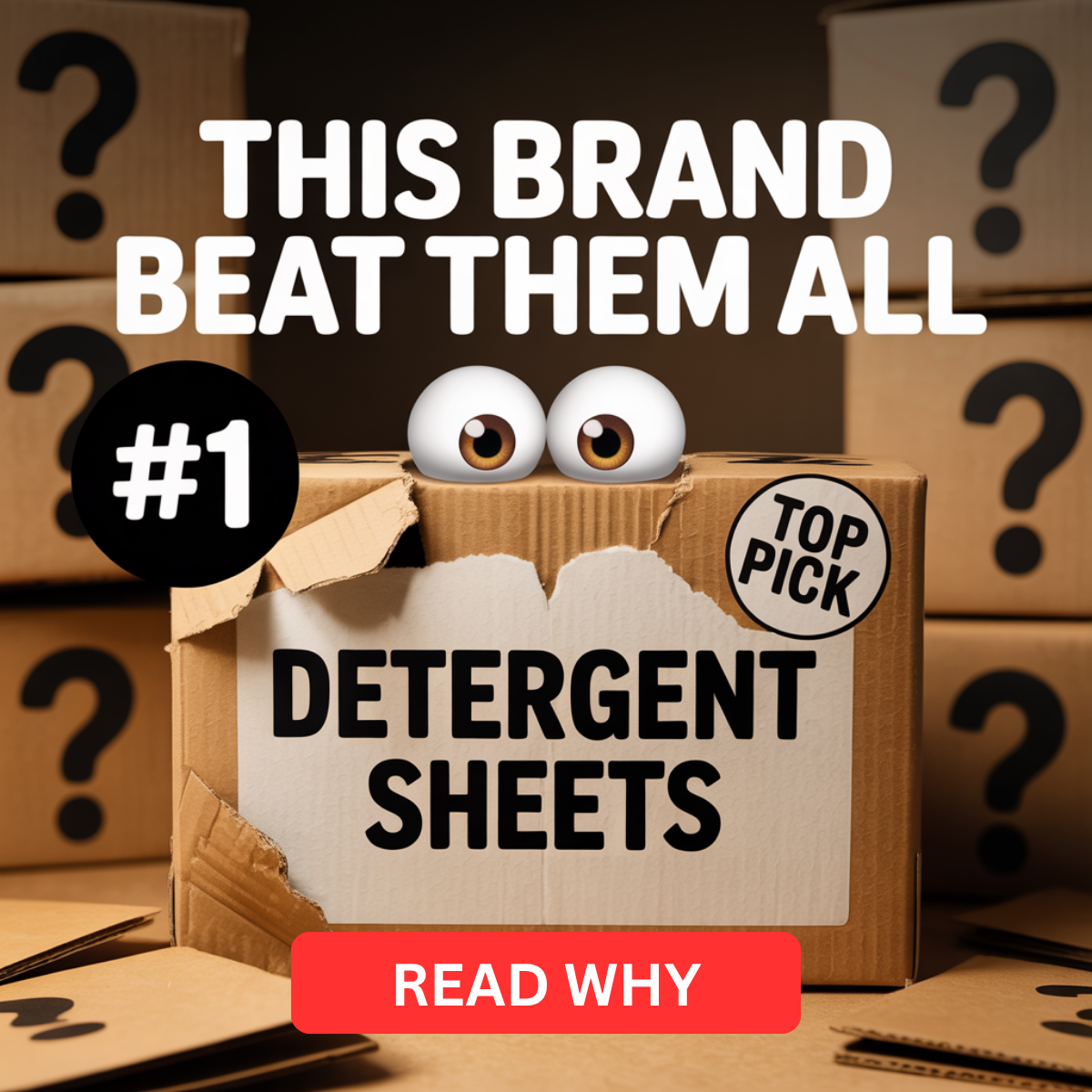
The headline This Brand Beat Them All is short, bold and deliberately vague: it promises a winner without naming the competition, which pushes the reader to click for context. Splitting the line and colouring Them All in gold gives emphasis to the victory. The eyes emoji adds a social-media native, gossip-like tone that softens the hard-sell feel. Top Pick and the number one repeat the same message visually, so the claim lands even without reading. Read Why is a low-commitment CTA that matches an editorial landing page. The copy relies on implied testing, so the landing page must back up the claim.
Visual design
The layout is centred and symmetrical: headline on top, product in the middle, CTA at the bottom. A near-black background with vignette and faint question marks keeps focus on the pack. The colour palette is limited to cream, gold, black and one red accent, which feels premium and award-like. The torn kraft paper adds texture and motion. The giant number one acts as a secondary focal point and balances the gold badge on the opposite side.
How to adapt this template for your brand
- Shoot or render your product pack on a dark background with soft rim lighting.
- Add a torn paper or unboxing effect so the product appears to be revealed.
- Place a large #1 and a round Top Pick or Editor's Choice badge around the pack.
- Write a two-line curiosity headline that claims victory without naming rivals.
- Add a bright button-style CTA such as Read Why and link it to a comparison advertorial.
Tips for home & living ads on Meta
On Meta, run this in Feed and Instagram placements and pair it with a review-style advertorial landing page rather than the product page. Use broad targeting and let the creative do the qualifying. Keep primary text short and editorial in tone, such as We tested 7 brands. Make sure the winner claim is backed up on the landing page to stay within Meta advertising policies. Test the dark version against a light version of the same layout to see which stands out more in your audience's feed.
About this creative
The creative is a square 1200×1200 image set against a near-black background with faint question marks and blurred competitor packs in the shadows. In the centre, a Freddie laundry detergent sheets pack tears through brown kraft paper, as if being unveiled. A huge cream-coloured number one stands behind the pack on the right, while a round gold Top Pick badge overlaps the bottom left. The headline sits at the top in heavy condensed type: This Brand Beat Them All, with the second line in gold and two cartoon eyes emoji adding playful suspense. A bright red rounded button reading Read Why anchors the bottom of the frame and acts as a visual call to action. The overall mood is dramatic and premium, similar to an award reveal. The ad is designed to drive clicks to an advertorial or comparison page where the ranking is explained.
Meta ad · 1200 × 1200 · Home & Living
Laundry Sheets Ad Template: Top Pick Product Shot
This square Meta ad for Freddie laundry detergent sheets uses a dark product-shot format with a giant number one, a gold Top Pick badge and a curiosity headline. It works as an advertorial pre-lander hook for any DTC brand that wants to position itself as the winner of a category comparison.
Added
All brand names and logos are property of their owners. Adplaylist is not affiliated with or endorsed by these brands.
Details
Ad copy
Primary text
We tested the most popular laundry detergent sheets so you don't have to. One brand beat them all on cleaning power, scent and value 👀 Tap to see why it's our #1 pick.
Description
See the full test results
On-image text
THIS BRAND BEAT THEM ALL 👀 | 1 | TOP PICK | Freddie – Laundry detergent sheets | READ WHY
Headline ideas for this template
- 1We Tested 7 Laundry Sheets – One Won
- 2The Laundry Sheet That Beat Them All
- 32025's #1 Detergent Sheet Revealed
- 4Why Everyone's Switching to This Brand
- 5Our Top Pick for Cleaner, Easier Laundry
Meta image ad specs
| Placement | Ratio | Size (px) |
|---|---|---|
| Feed | 1:1 or 4:5 | 1080×1080 / 1080×1350 |
| Marketplace | 1:1 | 1200×1200 |
| Messenger inbox | 1:1 | 1200×1200 |
| Stories & Reels | 9:16 | 1080×1920 |
This template is 1:1. Request 4:5 or 9:16 to cover all placements.