Key takeaways
- Format: Old vs new side-by-side with red X and green tick.
- Best for: Brands replacing a bulky or messy legacy product format.
- Hook: Ditch the jug – a direct command to drop the old habit.
- Reuse it: Put the old product under an X, yours under a tick, and add a year.
Available sizes
What is a comparison ad?
A comparison ad sets the product against an alternative, such as a competitor, the old way of doing things or a cheaper option, usually in a two-column layout or table. It helps buyers who are already weighing options see quickly why this one is the better choice.
See all comparison ads →Why this comparison ad works
- 01
Instant comparison
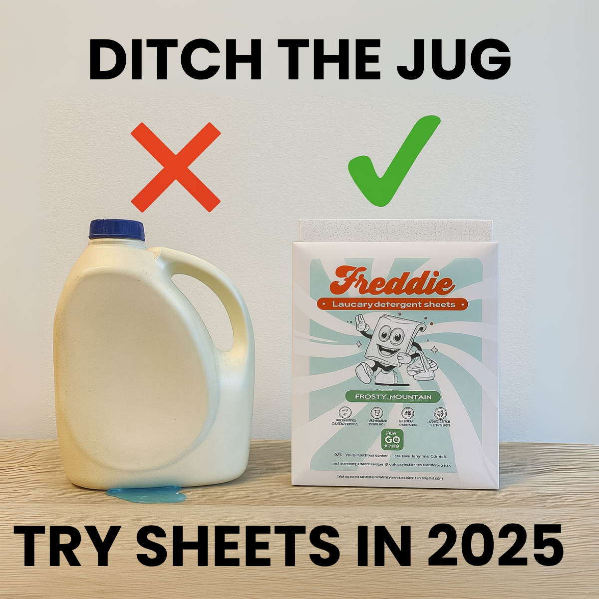
The red X and green tick are universal symbols, so the message is understood in under a second.
- 02
Visible pain point
The small spill under the jug shows mess without saying it, reminding viewers of a familiar annoyance.
- 03
Timely framing
Try sheets in 2025 turns the purchase into a new-year habit upgrade, which feels motivating rather than salesy.
- 04
Real-photo feel
The plain shelf and wall look like a home snapshot, which blends into organic feeds better than a polished studio ad.
Full creative breakdown
Who this ad targets
The ad targets US households who still buy large liquid detergent jugs, especially renters, small-apartment dwellers and people who carry laundry to shared machines. It also speaks to eco-conscious shoppers who want to cut plastic but haven't found a convenient alternative. The new-year framing makes it ideal for January campaigns aimed at people setting home and sustainability resolutions. Cold audiences understand it instantly, making it a strong prospecting creative.
Copywriting analysis
Ditch the Jug is a three-word imperative that names the enemy rather than the product, which is a classic switch-campaign tactic. It is easy to remember and feels conversational. Try Sheets in 2025 completes the thought with a gentle, low-risk ask: try, not buy. Adding the year creates urgency and makes the message feel current. The copy avoids feature lists entirely and lets the visual do the persuading. One weakness is that the brand name only appears on the pack, so brand recall relies on the product shot. Swapping the year keeps the ad evergreen.
Visual design
The design uses a strict two-column layout with matching headline bars top and bottom, framing the comparison like a meme template. Neutral grey and wood tones let the red and green symbols stand out. The jug and pack are sized similarly so the comparison feels fair. Black heavy type ensures legibility on mobile. The minimal composition and photographic style make the ad feel native and authentic rather than designed.
How to adapt this template for your brand
- Photograph the old product your customers use next to your product on a neutral surface.
- Add a visible flaw to the old product, such as a spill, mess or clutter.
- Place a large red X above the old product and a green tick above yours.
- Write a short command headline that tells people to drop the old product.
- Add a bottom line with the current year to frame it as a fresh-start switch.
Tips for home & living ads on Meta
This format performs well on Meta Feed and Instagram where fast comprehension matters. Run it heavily in January when new-year habit change is top of mind, and refresh the year each season. Use primary text to list two or three switching benefits such as no spills, no plastic jug and pre-measured doses. It can also be repurposed as a static Pin or a TikTok carousel cover. Test a version with the brand logo larger on the pack to improve recall.
About this creative
The creative is a clean, photo-style square image on a light grey wall and pale wooden surface. On the left stands a large white plastic laundry detergent jug with a blue cap and a small puddle of blue liquid leaking at its base. Above it floats a bold red X. On the right is a Freddie laundry detergent sheets pack in the Frosty Mountain scent, with a sheet peeking out of the top, topped by a green tick. Heavy black sans-serif type reads Ditch the Jug across the top and Try Sheets in 2025 across the bottom. There are no other design elements, which keeps the comparison instantly readable. The spill subtly reinforces the pain point of mess and waste. The year reference adds timeliness and a resolution-style push to try something new, making the ad feel like a seasonal habit change rather than just a product promotion.
Meta ad · 1200 × 1200 · Home & Living
Laundry Sheets Ad Template: Ditch the Jug Comparison
This square comparison ad places a plastic detergent jug with a red cross beside a Freddie laundry sheets pack with a green tick. The simple old-versus-new layout makes the switch obvious in one glance and suits any brand replacing a bulky, wasteful product with a cleaner alternative.
Added
All brand names and logos are property of their owners. Adplaylist is not affiliated with or endorsed by these brands.
Details
Ad copy
Primary text
Heavy, leaky jugs are out. Freddie laundry detergent sheets are pre-measured, mess-free and plastic-free – just toss one in and go. Make 2025 the year you ditch the jug.
Description
Mess-free, plastic-free laundry
On-image text
DITCH THE JUG | ✗ | ✓ | Freddie – Laundry detergent sheets – Frosty Mountain | TRY SHEETS IN 2025
Headline ideas for this template
- 1Ditch the Jug. Keep the Clean.
- 2No More Spills, No More Plastic
- 3Your Laundry Upgrade for 2025
- 4One Sheet. One Load. Zero Mess.
- 5Why Jugs Are So Last Year
Meta image ad specs
| Placement | Ratio | Size (px) |
|---|---|---|
| Feed | 1:1 or 4:5 | 1080×1080 / 1080×1350 |
| Marketplace | 1:1 | 1200×1200 |
| Messenger inbox | 1:1 | 1200×1200 |
| Stories & Reels | 9:16 | 1080×1920 |
This template is 1:1. Request 4:5 or 9:16 to cover all placements.