Key takeaways
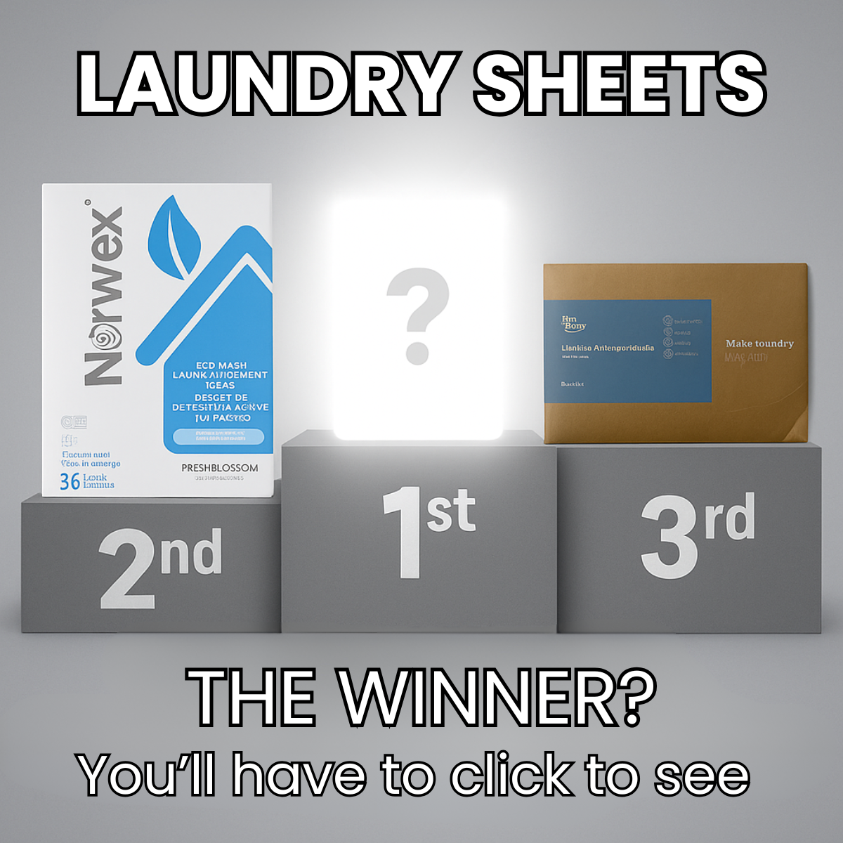
- Format: Podium ranking with a hidden, glowing first place.
- Best for: Driving clicks to comparison advertorials and review pages.
- Hook: Who won? The champion is hidden – you'll have to click to see.
- Reuse it: Put competitors on 2nd and 3rd, hide your product in a glowing 1st spot.
Available sizes
What is a comparison ad?
A comparison ad sets the product against an alternative, such as a competitor, the old way of doing things or a cheaper option, usually in a two-column layout or table. It helps buyers who are already weighing options see quickly why this one is the better choice.
See all comparison ads →Why this comparison ad works
- 01
Familiar podium metaphor
Everyone understands a podium instantly, so the ranking needs no explanation.
- 02
Explicit curiosity gap
The question mark plus You'll have to click to see makes the click the only way to resolve the tension.
- 03
Competitors as proof
Showing a known brand in second place implies the winner is even better, raising perceived value.
- 04
Glow as focal point
The bright light on the 1st-place block draws the eye in an otherwise flat grey scene.
Full creative breakdown
Who this ad targets
The ad targets US consumers who are aware of laundry sheets and possibly already know brands like Norwex, but haven't chosen a favourite. They enjoy rankings and quick verdicts, and respond to game-like suspense. It also captures existing users of second- and third-place brands who wonder if they are missing out. It is best suited to affiliate publishers and challenger brands that genuinely win a comparison.
Copywriting analysis
The copy is minimal and works in three beats. Laundry Sheets sets the category. The Winner? poses a direct question that the viewer instinctively wants answered. You'll have to click to see openly names the action, which is unusually transparent and almost playful. This honesty can increase click-through because it acknowledges the tease. There are no claims about features, keeping the ad compliant and simple. The risk is clickbait perception, so the landing page must reveal the winner immediately and justify the ranking.
Visual design
The design uses a centred, symmetrical podium on a gradient grey background, giving a clean, studio look. Grey removes colour distractions, so the products and glowing first place stand out. Outlined white typography adds a bold, game-show feel. The hierarchy flows from headline to glowing 1st place to bottom question. Placement numbers are large and embossed into the podium for instant readability.
How to adapt this template for your brand
- Build a three-step podium on a neutral grey background.
- Place competitor or generic products on the 2nd and 3rd blocks.
- Put a glowing light and question mark on the 1st-place block.
- Add the category name as a bold headline across the top.
- Finish with The Winner? and a clear click-to-reveal line at the bottom.
Tips for home & living ads on Meta
Run this on Meta Feed and Instagram to drive traffic to a ranking article. Because the ad is a tease, monitor bounce rate and make sure the winner is revealed above the fold. Avoid disparaging competitors and keep comparison claims factual. For TikTok or Reels, animate the podium and reveal the winner after a few seconds, then point to the link. Retarget clickers with the winning brand's own product ad.
About this creative
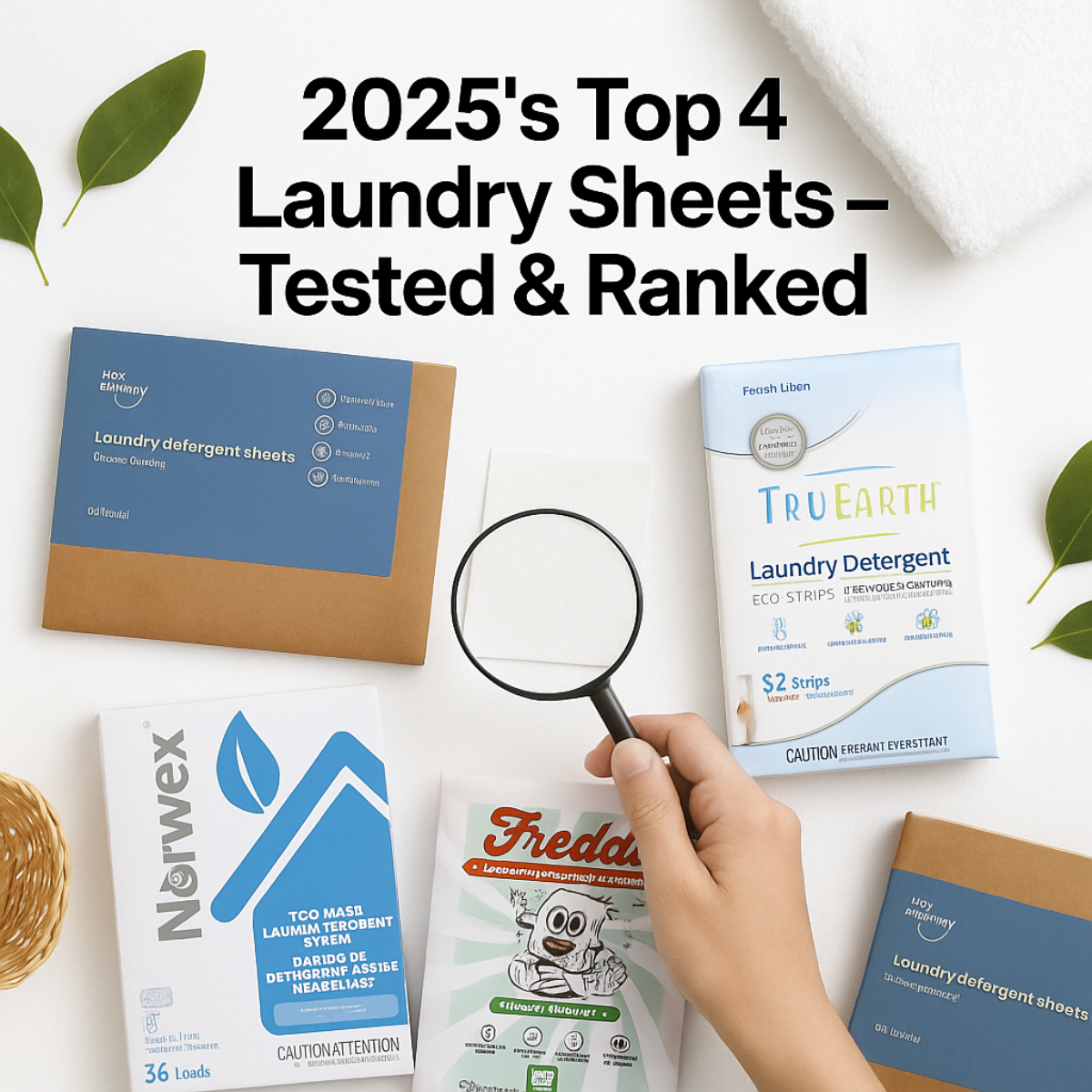
The creative is a monochrome grey square with a three-step podium in the centre, like an Olympic medal ceremony. On the left, the 2nd-place block holds a white and blue Norwex laundry sheets box showing 36 loads. On the right, the 3rd-place block holds a kraft and blue laundry sheets envelope. The tallest middle block, marked 1st, holds a glowing white rectangle with a large grey question mark – the winner is deliberately hidden behind a bright light. The headline Laundry Sheets runs across the top in heavy white uppercase letters with a black outline. At the bottom, outlined white text asks The Winner? followed by You'll have to click to see in a thinner weight. The neutral grey palette keeps all attention on the podium and the glowing mystery spot, turning a simple product comparison into a suspenseful reveal that practically demands a click.
Meta ad · 1200 × 1200 · Home & Living
Laundry Sheets Ad Template: Podium Winner Reveal
This square comparison ad places laundry sheet packs on a grey podium, with Norwex in second, a kraft pack in third and a glowing question mark in first place. The headline The Winner? You'll have to click to see turns a ranking into a reveal, ideal for advertorial and affiliate traffic.
Added
All brand names and logos are property of their owners. Adplaylist is not affiliated with or endorsed by these brands.
Details
Ad copy
Primary text
We ranked the top laundry sheets of the year. Second and third place might surprise you – but the winner beat them on cleaning, scent and price per load. You'll have to click to see who took gold 🏆
Description
Click to reveal the winner
On-image text
LAUNDRY SHEETS | 2nd | 1st | 3rd | ? | Norwex – 36 Loads | THE WINNER? You'll have to click to see
Headline ideas for this template
- 1Can You Guess the #1 Laundry Sheet?
- 2The Laundry Sheet That Took Gold
- 32nd and 3rd Revealed – Who Won?
- 4Our Laundry Sheet Champion of 2025
- 5The Winner Might Surprise You
Meta image ad specs
| Placement | Ratio | Size (px) |
|---|---|---|
| Feed | 1:1 or 4:5 | 1080×1080 / 1080×1350 |
| Marketplace | 1:1 | 1200×1200 |
| Messenger inbox | 1:1 | 1200×1200 |
| Stories & Reels | 9:16 | 1080×1920 |
This template is 1:1. Request 4:5 or 9:16 to cover all placements.
Browse similar by tag