Key takeaways
- Format: Vertical comparison table ad pitting the brand against a familiar alternative.
- Best for: Challenger brands with a clear, provable advantage over a common competitor.
- Hook: The claim 'Proven to beat playlists' against a named household app.
- Reuse it: Build a 3–5 row table with dull cells for the alternative and bright gradient cells for you.
Available sizes
What is a comparison ad?
A comparison ad sets the product against an alternative, such as a competitor, the old way of doing things or a cheaper option, usually in a two-column layout or table. It helps buyers who are already weighing options see quickly why this one is the better choice.
See all comparison ads →Why this comparison ad works
- 01
Instant, scannable comparison
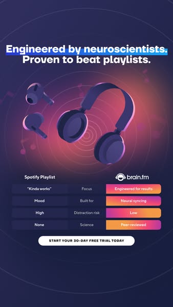
The table lets viewers compare four criteria in seconds. The colour contrast shows the winner before anyone reads a word.
- 02
Authority from science
'Engineered by neuroscientists' and 'Peer-reviewed' give credibility that a playlist can't match, justifying a paid subscription.
- 03
Relatable, honest framing
'Kinda works' is a humorous, fair description of playlists. It acknowledges the viewer's current habit without insulting it.
- 04
Low-risk CTA
A 30-day free trial makes switching from a free playlist easy and removes the main barrier.
Full creative breakdown
Who this ad targets
The ad targets students, remote workers, developers and knowledge workers aged 20–45 who already use Spotify or YouTube playlists like lo-fi beats or 'deep focus' to concentrate. They are productivity-minded, open to tools that improve performance and respect scientific evidence. People with ADHD or attention difficulties are a secondary audience. They need convincing that a dedicated app is worth paying for when playlists are free, which is exactly what the comparison addresses.
Copywriting analysis
The headline uses two short, confident claims with parallel structure: 'Engineered by neuroscientists' establishes authority, and 'Proven to beat playlists' makes a bold, measurable promise. The table copy is cleverly asymmetric: the playlist column uses casual, slightly dismissive words like 'Kinda works' and 'Mood', while the Brain.fm column uses technical, results-oriented terms such as 'Engineered for results', 'Neural syncing' and 'Peer-reviewed'. 'Distraction risk' introduces a pain point many listeners haven't considered. The CTA 'Start your 30-day free trial today' is clear and urgent. Naming Spotify is bold and must be backed by evidence.
Visual design
The design uses a deep indigo-purple background with concentric rings and a coral-pink glow behind the 3D headphones, creating a futuristic, audio-focused hero image. The comparison table uses dark, low-contrast cells for the competitor and bright pink-to-orange gradient pills for Brain.fm, making the brand column visually dominant. A blue highlighter stroke draws attention to the first headline line. White bold sans-serif type and a white pill CTA keep everything clean and legible.
How to adapt this template for your brand
- Identify the common alternative your audience uses today (a free tool, DIY method or market leader).
- Pick 3–5 criteria where you clearly and provably win.
- Write casual, honest labels for the alternative and specific, benefit-driven labels for your product.
- Style the competitor cells in muted tones and your cells in bright brand gradients.
- Add an authority headline above and a free-trial CTA button below.
Tips for music streaming ads on Meta
On Meta, comparison ads naming competitors are allowed but must be truthful and substantiated, so keep proof of the 'peer-reviewed' and 'proven' claims ready. The table sits low in the frame, so check it isn't hidden by the Stories CTA overlay; consider a 4:5 feed version with tighter spacing. Target interests like Spotify, lo-fi music, productivity apps and studying. An animated version revealing table rows one by one increases watch time.
About this creative
This vertical Brain.fm ad uses a direct comparison to win over people who rely on playlists to focus. At the top, a bold two-line headline reads 'Engineered by neuroscientists. Proven to beat playlists.', with the first line underlined by a bright blue highlighter stroke. The middle shows stylised 3D purple headphones and two floating earbuds over a dark indigo background, with concentric sound-wave rings and a warm coral glow suggesting audio energy. Below sits a four-row comparison table. The left column is labelled 'Spotify Playlist' with plain dark cells: 'Kinda works', 'Mood', 'High' and 'None'. The middle column lists criteria: Focus, Built for, Distraction risk and Science. The right column, under the Brain.fm logo, uses vibrant pink-to-orange gradient cells: 'Engineered for results', 'Neural syncing', 'Low' and 'Peer-reviewed'. A white pill button closes the ad: 'Start your 30-day free trial today'. Brain.fm visually and verbally wins every row.
Meta ad · 338 × 600 · Music Streaming
Brain.fm vs Spotify Playlist: Comparison Ad Template
This Brain.fm ad pits its science-based focus music against a typical Spotify playlist in a simple four-row comparison table. With 3D headphones, a neuroscience claim and a 30-day free trial CTA, it is a textbook template for challenger brands that want to position themselves against a well-known competitor.
Added
All brand names and logos are property of their owners. Adplaylist is not affiliated with or endorsed by these brands.
Details
Ad copy
Primary text
Your focus playlist 'kinda works'. Brain.fm is engineered by neuroscientists to boost focus with neural syncing – and backed by peer-reviewed research. Start your 30-day free trial today.
Description
Engineered by neuroscientists. Try 30 days free.
On-image text
Engineered by neuroscientists. Proven to beat playlists. | Spotify Playlist vs brain.fm | Focus: "Kinda works" vs Engineered for results | Built for: Mood vs Neural syncing | Distraction risk: High vs Low | Science: None vs Peer-reviewed | START YOUR 30-DAY FREE TRIAL TODAY
Headline ideas for this template
- 1Your Playlist vs Real Focus Science
- 2Stop Fighting Distractions With Playlists
- 3Focus Music Backed by Neuroscience
- 4Lo-Fi Is Nice. Brain.fm Works.
- 5Deep Focus, Peer-Reviewed
Meta image ad specs
| Placement | Ratio | Size (px) |
|---|---|---|
| Feed | 1:1 or 4:5 | 1080×1080 / 1080×1350 |
| Marketplace | 1:1 | 1200×1200 |
| Messenger inbox | 1:1 | 1200×1200 |
| Stories & Reels | 9:16 | 1080×1920 |
This template is 1:1. Request 4:5 or 9:16 to cover all placements.