Key takeaways
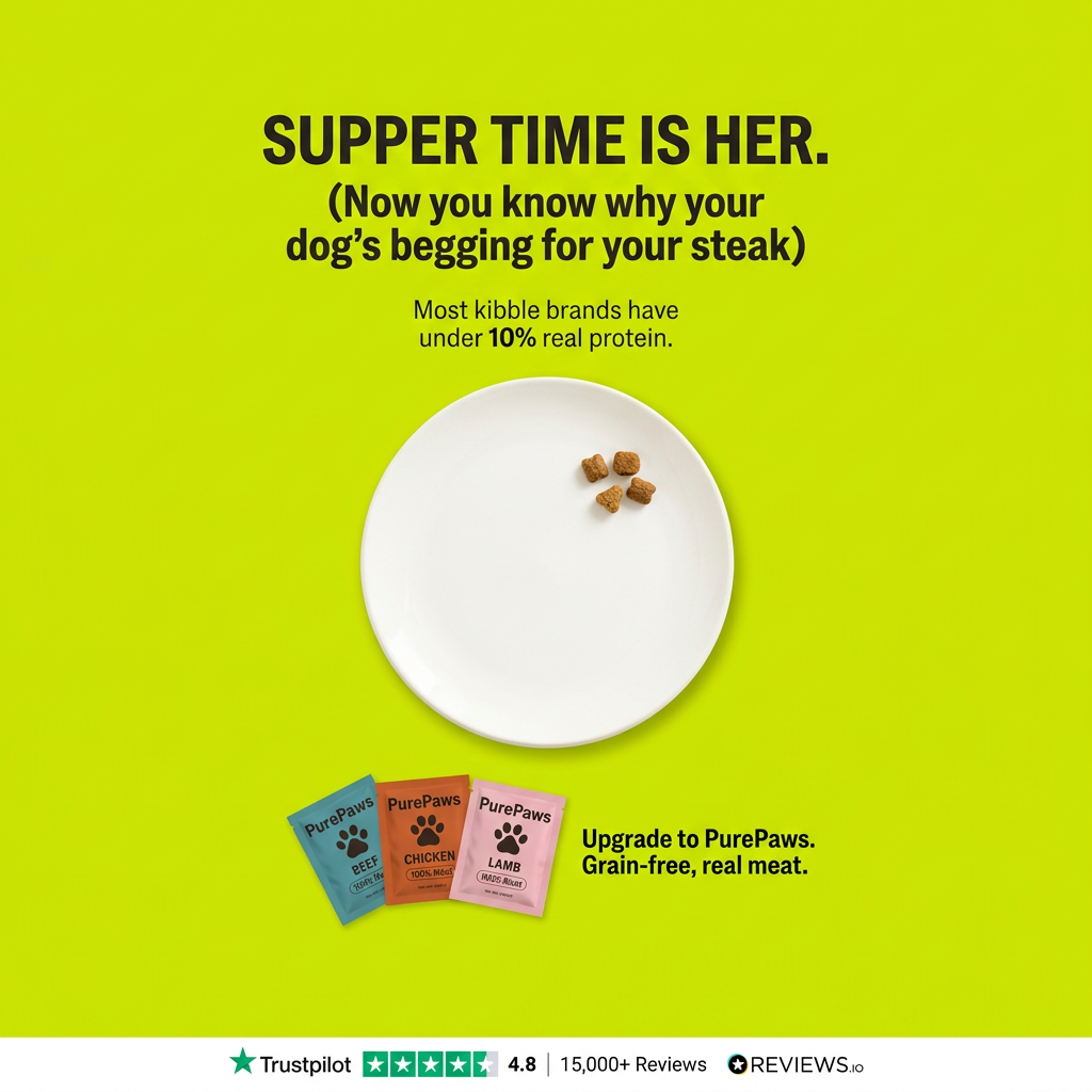
- Format: Visual metaphor of an empty plate with a protein statistic.
- Best for: Pet food brands competing on real meat content.
- Hook: Most kibble brands have under 10% real protein.
- Reuse it: Dramatise what competitors lack with one simple visual.
Available sizes
What is a comparison ad?
A comparison ad sets the product against an alternative, such as a competitor, the old way of doing things or a cheaper option, usually in a two-column layout or table. It helps buyers who are already weighing options see quickly why this one is the better choice.
See all comparison ads →Why this comparison ad works
- 01
Empty plate metaphor
Four kibble pieces on a huge plate turn an abstract stat into a picture anyone gets.
- 02
Relatable humour
The steak-begging line makes the claim feel funny and true at the same time.
- 03
Loud, single colour
Lime green is unusual for pet food and stops the scroll.
- 04
Heavy social proof
4.8 stars from 15,000+ reviews backs up the bold claims.
Full creative breakdown
Who this ad targets
Dog owners aged 25–50 who feed standard kibble and have never thought about how much real meat it contains. They notice their dog begging for human food and find that funny and slightly worrying. They respond to bold, witty brands on social media and trust large review counts when trying a new food. Many already spend more than average on treats, toys and grooming for their pets.
Copywriting analysis
The headline intends to say 'Supper time is here' but reads 'her', which is a clear typo that undermines trust and should be fixed before running. The bracketed line adds humour and links the problem to something owners see daily. The protein statistic is powerful but must be sourced, as it's a comparative claim about competitors. 'Grain-free, real meat' is short and clear. The review strip provides strong, scannable proof. Testing one or two alternative headlines would help find the strongest angle.
Visual design
The flat lime background is bold and attention-grabbing, and the white plate creates a strong central focal point. Leaving the plate almost empty uses negative space as the message itself. Colourful pouches add warmth in the lower corner without competing with the plate. The white review strip at the bottom gives a clean, trustworthy finish. The overall effect is clean, calm and easy to read on a small screen.
How to adapt this template for your brand
- Find a statistic that exposes what competitors lack.
- Show it visually, like an almost empty plate.
- Add a funny, relatable line in brackets under the headline.
- Place your product in a corner with a short upgrade line.
- Finish with a review strip along the bottom.
Tips for pets ads on Meta
This loud creative works well as a scroll-stopper on Meta and Instagram. For Reels, start with a full plate of kibble and remove pieces until four are left. Fix the 'her' typo and keep a source for the 10% protein claim, as comparative claims attract scrutiny. Only show review scores and third-party logos that match your verified profiles. Track click-through and cost per purchase to judge whether the angle is working.
About this creative
A bright, flat lime-green background with a bold black headline at the top. It reads 'Supper time is her.' – almost certainly a typo for 'here' – followed by a cheeky line in brackets: now you know why your dog's begging for your steak. Below, smaller text claims most kibble brands have under 10% real protein, with '10%' in bold. In the centre, a large, empty white plate holds just four small pieces of kibble clustered near the edge, visually showing how little 'real' food there is. In the lower left, three fanned pouches in teal, orange and pink read PurePaws Beef, Chicken and Lamb with paw icons. Next to them, bold black text says: upgrade to PurePaws, grain-free, real meat. A white strip along the bottom shows Trustpilot with four and a half stars, a 4.8 score and 15,000+ reviews, plus a REVIEWS.io logo. The design is loud, minimal and witty.
Meta ad · 1200 × 1200 · Pets
Empty Plate Protein Comparison Dog Food Ad
This comparison ad for PurePaws puts four lonely kibble pieces on a big white plate to dramatise how little real protein is in most kibble, then offers real-meat pouches as the upgrade. Use it as a template for any product that wins by exposing what competitors leave out.
Added
All brand names and logos are property of their owners. Adplaylist is not affiliated with or endorsed by these brands.
Details
Ad copy
Primary text
Ever wonder why your dog begs for your steak? Most kibble brands have under 10% real protein. PurePaws is grain-free and made with real beef, chicken and lamb – so supper time finally looks like something worth begging for. Rated 4.8 from 15,000+ reviews.
Description
Grain-free, real meat dog food
On-image text
SUPPER TIME IS HER. (Now you know why your dog's begging for your steak) | Most kibble brands have under 10% real protein. | Pouches: PurePaws – Beef, Chicken, Lamb (small text garbled) | Upgrade to PurePaws. Grain-free, real meat. | Trustpilot ★★★★½ 4.8 | 15,000+ Reviews | REVIEWS.io | Note: headline reads 'HER' – likely a typo for 'HERE'
Headline ideas for this template
- 1Why Your Dog Begs for Your Steak
- 2Real Meat, Not Just Kibble
- 3Under 10% Protein? Upgrade Today
- 4Supper Time, Upgraded
- 5Fill the Bowl with Real Meat
Meta image ad specs
| Placement | Ratio | Size (px) |
|---|---|---|
| Feed | 1:1 or 4:5 | 1080×1080 / 1080×1350 |
| Marketplace | 1:1 | 1200×1200 |
| Messenger inbox | 1:1 | 1200×1200 |
| Stories & Reels | 9:16 | 1080×1920 |
This template is 1:1. Request 4:5 or 9:16 to cover all placements.
Browse similar by tag