Key takeaways
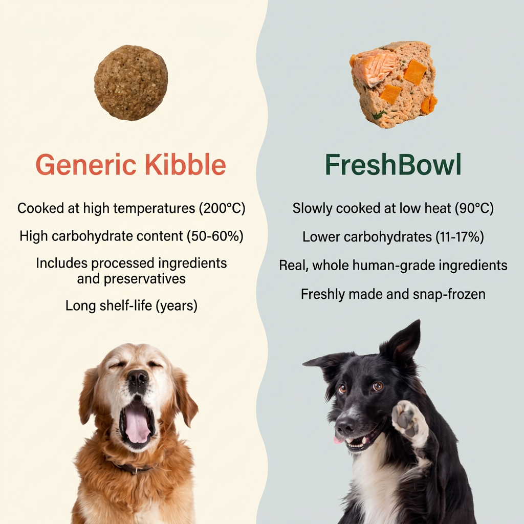
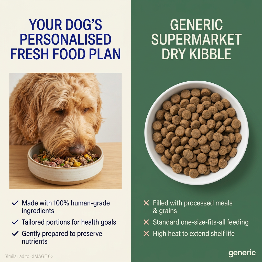
- Format: Split-screen comparison of competitor vs product.
- Best for: Fresh or premium brands challenging a mainstream category.
- Hook: A dull bowl of kibble next to colourful fresh food.
- Reuse it: Contrast the category norm with your product in four points each.
Available sizes
What is a comparison ad?
A comparison ad sets the product against an alternative, such as a competitor, the old way of doing things or a cheaper option, usually in a two-column layout or table. It helps buyers who are already weighing options see quickly why this one is the better choice.
See all comparison ads →Why this comparison ad works
- 01
Visual contrast does the selling
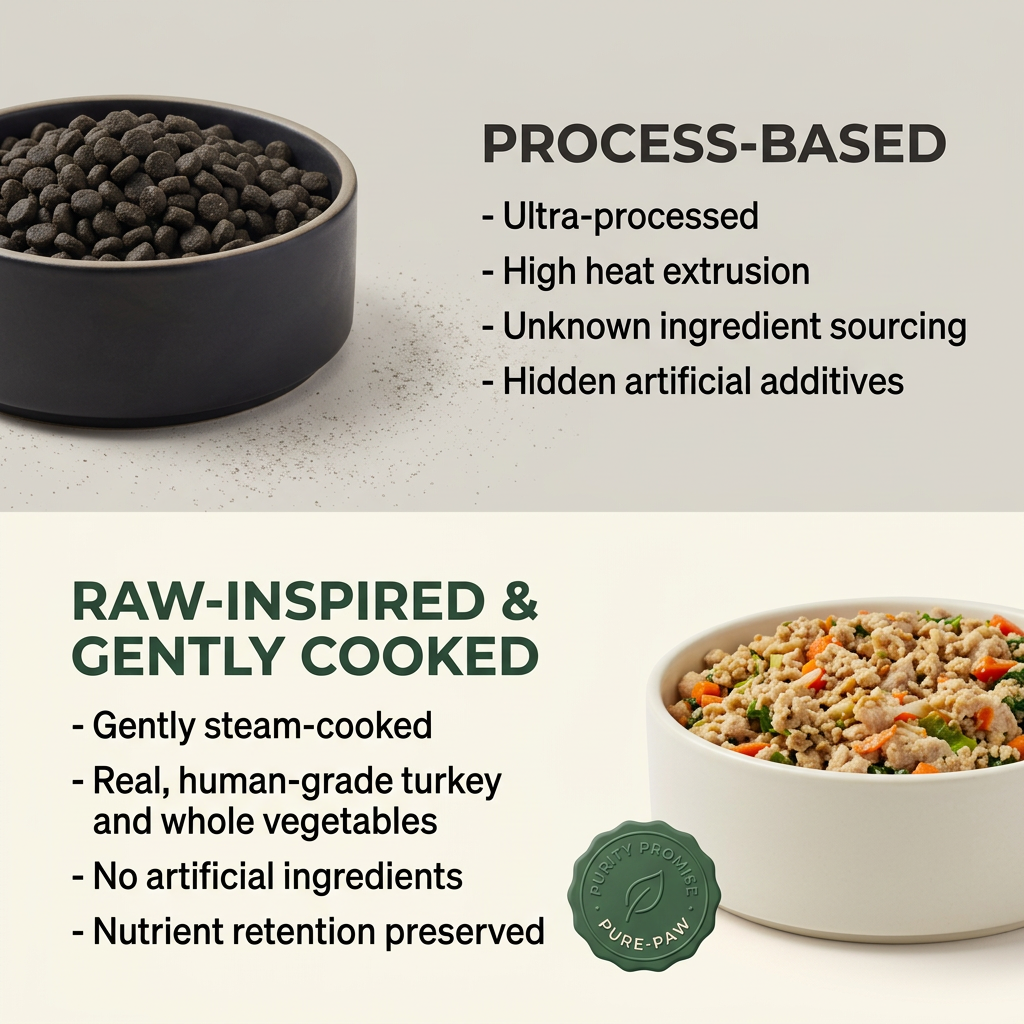
Brown kibble in a dark bowl versus colourful fresh food in a white bowl makes the quality gap obvious before reading.
- 02
Parallel bullet lists
Four points on each side match up, so viewers compare like for like and the fresh option wins on each.
- 03
Names the enemy without naming brands
Calling kibble 'process-based' attacks the category, not a competitor, which keeps the ad safe and broad.
- 04
Trust badge seals it
The wax-seal 'Purity Promise' badge adds a sense of guarantee to the fresh option.
Full creative breakdown
Who this ad targets
The ad targets dog owners currently feeding kibble who have started questioning what's in it. They're often reading about ultra-processed food for themselves and applying the same thinking to their pets. Likely ages 25 to 55, with a premium or health-first mindset. Interests in raw feeding, fresh dog food, natural pet care and clean eating would fit, as would retargeting blog readers.
Copywriting analysis
The copy is built on contrast. The top heading 'Process-based' is neutral but loaded, and its bullets use worrying words like 'ultra-processed', 'unknown' and 'hidden'. The bottom heading leads with 'raw-inspired', which appeals to raw-feeding fans without the safety concerns of raw. Its bullets use reassuring words like 'gently', 'real', 'human-grade' and 'whole'. Each list has four points, which feels thorough without overloading. Claims about kibble should be kept general and defensible, since 'hidden additives' could be challenged.
Visual design
A clean horizontal split creates two distinct zones: cool grey for kibble and warm cream for the fresh option. Bowls sit on opposite sides, creating a Z-shaped reading path. Bold uppercase headings and simple dash bullets keep it highly scannable. Dark green ties the fresh section to the badge and brand. The food photography is crisp and appetising in the lower half, while the kibble looks flat and dull by design.
How to adapt this template for your brand
- Pick the category norm your product replaces and photograph both side by side in matching setups.
- Use a cool, dull palette for the 'old way' and a warm, bright one for your product.
- Write four matching bullets for each side, negatives above and positives below.
- Mirror the layout so images and text swap sides between halves.
- Add a trust badge or guarantee seal to your product's half.
Tips for pets ads on Meta
On Meta, comparison ads perform well with cold audiences, so use this for prospecting. Avoid naming competitor brands and keep kibble claims factual to avoid disputes. Test a carousel version where the first card shows the kibble and the second reveals the fresh bowl. Pair with a trial offer in the primary text to convert curious kibble buyers.
About this creative
The creative is split horizontally into two halves. The top half has a light grey background with a dark matte bowl full of brown kibble on the left, with a few crumbs scattered beside it. To its right, a bold dark heading reads 'PROCESS-BASED' above four dash-led bullets: ultra-processed, high heat extrusion, unknown ingredient sourcing and hidden artificial additives. The bottom half switches to a warm cream background. On the left, a dark green heading reads 'RAW-INSPIRED & GENTLY COOKED' above four positive bullets: gently steam-cooked, real human-grade turkey and whole vegetables, no artificial ingredients and preserved nutrients. On the right, a white bowl brims with fresh ground turkey, carrots and greens. A green wax-seal style badge reading 'Purity Promise – Pure-Paw' overlaps the bowl. Mirroring the layout, with the bowls on opposite sides, guides the eye in a Z-pattern from bad to good.
Meta ad · 1200 × 1200 · Pets
Dog Food Ad Template: Kibble vs Gently Cooked Comparison
This square fresh dog food ad splits the frame in two: a dark bowl of kibble with four negatives on top, and a white bowl of fresh turkey and vegetables with four positives below. It's a classic comparison format that helps fresh pet food brands win over kibble buyers on Meta.
Added
All brand names and logos are property of their owners. Adplaylist is not affiliated with or endorsed by these brands.
Details
Ad copy
Primary text
Look at what's really in the bowl. Most kibble is extruded at high heat with ingredients you can't trace. Pure-Paw is gently steam-cooked with human-grade turkey and whole vegetables. Your dog can taste the difference.
Description
Human-grade turkey and vegetables, gently steam-cooked.
On-image text
PROCESS-BASED – Ultra-processed – High heat extrusion – Unknown ingredient sourcing – Hidden artificial additives | RAW-INSPIRED & GENTLY COOKED – Gently steam-cooked – Real, human-grade turkey and whole vegetables – No artificial ingredients – Nutrient retention preserved | Badge: Purity Promise – Pure-Paw
Headline ideas for this template
- 1What's really in your dog's bowl?
- 2Swap the extruded for the real.
- 3Kibble is processed. Dinner shouldn't be.
- 4Real turkey, gently cooked. See the difference.
- 5Your dog deserves more than pellets.
Meta image ad specs
| Placement | Ratio | Size (px) |
|---|---|---|
| Feed | 1:1 or 4:5 | 1080×1080 / 1080×1350 |
| Marketplace | 1:1 | 1200×1200 |
| Messenger inbox | 1:1 | 1200×1200 |
| Stories & Reels | 9:16 | 1080×1920 |
This template is 1:1. Request 4:5 or 9:16 to cover all placements.