Key takeaways
- Format: Side-by-side "VS" comparison of two brand tiles.
- Best for: Review sites, affiliates and SaaS comparison landing pages.
- Hook: A neutral question that mirrors the buyer's own decision.
- Reuse it: Put two recognisable options side by side under a question and link to your comparison.
Available sizes
What is a comparison ad?
A comparison ad sets the product against an alternative, such as a competitor, the old way of doing things or a cheaper option, usually in a two-column layout or table. It helps buyers who are already weighing options see quickly why this one is the better choice.
See all comparison ads →Why this comparison ad works
- 01
Mirrors buyer intent
The question matches exactly what someone choosing a design tool is asking, so it feels like help, not an ad.
- 02
Recognisable icons
Familiar app-style tiles grab attention from people who already know or use these tools.
- 03
Curiosity gap
The ad never gives the answer, which pushes viewers to click through to find out.
- 04
Clean, neutral design
Balanced layout and soft gradients feel impartial, which helps trust in a comparison.
Full creative breakdown
Who this ad targets
This ad targets small business owners, social media managers, marketers, students and creators aged 18–45 who need to make graphics without professional design skills. They are actively choosing or reconsidering a design tool and want an unbiased comparison. Many already use one of the tools and are curious whether the other is better. It also suits affiliate audiences looking at software deals and trials.
Copywriting analysis
The headline is phrased as a question, which invites engagement and positions the advertiser as a neutral guide. "Ease of creation" is highlighted, focusing on the key decision factor for non-designers. The "VS" device is simple and widely understood. The CTA "Compare design tools" is low-commitment and informational. The phrase "greater ease of creation" is a little formal; "Which is easier to use?" could be punchier. Using third-party brand names and logos in ads may require trademark permission or platform approval, and the comparison itself should be fair and accurate.
Visual design
The symmetrical layout centres the VS, giving both options equal weight. App tiles with rounded corners and soft shadows look clickable and familiar. The pastel gradient background is light and modern, letting the red Adobe tile and colourful logos stand out. The gradient highlight text ties to both brands' colourful identities. Lots of white space and a single text CTA keep the design uncluttered and easy to read on mobile.
How to adapt this template for your brand
- Choose two options your audience commonly compares and frame a question around their main decision factor.
- Design equal-sized tiles or cards for each option with a central "VS".
- Highlight the key comparison word in a gradient or accent colour.
- Add a low-commitment CTA that leads to your comparison page.
- Check trademark and logo usage rules before using third-party brands in ads.
Tips for saas ads on Meta
Google Ads and Meta can restrict ads that use other companies' trademarks in text or images, so check policies and consider using names only, or your own icons. This format works well on LinkedIn and Meta for affiliate and review content. Test a version that teases a winner or a key stat. Match the landing page headline to the ad question for better Quality Score and conversion.
About this creative
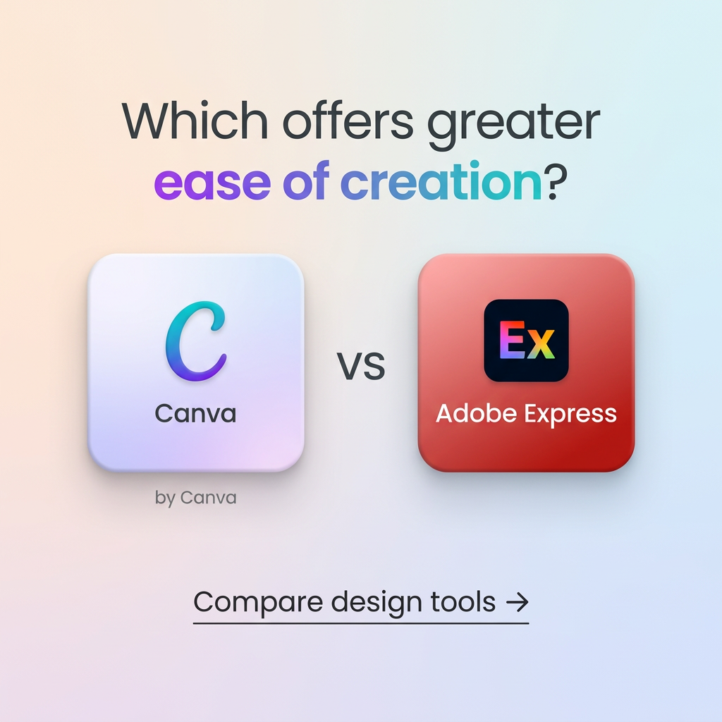
This comparison ad uses a soft pastel gradient background moving from peach and lilac to pale blue. At the top, a large dark-grey sans-serif question reads "Which offers greater ease of creation?", with "ease of creation" highlighted in a purple-to-teal gradient. Below, two rounded app-style tiles with soft shadows sit on either side of a centred "VS". The left tile is white-lilac with a gradient "C" and the label "Canva", plus a small "by Canva" caption. The right tile is red with a dark rounded square showing a colourful "Ex" mark and the label "Adobe Express". Near the bottom, an underlined text CTA reads "Compare design tools" with an arrow. The layout is clean, symmetric and UI-inspired, borrowing from app-store aesthetics. It is clearly designed to drive traffic to a comparison or review article rather than sell one product directly.
Meta ad · 1200 × 1200 · SaaS
Canva vs Adobe Express Ad: Question-Led Comparison
This square comparison ad places Canva and Adobe Express app tiles side by side with a "VS" between them, under a question about ease of creation. A simple underlined CTA invites viewers to compare design tools. Use this format for review sites, affiliates and SaaS comparison content.
Added
All brand names and logos are property of their owners. Adplaylist is not affiliated with or endorsed by these brands.
Details
Ad copy
Primary text
Canva or Adobe Express? We compared both on templates, AI features, pricing and ease of use so you can pick the right design tool in minutes.
Description
Compare design tools side by side.
On-image text
Which offers greater ease of creation? | Canva | by Canva | VS | Ex | Adobe Express | Compare design tools →
Headline ideas for this template
- 1Canva or Adobe Express: which is easier?
- 2The design tool showdown you need
- 3Pick the right design tool in 2 minutes
- 4Templates, AI and price compared
- 5Which design tool should you choose?
Meta image ad specs
| Placement | Ratio | Size (px) |
|---|---|---|
| Feed | 1:1 or 4:5 | 1080×1080 / 1080×1350 |
| Marketplace | 1:1 | 1200×1200 |
| Messenger inbox | 1:1 | 1200×1200 |
| Stories & Reels | 9:16 | 1080×1920 |
This template is 1:1. Request 4:5 or 9:16 to cover all placements.