Key takeaways
- Format: Split-screen $$$$ vs $$ comparison with a bonus gift callout.
- Best for: Challenger brands that beat a known competitor on price or value.
- Hook: Same category, fewer dollar signs, plus a free sauna blanket.
- Reuse it: Split the frame, use dollar signs for price, and show your side in use with a bonus.
Available sizes
What is a comparison ad?
A comparison ad sets the product against an alternative, such as a competitor, the old way of doing things or a cheaper option, usually in a two-column layout or table. It helps buyers who are already weighing options see quickly why this one is the better choice.
See all comparison ads →Why this comparison ad works
- 01
Instant visual verdict
Dollar signs and red versus blue explain the message without reading. Viewers get the value story in a second.
- 02
Lifestyle versus product
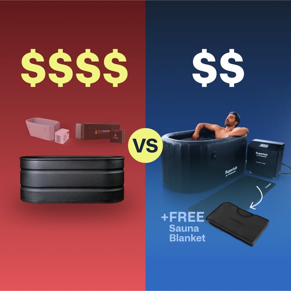
The competitor side shows only boxes and a tank, while the Supertub side shows a happy user. Emotion tips the comparison.
- 03
Bonus adds value
The free sauna blanket gives an extra reason to choose now. It turns a cold product into a hot and cold bundle.
- 04
No exact prices needed
Using $$$$ and $$ avoids price disputes and dated numbers. It keeps the ad evergreen.
Full creative breakdown
Who this ad targets
The ad targets price-conscious shoppers roughly 25 to 50 who are actively comparing cold plunges and have probably seen premium brands already. They want a real chiller system, not just an inflatable tub, but do not want to pay top-tier prices. The free sauna blanket also appeals to people interested in contrast therapy who would otherwise buy heat and cold products separately.
Copywriting analysis
There is very little copy, and that is the point. Four dollar signs against two dollar signs make the price argument without numbers, which avoids disputes and keeps the ad evergreen. VS frames the image as a direct comparison and invites the viewer to judge. The only real phrase is plus free sauna blanket, which adds a bonus and shifts the comparison from price alone to total value. Free is one of the strongest words in advertising, and the arrow pointing to the blanket makes sure it is seen. The primary text and headline must carry the product name and benefits, since the image does not explain features.
Visual design
A strict 50/50 split with red on the left and blue on the right creates instant contrast. Red carries negative connotations such as cost and danger, while blue suggests calm and trust, which favours the Supertub side. The yellow VS circle sits in the exact centre and draws the eye across both halves. The competitor products are washed out and smaller, while the Supertub side is sharp, larger and features a person. The white hand-drawn arrow adds a casual, social-native touch.
How to adapt this template for your brand
- Split the frame into two contrasting colours, using a negative colour for the competitor.
- Use dollar signs, stars or another simple symbol to show the difference.
- Show the alternative as plain products and your side with a happy user.
- Add a bonus or gift on your side with an arrow and the word free.
- Place a bold VS badge on the centre line, and avoid naming the competitor directly.
Tips for cold plunge ads on Meta
Square works well in Meta and Instagram Feeds; also make a 9:16 version with the halves stacked top and bottom for Stories. Comparison ads perform best with in-market shoppers, so retarget product page visitors and target people interested in competitor brands. Avoid showing competitor logos clearly, as that can cause disapproval or legal issues. Put a deadline on the free gift to add urgency.
About this creative
This square comparison ad is split down the middle. The left half has a red background with four yellow dollar signs at the top. Below them sit a faded, pinkish set of competitor products, including tub and chiller boxes with a SunHome-style logo, and a large black oval stock tank tub at the bottom. The right half has a deep blue background with two white dollar signs. Here, a relaxed man leans back in a black oval Supertub with his eyes closed, next to a black chiller unit. A floor mat and a black folded sauna blanket sit in front, with a curved arrow and the text plus free sauna blanket. A yellow circle with VS sits on the centre line. The colour logic is instant: red for costly and bad, blue for smart and calm. The left side has no people, while the right side shows someone enjoying the product, which makes the choice feel obvious.
Meta ad · 338 × 600 · Cold Plunge
Cold Plunge Ad Template: $$$$ vs $$ Comparison
This square ad for the Supertub splits the frame into a red $$$$ side and a blue $$ side, comparing an expensive cold plunge setup with a cheaper bundle and a free sauna blanket. Use it as a template for any product that wins on price or value against a known competitor.
Added
All brand names and logos are property of their owners. Adplaylist is not affiliated with or endorsed by these brands.
Details
Ad copy
Primary text
Why pay $$$$ for a cold plunge? The Supertub gives you an insulated tub and powerful chiller for a fraction of the price, and right now you get a free sauna blanket too. Hot and cold recovery, one smart buy.
Description
Free sauna blanket included
On-image text
$$$$ | VS | $$ | Supertub | +FREE Sauna Blanket
Headline ideas for this template
- 1Same cold plunge, half the price
- 2Skip the premium price tag
- 3Get the plunge and a free sauna blanket
- 4Hot and cold recovery for less
- 5The smarter way to plunge
Meta image ad specs
| Placement | Ratio | Size (px) |
|---|---|---|
| Feed | 1:1 or 4:5 | 1080×1080 / 1080×1350 |
| Marketplace | 1:1 | 1200×1200 |
| Messenger inbox | 1:1 | 1200×1200 |
| Stories & Reels | 9:16 | 1080×1920 |
This template is 1:1. Request 4:5 or 9:16 to cover all placements.