Key takeaways
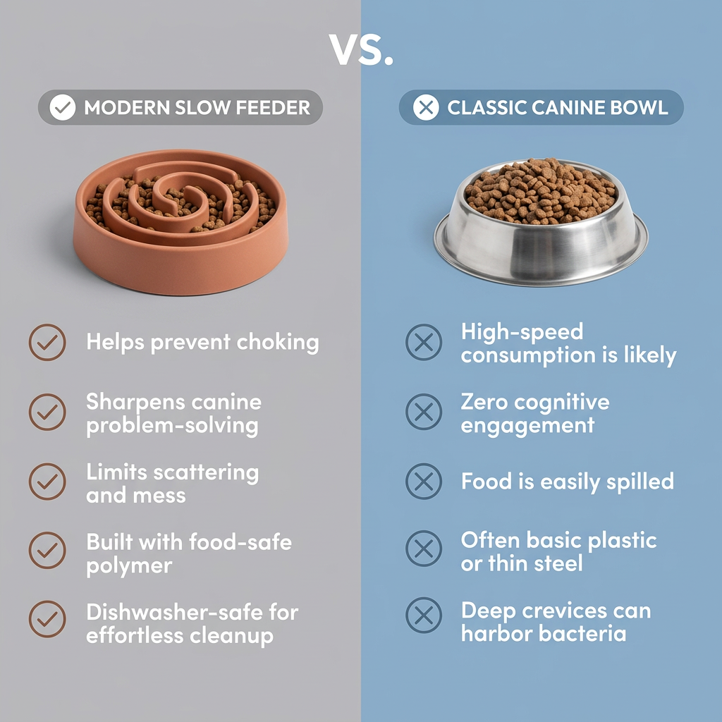
- Format: Comparison: product vs everyday item with ticks and crosses.
- Best for: Accessories that upgrade a common household item.
- Hook: Maze mat vs plain bowl.
- Reuse it: Put your product against the default item and mirror four rows.
Available sizes
What is a comparison ad?
A comparison ad sets the product against an alternative, such as a competitor, the old way of doing things or a cheaper option, usually in a two-column layout or table. It helps buyers who are already weighing options see quickly why this one is the better choice.
See all comparison ads →Why this comparison ad works
- 01
Familiar enemy
Every dog owner has a plain bowl, so the comparison instantly applies to them.
- 02
Four matching rows
Each benefit lines up against a drawback, making it easy to compare point by point.
- 03
Health plus brain
Combining slow eating with mental stimulation gives two strong reasons beyond novelty.
- 04
Gold signals premium
Gold ticks and the VS badge make the mat feel like the upgraded, premium choice.
Full creative breakdown
Who this ad targets
Dog owners whose dogs eat too fast, get bored easily or make a mess at mealtimes, typically 25–50. They are interested in enrichment, training and canine wellbeing, often own high-energy breeds or puppies, and like products that combine health benefits with mental stimulation. They respond to clear, logical comparisons and simple upgrades to daily routines. Many also own puzzle toys or lick mats already.
Copywriting analysis
Each row on the mat side is a positive benefit using health and development language (healthier, cognitive skills), while each bowl row uses mildly negative phrasing (rapid eating, zero mental workout, mess). Using "Plain Dog Bowl" as the opponent avoids naming competitors. Some wording is a little formal ("utilizes basic materials", "tidier feeding environment") and could be simplified for social audiences. The copy is entirely on-image without an offer, so the post text needs to carry the CTA. Shorter, punchier wording would help on mobile.
Visual design
The grey and blue split gives a calm, modern look without aggressive colours. Products are photographed from above at the top of each half for direct comparison. The gold VS badge acts as the focal point between them. Gold ticks and maroon crosses colour-code the verdict. Bold white rounded sans-serif text stays readable on both backgrounds, and rows are evenly spaced for a tidy grid.
How to adapt this template for your brand
- Pick the everyday item your product replaces as the opponent.
- Split the canvas into two calm colours and add a VS badge on the line.
- Shoot both products from the same angle at the top.
- Write four benefits and four matching drawbacks.
- Use coloured tick and cross icons and add your logo and offer.
Tips for pets ads on Meta
Comparison ads perform well on Meta feed and Pinterest. Add a logo and price or discount for conversion campaigns, as this version has none. For TikTok and Reels, film a dog eating from each side and show the time difference on screen. Make sure claims like slower eating can be supported. A 4:5 version gives more room for the text rows.
About this creative
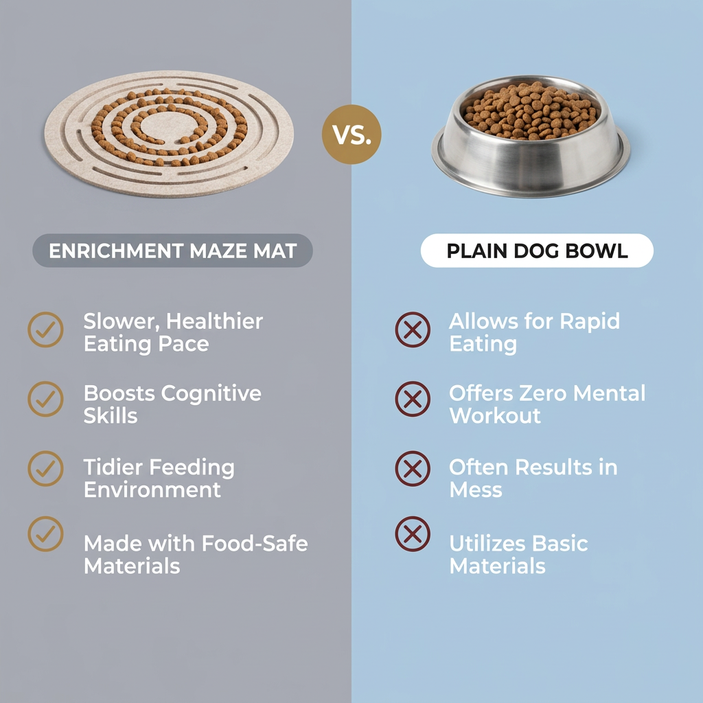
A clean split-screen comparison ad. The left half has a cool grey background and the right half a soft powder blue. At the top left, a round oatmeal-coloured felt mat with concentric maze grooves holds kibble arranged in rings. At the top right, a stainless steel dog bowl is heaped with brown kibble. A gold circle with "VS." in white sits on the dividing line between them. Beneath each product, a pill label names it: Enrichment Maze Mat on a dark grey pill and Plain Dog Bowl on a white pill. Four rows follow on each side. The mat side uses gold tick circles: slower, healthier eating pace; boosts cognitive skills; tidier feeding environment; made with food-safe materials. The bowl side uses maroon cross circles: allows for rapid eating; offers zero mental workout; often results in mess; utilizes basic materials. Bold white text keeps everything readable. There is no logo or offer.
Meta ad · 1200 × 1200 · Pets
Dog Enrichment Mat vs Bowl: Split Comparison Ad
This ad compares a round felt maze mat filled with kibble against a plain steel dog bowl, using a grey and blue split, a gold VS badge and four matching rows of ticks and crosses. It is a comparison format for pet accessory brands replacing an everyday item with an upgraded version.
Added
All brand names and logos are property of their owners. Adplaylist is not affiliated with or endorsed by these brands.
Details
Ad copy
Primary text
Does your dog inhale dinner in seconds? The Enrichment Maze Mat turns mealtime into a brain game, slowing down eating, keeping food off the floor and giving your dog a real mental workout. Made with food-safe materials.
Description
Slower eating, smarter dog, tidier floors
On-image text
ENRICHMENT MAZE MAT | VS. | PLAIN DOG BOWL | Slower, Healthier Eating Pace | Boosts Cognitive Skills | Tidier Feeding Environment | Made with Food-Safe Materials | Allows for Rapid Eating | Offers Zero Mental Workout | Often Results in Mess | Utilizes Basic Materials
Headline ideas for this template
- 1Turn Dinner Into a Brain Game
- 2Fast Eater? Try a Maze Mat
- 3The Bowl Upgrade Your Dog Needs
- 4Slower Meals, Smarter Dogs
- 5Why Plain Bowls Fall Short
Meta image ad specs
| Placement | Ratio | Size (px) |
|---|---|---|
| Feed | 1:1 or 4:5 | 1080×1080 / 1080×1350 |
| Marketplace | 1:1 | 1200×1200 |
| Messenger inbox | 1:1 | 1200×1200 |
| Stories & Reels | 9:16 | 1080×1920 |
This template is 1:1. Request 4:5 or 9:16 to cover all placements.