Key takeaways
- Format: Collage layout with contrast headline and CTA button
- Best for: Premium products positioned against everyday alternatives
- Hook: 'This isn't grocery-store butter'
- Reuse it: Name the cheaper alternative and say 'this isn't that'
Available sizes
What is a feature callout ad?
A feature callout ad is a static image that shows a single product with short text labels pointing to its key features or benefits, usually joined to the product by thin lines. It explains several selling points at a glance without a long caption, which is why it's common for supplements, skincare, electronics and kitchenware.
See all feature callouts ads →Why this feature callouts ad works
- 01
Enemy positioning
Calling out grocery-store butter frames Wildgrain as the upgrade without naming competitors.
- 02
Specific proof
'100% grass-fed' and 'slow-churned in France' give concrete reasons to believe the premium claim.
- 03
Multiple angles
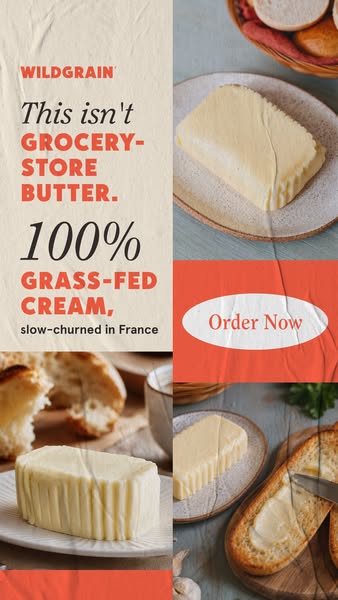
The collage shows the butter plain, on a plate and spread on bread, answering how it looks and is used.
- 04
Clear action
A large 'Order Now' button inside the creative makes the next step obvious.
Full creative breakdown
Who this ad targets
The ad targets quality-focused shoppers who already buy butter regularly but may not have tried European or grass-fed varieties. Likely viewers are US adults aged 30 to 60 with an interest in cooking, baking or specialty foods. They are open to paying more for better ingredients if the difference is explained. As an add-on to a bread subscription, it also targets existing Wildgrain customers who could increase their order value.
Copywriting analysis
The headline uses a contrast structure, 'This isn't grocery-store butter', which defines the product by what it is not. This sets up the reader to expect something better, then delivers proof with '100% grass-fed cream' and 'slow-churned in France.' Mixing script and bold caps creates emphasis on the key words while keeping a friendly tone. The copy avoids adjectives like 'delicious', relying on facts instead. 'Order Now' is direct and simple, appropriate for a product many people already understand. It reads in seconds.
Visual design
A modular grid lets the ad show four images and a text column without feeling cluttered. Coral is used for key words and the CTA panel, creating visual links between the headline and the button. Natural, slightly moody food photography with ceramics and linen supports the artisan story. The crumpled-paper overlay adds texture and ties the panels together into a single poster-like composition.
How to adapt this template for your brand
- Start with a close-up product photo that shows texture.
- Write a short, punchy headline built around one key benefit.
- Add a supporting line with proof points such as origin or ingredients.
- Include a badge or button for the offer or CTA.
- Match fonts and colors to the brand palette and keep the layout clean.
Tips for food ads on Meta
Use this in Meta Stories and Reels at 9:16, keeping the logo, headline and badge inside the central safe area so interface elements don't cover them. Short primary text that restates the key benefit helps people who scroll past without reading the image. Test it with the offer badge on and off, and try a 4:5 crop for Feed placements so the headline still leads. Refresh the imagery seasonally to keep click-through rates stable over a longer flight.
About this creative
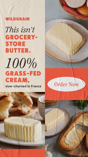
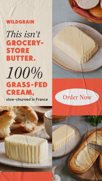
This vertical Wildgrain ad is a grid-style collage. The left column is a cream panel with the coral Wildgrain logo and the headline 'This isn't' in black script, followed by 'Grocery-store butter.' in bold coral capitals. Below, a large script '100%' introduces 'Grass-fed cream,' in coral caps and a small line, 'slow-churned in France.' The right side stacks photos: a butter block on a ceramic plate with bread rolls behind it, a coral panel with a white oval 'Order Now' button, and a close-up of butter being spread on toasted bread. Another butter photo sits at the bottom left. A faint crumpled-paper texture overlays everything, adding a tactile, poster-like feel. The collage shows the butter from multiple angles, on its own and in use, while the text builds a clear contrast between Wildgrain and ordinary supermarket butter, using origin and ingredients as proof.
Meta ad · 338 × 600 · Food
'This Isn't Grocery-Store Butter' Collage Ad
This Wildgrain story ad uses a multi-panel collage of butter shots next to a bold headline: 'This isn't grocery-store butter.' It calls out 100% grass-fed cream and French slow-churning, with an Order Now button. It is a feature callouts format for Meta, a template for premium food brands positioning against everyday alternatives.
Added
All brand names and logos are property of their owners. Adplaylist is not affiliated with or endorsed by these brands.
Details
Ad copy
Primary text
This isn't grocery-store butter. Wildgrain's French butter is slow-churned from 100% grass-fed cream. Add it to your artisan bread box.
Description
Slow-churned in France
On-image text
WILDGRAIN | This isn't GROCERY-STORE BUTTER. | 100% GRASS-FED CREAM, slow-churned in France | Order Now
Headline ideas for this template
- 1Butter, but actually French
- 2Upgrade from supermarket butter
- 3Grass-fed, slow-churned, delivered
- 4Your toast deserves better butter
- 5The butter chefs reach for
Meta image ad specs
| Placement | Ratio | Size (px) |
|---|---|---|
| Feed | 1:1 or 4:5 | 1080×1080 / 1080×1350 |
| Marketplace | 1:1 | 1200×1200 |
| Messenger inbox | 1:1 | 1200×1200 |
| Stories & Reels | 9:16 | 1080×1920 |
This template is 1:1. Request 4:5 or 9:16 to cover all placements.
Browse similar by tag