Key takeaways
- Format: Bold color-block ad with heritage callouts
- Best for: Premium products with a named maker or origin
- Hook: 'Made by a French creamery. Not a factory.'
- Reuse it: Name your producer and their traditional method
Available sizes
What is a feature callout ad?
A feature callout ad is a static image that shows a single product with short text labels pointing to its key features or benefits, usually joined to the product by thin lines. It explains several selling points at a glance without a long caption, which is why it's common for supplements, skincare, electronics and kitchenware.
See all feature callouts ads →Why this feature callouts ad works
- 01
Craft vs mass
'Creamery, not a factory' creates a sharp contrast that frames the butter as handmade.
- 02
Named producer
Mentioning Le Gall adds credibility and specificity that generic claims lack.
- 03
Time as proof
'A century' of barrel churning signals expertise and authenticity.
- 04
Scroll-stopping color
A full coral background stands out in feeds dominated by neutral food photography.
Full creative breakdown
Who this ad targets
The ad targets discerning food shoppers aged 30 to 65 who care about provenance, craft production and European food traditions. They often read labels, shop at specialty stores and are skeptical of mass-produced products. They are willing to pay more when the story is credible. The ad also appeals to existing Wildgrain subscribers who might add butter to their boxes, and to gift buyers seeking premium food items.
Copywriting analysis
The headline uses a two-part contrast, 'Made by a French creamery.' and 'Not a factory.', mixing script and caps to create emphasis. It defines quality through how the product is made rather than how it tastes. The speech bubble, 'How butter should taste', adds a confident, slightly opinionated voice. The body copy gives proof: traditional barrels, Le Gall and a century of practice. Together, the lines build a credible heritage story with very few words. It sounds credible and calm.
Visual design
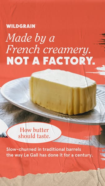
A full coral background makes this the boldest of the Wildgrain butter ads and gives strong contrast for the white butter and text. The butter stands centered at eye level, appearing monumental. Brushed white strokes and paper texture add a handmade feel. The cream speech bubble breaks the coral field and draws the eye to the taste claim, while the kraft strip at the bottom ties into brand packaging.
How to adapt this template for your brand
- Start with a close-up product photo that shows texture.
- Write a short, punchy headline built around one key benefit.
- Add a supporting line with proof points such as origin or ingredients.
- Include a badge or button for the offer or CTA.
- Match fonts and colors to the brand palette and keep the layout clean.
Tips for food ads on Meta
Use this in Meta Stories and Reels at 9:16, keeping the logo, headline and badge inside the central safe area so interface elements don't cover them. Short primary text that restates the key benefit helps people who scroll past without reading the image. Test it with the offer badge on and off, and try a 4:5 crop for Feed placements so the headline still leads. Refresh the imagery seasonally to keep click-through rates stable over a longer flight.
About this creative
This vertical Wildgrain ad uses a saturated coral background with a crumpled-paper texture and brushed white strokes on the right. The white Wildgrain logo sits top left, followed by the script line 'Made by a French creamery.' and bold white caps, 'Not a factory.' In the center, a tall block of pale butter with ridged sides stands on a white plate, shot at eye level on a dark surface strip. A cream speech-bubble shape on the left says 'How butter should taste.' in coral script. Below, white body text explains that the butter is slow-churned in traditional barrels the way Le Gall has done it for a century. A strip of kraft paper peeks in at the bottom. Compared with Wildgrain's softer butter ads, this one is louder and more graphic, using the brand coral as the main color. It sells heritage, craft and authenticity, positioning the butter against mass-produced alternatives.
Meta ad · 338 × 600 · Food
'Made by a French Creamery. Not a Factory.' Butter Ad
This Wildgrain story ad sets a block of butter on a bold coral background with the headline 'Made by a French creamery. Not a factory.' It names producer Le Gall and its century of barrel churning. It is a feature callouts format for Meta, a template for brands using origin and heritage to justify a premium.
Added
All brand names and logos are property of their owners. Adplaylist is not affiliated with or endorsed by these brands.
Details
Ad copy
Primary text
Made by a French creamery, not a factory. Le Gall butter is slow-churned in traditional barrels, the way it's been done for a century. Add it to your Wildgrain box.
Description
Slow-churned the traditional way
On-image text
WILDGRAIN | Made by a French creamery. NOT A FACTORY. | How butter should taste. | Slow-churned in traditional barrels the way Le Gall has done it for a century.
Headline ideas for this template
- 1Butter with a hundred-year story
- 2Creamery-made, never factory-made
- 3Churned in barrels, not machines
- 4Taste the French tradition
- 5This is how butter should taste
Meta image ad specs
| Placement | Ratio | Size (px) |
|---|---|---|
| Feed | 1:1 or 4:5 | 1080×1080 / 1080×1350 |
| Marketplace | 1:1 | 1200×1200 |
| Messenger inbox | 1:1 | 1200×1200 |
| Stories & Reels | 9:16 | 1080×1920 |
This template is 1:1. Request 4:5 or 9:16 to cover all placements.
Browse similar by tag