Key takeaways
- Format: Diagonal band layout with feature callouts
- Best for: Indulgent food products and add-on upsells
- Hook: 'Worth the extra slice'
- Reuse it: Tie your add-on to more use of the core product
Available sizes
What is a feature callout ad?
A feature callout ad is a static image that shows a single product with short text labels pointing to its key features or benefits, usually joined to the product by thin lines. It explains several selling points at a glance without a long caption, which is why it's common for supplements, skincare, electronics and kitchenware.
See all feature callouts ads →Why this feature callouts ad works
- 01
Bread-boosting line
'Worth the extra slice' links the butter to eating more bread, the core Wildgrain product.
- 02
Texture vocabulary
'Creamy' and 'salted' are short, sensory and match what the photos show.
- 03
Dynamic layout
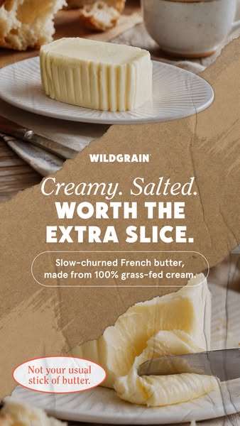
The diagonal kraft band creates movement and separates two complementary product shots.
- 04
Subtle comparison
'Not your usual stick of butter' positions it above supermarket butter without attacking anyone.
Full creative breakdown
Who this ad targets
The ad targets home cooks and bread lovers aged 30 to 60 who enjoy simple indulgences like buttered toast or fresh bread at dinner. They value quality ingredients and are willing to pay more for European-style butter. The ad also works as an upsell to existing Wildgrain subscribers, encouraging them to add butter to their bread box. Interests could include gourmet food, baking and specialty grocery shopping.
Copywriting analysis
The headline is built in two parts: a slow, script-styled 'Creamy. Salted.' and a punchy, all-caps 'Worth the extra slice.' The first part describes; the second persuades with a small, relatable indulgence. The pill callout adds proof without breaking the flow, and the sticker line, 'Not your usual stick of butter', adds a friendly comparison. The copy feels confident and a little playful, encouraging people to treat themselves rather than pushing a discount. It also nudges viewers to think about the bread they would spread it on.
Visual design
A diagonal composition splits the frame into a product shot above and an action shot below, with the kraft band holding all the text. White type on brown kraft stays legible and on-brand. The coral sticker in the corner adds a small pop of the brand color. Natural light, crusty bread and ceramics reinforce the artisan, European breakfast feel. It feels cohesive.
How to adapt this template for your brand
- Start with a close-up product photo that shows texture.
- Write a short, punchy headline built around one key benefit.
- Add a supporting line with proof points such as origin or ingredients.
- Include a badge or button for the offer or CTA.
- Match fonts and colors to the brand palette and keep the layout clean.
Tips for food ads on Meta
Use this in Meta Stories and Reels at 9:16, keeping the logo, headline and badge inside the central safe area so interface elements don't cover them. Short primary text that restates the key benefit helps people who scroll past without reading the image. Test it with the offer badge on and off, and try a 4:5 crop for Feed placements so the headline still leads. Refresh the imagery seasonally to keep click-through rates stable over a longer flight.
About this creative
This vertical Wildgrain ad is built around a torn kraft-paper band that runs diagonally across the frame. Above it, a block of ridged butter sits on a fluted white plate with crusty bread pieces and a coffee cup behind. Below, a knife scrapes into soft butter, showing its creamy texture. On the kraft band, the white Wildgrain logo leads into a script line, 'Creamy. Salted.', then bold white capitals, 'Worth the extra slice.' An outlined pill shape adds 'Slow-churned French butter, made from 100% grass-fed cream.' In the bottom left corner, a small coral-outlined oval sticker says 'Not your usual stick of butter.' The diagonal composition creates movement and divides the two photos neatly, while the kraft texture keeps the artisan packaging look consistent with other Wildgrain creatives. The ad sells butter as an indulgent upgrade that makes people reach for more bread, linking the add-on back to the core product.
Meta ad · 338 × 600 · Food
'Creamy. Salted. Worth The Extra Slice.' Butter Ad
This Wildgrain story ad slices a kraft-paper band diagonally across two butter photos, carrying the headline 'Creamy. Salted. Worth the extra slice.' A pill callout explains it is slow-churned French butter from grass-fed cream. It is a feature callouts format for Meta, a template for premium food brands selling texture and indulgence.
Added
All brand names and logos are property of their owners. Adplaylist is not affiliated with or endorsed by these brands.
Details
Ad copy
Primary text
Creamy, salted and worth the extra slice. Wildgrain's slow-churned French butter is made from 100% grass-fed cream. Add it to your box.
Description
Slow-churned French butter
On-image text
WILDGRAIN | Creamy. Salted. WORTH THE EXTRA SLICE. | Slow-churned French butter, made from 100% grass-fed cream. | Not your usual stick of butter.
Headline ideas for this template
- 1Butter that earns another slice
- 2Creamy, salted, French
- 3Not your usual stick of butter
- 4One more slice? Obviously.
- 5Slow-churned for your bread
Meta image ad specs
| Placement | Ratio | Size (px) |
|---|---|---|
| Feed | 1:1 or 4:5 | 1080×1080 / 1080×1350 |
| Marketplace | 1:1 | 1200×1200 |
| Messenger inbox | 1:1 | 1200×1200 |
| Stories & Reels | 9:16 | 1080×1920 |
This template is 1:1. Request 4:5 or 9:16 to cover all placements.
Browse similar by tag