Key takeaways
- Format: Surreal mascot with a three-point mistakes list.
- Best for: Agencies, website builders and B2B services.
- Hook: A suited chimpanzee that stops the scroll.
- Reuse it: Pair any unexpected hero with a short numbered list.
Available sizes
What is a listicle ad?
A listicle ad presents the product's benefits or reasons to buy as a short numbered list, like an article headline ("5 reasons…"). The list format is easy to scan in a feed and lets one creative answer several objections at once.
See all listicle ads →Why this listicle ad works
- 01
Pattern interrupt
A chimpanzee in a suit is unexpected and hard to scroll past.
- 02
Mistakes framing
People stop to check if they are making these errors.
- 03
Short list
Three two-word points are easy to read in seconds.
- 04
Floating UI
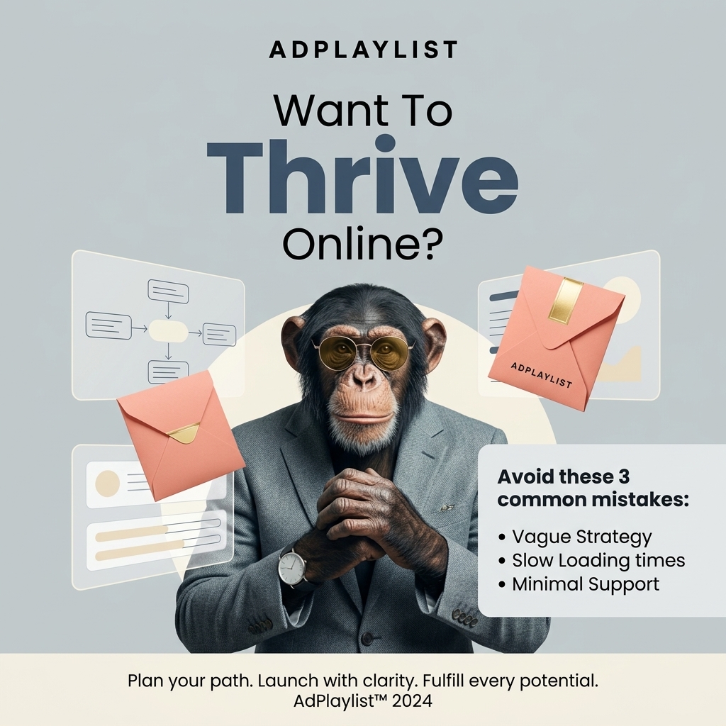
Wireframes and envelopes hint at websites and email marketing.
Full creative breakdown
Who this ad targets
This ad targets small business owners, solopreneurs and startup founders aged 25 to 50 who are building or relaunching their online presence. They feel unsure about strategy and technology and want a reliable partner. The playful visual also appeals to marketers looking for a creative agency. Interest targeting is a good starting point, and lookalike audiences built from past purchasers are a strong next step once the ad has data.
Copywriting analysis
The question headline qualifies the audience, and 'Thrive' is emphasised as the desired outcome. The list is clear but inconsistent in capitalisation ('Slow Loading times'). The footer slogan is awkward ('Fulfill every potential') and the 2024 date is outdated, so both should be refreshed. List copy works because each line is short, parallel and easy to check against your own situation. Framing the points as mistakes taps into loss aversion, which is often more motivating than promising gains. Together, the words and visuals give the viewer one clear reason to click.
Visual design
The chimp stands centred in front of a soft circle, giving it a spotlight effect. Coral envelopes add warm accents against cool grey. The list box sits bottom right, balancing the headline above. The cream footer bar closes the layout cleanly. The square 1:1 format keeps every element readable on mobile, and the clear hierarchy guides the eye from brand to message to product in a natural order.
How to adapt this template for your brand
- Choose three common mistakes or tips your web service helps people with.
- Write each point in two or three words using the same grammatical pattern.
- Put the list in a clean box so it reads separately from the visual.
- Pair it with an unexpected hero image to stop the scroll.
- Test 'mistakes' versus 'tips' framing to see which drives more clicks.
Tips for saas ads on Meta
On LinkedIn, run this web service creative as single-image Sponsored Content targeted by job title and industry, and keep the intro text under 150 characters so it is not truncated. On Meta, use the same 1:1 file in Feed and crop a 4:5 version for mobile. Keep key text away from the edges, and open the primary text with the work problem the product solves.
About this creative
The creative uses a light grey-blue background with the Adplaylist wordmark at the top and a large headline asking want to thrive online, with thrive in heavy navy type. In the centre stands a chimpanzee wearing a grey tweed suit, a wristwatch and round gold-tinted sunglasses, hands clasped calmly. Floating around it are coral envelopes with gold seals and translucent UI cards showing a flowchart and website wireframes. A box on the right lists three common mistakes: vague strategy, slow loading times and minimal support. A cream footer reads plan your path, launch with clarity, fulfill every potential. As a listicle ad, it organises the message into a short numbered list that the viewer can scan in seconds. Lists promise quick, practical value, so people stop to check whether they are making any of the points mentioned. Pairing the list with a striking visual earns the initial attention, and the list then gives the brand a credible, helpful reason to be remembered.
Meta ad · 1200 × 1200 · SaaS
Website Launch Ad Template – Listicle Example
This website launch ad template uses a listicle format to show a chimpanzee in a suit and sunglasses beside a list of three common online mistakes. It is a strong reference for agencies, website builders and B2B services. Below: the copy, why it works and five steps to adapt it.
Added
All brand names and logos are property of their owners. Adplaylist is not affiliated with or endorsed by these brands.
Details
Ad copy
Primary text
Most online launches fail for the same three reasons: vague strategy, slow loading times and minimal support. Adplaylist helps you plan your path and launch with clarity.
Description
Plan, launch and grow online
On-image text
ADPLAYLIST | Want To Thrive Online? | Avoid these 3 common mistakes: • Vague Strategy • Slow Loading times • Minimal Support | ADPLAYLIST (on envelope) | Plan your path. Launch with clarity. Fulfill every potential. AdPlaylist™ 2024
Headline ideas for this template
- 13 mistakes killing your online growth.
- 2Thrive online without the guesswork.
- 3Launch with clarity, not chaos.
- 4Is your website making these mistakes?
- 5Plan smarter. Launch faster.
Meta image ad specs
| Placement | Ratio | Size (px) |
|---|---|---|
| Feed | 1:1 or 4:5 | 1080×1080 / 1080×1350 |
| Marketplace | 1:1 | 1200×1200 |
| Messenger inbox | 1:1 | 1200×1200 |
| Stories & Reels | 9:16 | 1080×1920 |
This template is 1:1. Request 4:5 or 9:16 to cover all placements.
Browse similar by tag