Key takeaways
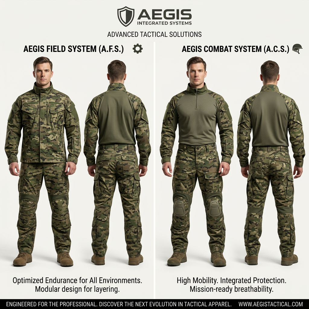
- Format: Side-by-side comparison of two product lines, each shown front and back.
- Best for: Brands with two tiers, versions or use cases that buyers need to choose between.
- Hook: Two named 'systems' invite the viewer to decide which one fits their mission.
- Reuse it: Swap in your two lines, keep the divider, icons and one benefit pair per column.
Available sizes
What is a comparison ad?
A comparison ad sets the product against an alternative, such as a competitor, the old way of doing things or a cheaper option, usually in a two-column layout or table. It helps buyers who are already weighing options see quickly why this one is the better choice.
See all comparison ads →Why this comparison ad works
- 01
Built-in decision
The split layout turns the ad into a choice rather than a pitch. Viewers instinctively compare and pick a side, which raises engagement.
- 02
Front and back views
Showing both sides answers fit and detail questions before the click, which matters for technical apparel bought in bulk.
- 03
Named systems feel premium
Labels like A.F.S. and A.C.S. borrow military and engineering language, making a uniform feel like specified equipment.
- 04
Short benefit lines
Each column ends with three compact benefits, so the difference between the two products is readable in seconds.
Full creative breakdown
Who this ad targets
This ad targets professional buyers of tactical apparel: military and police procurement officers, security firms, outdoor professionals and serious airsoft or hunting enthusiasts. These buyers compare specifications, care about durability and fit, and often need to justify a choice. The comparison format helps them decide between a layering-focused field uniform and a mobility-focused combat uniform. The US-style .com domain and professional tone suggest a North American B2B and prosumer audience that responds to technical credibility over lifestyle imagery.
Copywriting analysis
The copy borrows the language of defence procurement. 'Integrated Systems', 'Advanced Tactical Solutions' and acronyms like A.F.S. and A.C.S. frame clothing as engineered equipment. The benefit lines follow a rhythm of short fragments: 'High Mobility. Integrated Protection. Mission-ready breathability.' This scans quickly and feels decisive. The left column focuses on endurance and layering, the right on mobility and protection, so each product owns a clear job. The footer, 'Engineered for the professional', reinforces exclusivity and authority, while 'next evolution in tactical apparel' adds a sense of innovation. There is no price or hard call to action, so this works best as a consideration ad that sends qualified buyers to the website.
Visual design
The layout is symmetrical and catalogue-like: a centred logo, a thin divider and four evenly spaced model shots on a light grey studio background. The muted olive and woodland camo palette contrasts cleanly with the white backdrop, so the products dominate. Bold condensed typography for the system names and small icons (gear and helmet) help the eye separate the columns. The black footer bar anchors the composition and holds the URL. Consistent model pose and lighting make the comparison fair and easy to read.
How to adapt this template for your brand
- Pick two product lines, tiers or versions that serve clearly different needs.
- Shoot or render both on the same model, pose and background, front and back.
- Give each line a short name and a simple icon that signals its job.
- Write one three-part benefit line per column using short fragments.
- Add a footer bar with your brand promise and URL as the destination.
Tips for uniforms ads on Meta
On Meta, use this as a carousel opener or single image for consideration campaigns aimed at security and outdoor interests. On LinkedIn, it suits procurement and facilities audiences; pair it with copy that mentions bulk orders or spec sheets. On Google Display, crop to keep both columns visible and make sure the system names stay legible at small sizes. Test a version with a clear 'Compare specs' call to action against the soft brand-led version.
About this creative
This square ad from Aegis Integrated Systems compares two tactical uniform lines in a clean, catalogue-style split layout. The brand shield logo and the line 'Advanced Tactical Solutions' sit centred at the top. A thin vertical divider separates the left column, the Aegis Field System (A.F.S.) marked with a gear icon, from the right column, the Aegis Combat System (A.C.S.) marked with a helmet icon. Each column shows the same male model from the front and the back, wearing woodland digital camouflage with olive panels, cargo trousers, knee pads and coyote boots. The Field System adds a full camo jacket for layering, while the Combat System uses a breathable combat shirt with a quarter zip. Under each column, a two-line benefit statement summarises the use case: endurance and modularity versus mobility, protection and breathability. A black footer bar carries the brand promise and the website URL, closing the ad with a clear destination for interested buyers and procurement teams.
Meta ad · 1200 × 1200 · Uniforms
Tactical Uniform Ad Template: Two-System Comparison
This tactical uniform ad from Aegis Integrated Systems uses a split-screen comparison to present two camouflage systems side by side, each shown front and back. It is a clean template for any apparel brand selling two product lines, tiers or versions and wanting buyers to self-select quickly.
Added
All brand names and logos are property of their owners. Adplaylist is not affiliated with or endorsed by these brands.
Details
Ad copy
Primary text
Two systems. One standard. Compare the Aegis Field System built for endurance and layering with the Aegis Combat System built for mobility and integrated protection – and pick the uniform that fits your mission.
Description
Next-generation tactical apparel, engineered for professionals.
On-image text
AEGIS INTEGRATED SYSTEMS | ADVANCED TACTICAL SOLUTIONS | AEGIS FIELD SYSTEM (A.F.S.) | AEGIS COMBAT SYSTEM (A.C.S.) | Optimized Endurance for All Environments. Modular design for layering. | High Mobility. Integrated Protection. Mission-ready breathability. | ENGINEERED FOR THE PROFESSIONAL. DISCOVER THE NEXT EVOLUTION IN TACTICAL APPAREL. | WWW.AEGISTACTICAL.COM
Headline ideas for this template
- 1Field or Combat? Find Your System
- 2Two Uniforms. Two Missions. One Standard.
- 3Built for Endurance. Built for Speed.
- 4Which Tactical System Fits Your Team?
- 5Engineered for the Professional
Meta image ad specs
| Placement | Ratio | Size (px) |
|---|---|---|
| Feed | 1:1 or 4:5 | 1080×1080 / 1080×1350 |
| Marketplace | 1:1 | 1200×1200 |
| Messenger inbox | 1:1 | 1200×1200 |
| Stories & Reels | 9:16 | 1080×1920 |
This template is 1:1. Request 4:5 or 9:16 to cover all placements.