Key takeaways
- Format: Concept product shot with the full range inside a themed prop.
- Best for: Showing a wide cap range as part of a daily routine.
- Hook: An open locker full of caps, like a peek into someone's daily kit.
- Reuse it: Place your range inside a familiar everyday object that tells a story.
Available sizes
What is a product shot ad?
A product shot ad puts the product itself at the centre of the frame, usually on a clean or styled background with little text. It works best when the packaging or product is distinctive enough to stop the scroll and the viewer already understands what it does.
See all product shot ads →Why this product shot ad works
- 01
Familiar setting
Lockers are instantly recognisable and link the caps to work, sport and routine.
- 02
Full range on display
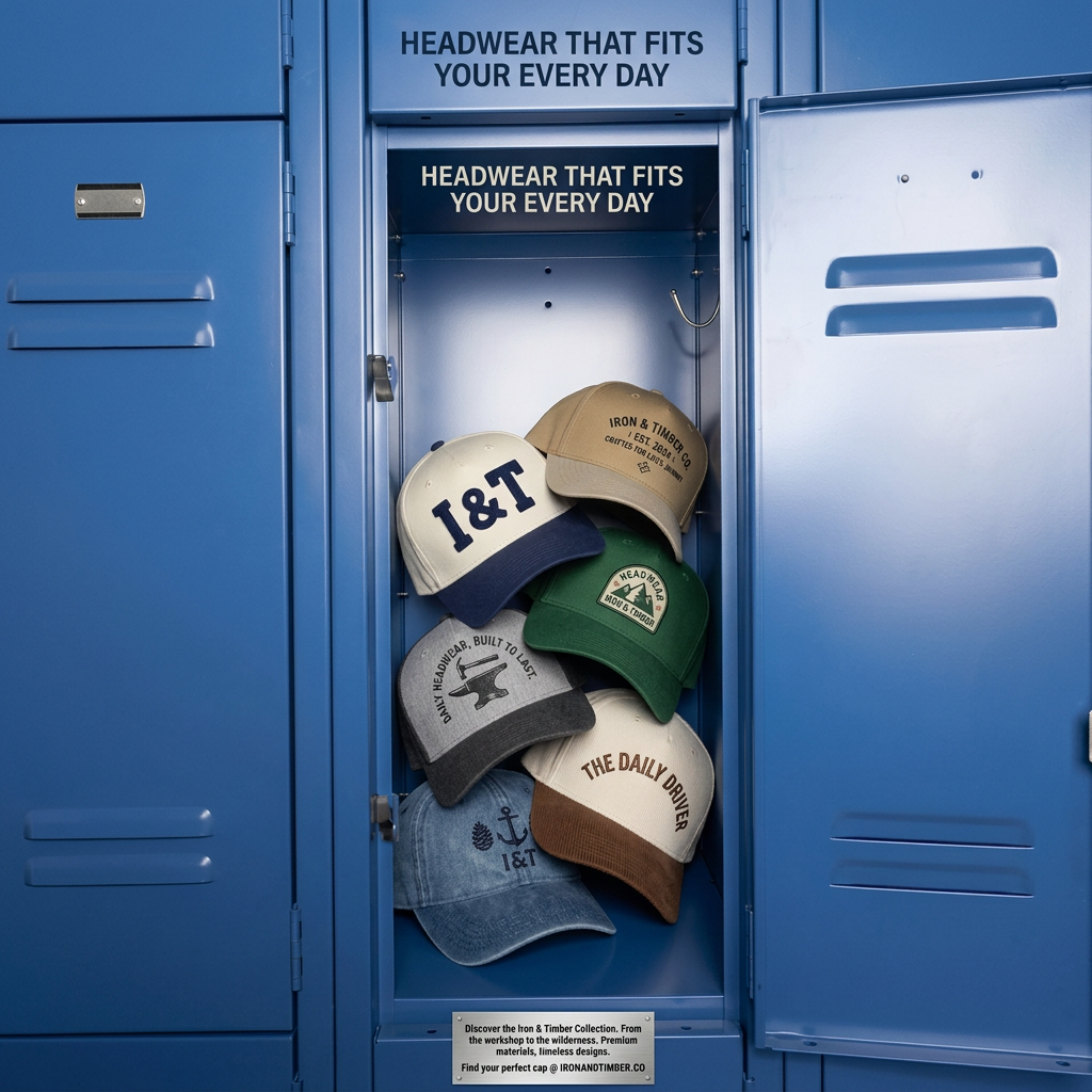
Seven designs show variety in colour, material and graphics in one view.
- 03
Strong colour contrast
Earthy caps stand out clearly against the saturated blue metal.
- 04
Copy built into the scene
The stamped plaque makes the brand message feel like part of the locker, not an overlay.
Full creative breakdown
Who this ad targets
The ad targets men and women aged about 22 to 45 with an active, practical lifestyle: tradespeople, gym-goers, weekend DIYers and outdoor fans. They want caps that look good, last long and suit daily use rather than one-off fashion moments. The workshop-to-wilderness message and tool and anchor graphics suggest a rugged American heritage style. The range of designs also appeals to people buying several caps to rotate through the week.
Copywriting analysis
HEADWEAR THAT FITS YOUR EVERY DAY plays on fit in two ways: physical fit and fitting into your routine. It is clear and benefit-led. The plaque copy adds the brand story, from the workshop to the wilderness, and proof points, premium materials and timeless designs, ending with a direct call to find your cap at the website. The cap graphics add extra lines such as BUILT TO LAST and THE DAILY DRIVER that reinforce durability. The main weakness is that the headline is repeated twice, which looks like an error and wastes space. Some cap text also looks distorted, so a cleaner retouch is advisable before reuse.
Visual design
The saturated blue lockers create a bold, uniform frame, with the open locker as a natural spotlight. The caps are arranged in a loose cascade that adds depth and a lived-in feel. Even studio lighting gives the metal a clean sheen. Earthy cap colours contrast well with the blue. The headline uses dark navy on the top panel and cream on a dark inner strip. A brushed metal plaque at the bottom acts as the copy area and fits the industrial theme.
How to adapt this template for your brand
- Pick an everyday object that suits your brand story, such as a locker, toolbox or shelf.
- Fill it with your product range in a natural, slightly casual arrangement.
- Add your headline once, in a spot that feels part of the object.
- Use a built-in element, such as a plaque or label, for brand copy and URL.
- Check all product text and graphics for errors before publishing.
Tips for hats ads on Meta
On Meta, this colourful concept image works well for prospecting and stands out in the feed thanks to the strong blue. Remove the duplicated headline to free space and improve readability. Use a carousel that starts with the locker and then shows each cap individually. In Stories, extend the lockers vertically. Target interests like workwear, DIY, fitness and outdoor activities, and run a back-to-school or new-season version.
About this creative
This square product-shot ad from Iron & Timber Co. shows an open, glossy blue metal locker in the centre of a row of identical lockers. Inside, seven caps hang on hooks and lean against each other: a cream and navy two-tone cap with a bold I&T, a tan cap with IRON & TIMBER CO. EST. 2024, a green cap with a mountain HEADWEAR patch, a heather grey cap with an anvil and hammer and DAILY HEADWEAR, BUILT TO LAST., a cream cap with a brown corduroy brim reading THE DAILY DRIVER, and a washed denim cap with a pinecone, anchor and I&T. The headline HEADWEAR THAT FITS YOUR EVERY DAY appears twice, once above the locker and once on a dark strip inside. A brushed metal plaque at the bottom carries the brand copy and the website IRONANDTIMBER.CO. The locker setting evokes gyms, workshops and daily routines, making the caps feel like everyday kit.
Meta ad · 1200 × 1200 · Hats
Baseball Cap Ad Template: Caps in a Blue Locker
This baseball cap ad from Iron & Timber Co. shows seven caps hanging inside an open blue metal locker with a stamped plaque below. It is a concept-driven product shot that suggests a daily routine. Use it as a template when you want to present a full range in a setting that tells a story.
Added
All brand names and logos are property of their owners. Adplaylist is not affiliated with or endorsed by these brands.
Details
Ad copy
Primary text
From the workshop to the wilderness. The Iron & Timber collection brings premium materials and timeless designs to everyday caps. Find your perfect cap at ironandtimber.co.
Description
Premium caps, built to last
On-image text
HEADWEAR THAT FITS YOUR EVERY DAY (shown twice) | Discover the Iron & Timber Collection. From the workshop to the wilderness. Premium materials, timeless designs. Find your perfect cap @ IRONANDTIMBER.CO | I&T | IRON & TIMBER CO. EST. 2024 | DAILY HEADWEAR, BUILT TO LAST. | THE DAILY DRIVER | HEADWEAR (patch) (on caps)
Headline ideas for this template
- 1Grab Your Cap and Start Your Day
- 2From the Workshop to the Wilderness
- 3Seven Caps, One for Every Day
- 4Daily Headwear, Built to Last
- 5Your Locker Is Missing This Cap
Meta image ad specs
| Placement | Ratio | Size (px) |
|---|---|---|
| Feed | 1:1 or 4:5 | 1080×1080 / 1080×1350 |
| Marketplace | 1:1 | 1200×1200 |
| Messenger inbox | 1:1 | 1200×1200 |
| Stories & Reels | 9:16 | 1080×1920 |
This template is 1:1. Request 4:5 or 9:16 to cover all placements.
Browse similar by tag