Key takeaways
- Format: Numbered tip with one giant stat inside a soft shape.
- Best for: SaaS brands running educational content ads to build trust.
- Hook: A specific stat that promises a quick win for the viewer.
- Reuse it: Turn one benchmark from your data into a numbered tip with a huge number.
Available sizes
What is a listicle ad?
A listicle ad presents the product's benefits or reasons to buy as a short numbered list, like an article headline ("5 reasons…"). The list format is easy to scan in a feed and lets one creative answer several objections at once.
See all listicle ads →Why this listicle ad works
- 01
Value before the pitch
The ad teaches a useful tactic instead of asking for a sale. Viewers get something even if they never click.
- 02
Big number, fast read
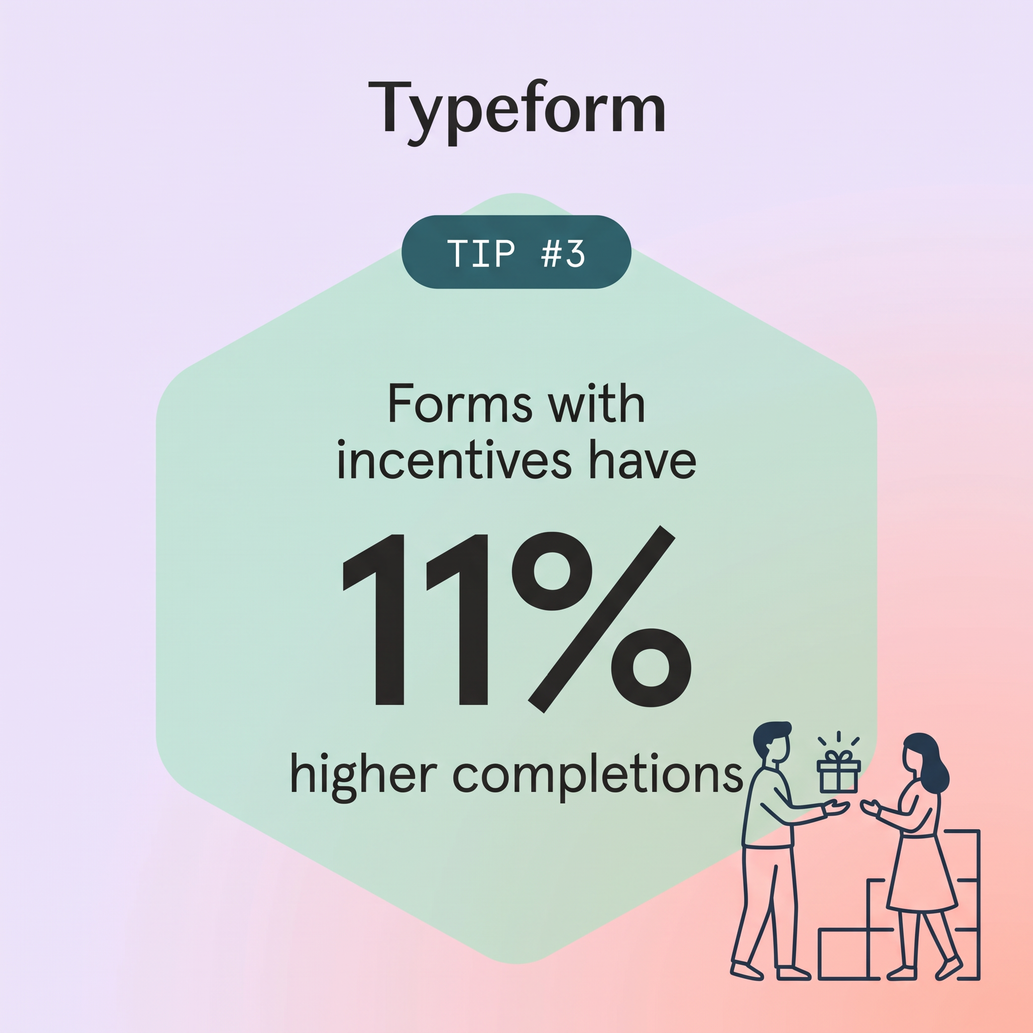
The giant 11% is the first thing anyone sees. Specific numbers feel credible and are easy to remember.
- 03
Series framing builds curiosity
"Tip #3" implies there are other tips. It encourages viewers to look for more and positions Typeform as an expert.
- 04
Illustration explains the stat
The gift exchange drawing shows what an incentive is at a glance. It adds warmth to a data-driven message.
Full creative breakdown
Who this ad targets
This ad targets marketers, researchers, HR teams and customer experience managers who create surveys and forms and struggle with drop-off. They care about response rates and data quality. The stat appeals to practical people who want quick, proven improvements. It works for top-of-funnel audiences on LinkedIn by job function, and for retargeting Typeform free users to encourage deeper engagement. Typically aged 25 to 45, they read marketing blogs and value benchmarks from tools with large datasets.
Copywriting analysis
The copy follows a stat-led formula: context, number, outcome. "Forms with incentives have" sets up the tactic, "11%" delivers the proof and "higher completions" names the result viewers want. Using the word completions speaks the language of form builders and signals expertise. "Tip #3" adds a content-series wrapper that feels editorial. The copy is neutral and helpful with no hard sell, relying on Typeform's data authority. Adding a source note or sample size could make the stat even more credible.
Visual design
The design is centered and symmetrical, with the hexagon acting as a container for the stat. The pastel lavender-to-peach gradient and mint shape create a calm, friendly palette. The dark teal tip pill echoes Typeform's brand tones and anchors the top. Typography uses clear contrast between the medium supporting text and the heavy stat. The navy line illustration breaks out of the hexagon at the bottom right, adding movement and preventing the layout from feeling static.
How to adapt this template for your brand
- Pull a surprising benchmark from your own product data or research.
- Frame it as a numbered tip to suggest a series.
- Make the number the largest element inside a simple shape.
- Add a small line illustration that shows the tactic in action.
- Run several tips as a series and keep layout and colors consistent.
Tips for saas & tech ads on Meta
On LinkedIn, run this as a single-image or document ad and link to a blog post with all the tips; educational content often earns lower costs and more engagement there. On Meta, test it as a carousel with tips 1 to 5. Keep intro text short and repeat the tip, not the brand. Rotate tips regularly to avoid ad fatigue, and A/B test against the coral variant to find the best background.
About this creative
This square Typeform creative has a soft gradient background moving from lavender at the top to peach at the bottom right. The Typeform wordmark sits large and bold at the top center in black. Below it, a dark teal pill labelled "TIP #3" in monospaced white type introduces a series. A large mint-green hexagon fills the center and holds the message: "Forms with incentives have" in medium black sans-serif, then a huge bold "11%", and "higher completions" underneath. The stat is by far the largest element and is readable at any size. In the bottom right, a navy line illustration shows a man handing a gift box, with small burst lines, to a smiling woman, while simple outlined boxes or steps stand behind them. The illustration visualises the idea of an incentive. The ad has no product UI or CTA button, and its soft pastel colors make it feel like helpful content rather than advertising.
Meta ad · 1200 × 1200 · SaaS & Tech
SaaS Tip Series Ad Template with a Big Stat (Typeform Example)
This Typeform ad is part of a numbered tip series, sharing one data point: forms with incentives have 11% higher completions. A giant percentage inside a soft hexagon makes the stat the hero. It is a great template for SaaS brands running educational, value-first ads on LinkedIn and Meta.
Added
All brand names and logos are property of their owners. Adplaylist is not affiliated with or endorsed by these brands.
Details
Ad copy
Primary text
Want more people to finish your forms? Add an incentive. Forms with incentives see 11% higher completion rates. More tips to boost your response rates on our blog.
Description
Get more form completions
On-image text
Typeform | TIP #3 | Forms with incentives have 11% higher completions
Headline ideas for this template
- 1One small change, 11% more completions.
- 2Want more people to finish your form? Try this.
- 3Tip #3: Give people a reason to finish.
- 4The easiest way to boost response rates.
- 5Incentives work. Here's the proof.
Meta image ad specs
| Placement | Ratio | Size (px) |
|---|---|---|
| Feed | 1:1 or 4:5 | 1080×1080 / 1080×1350 |
| Marketplace | 1:1 | 1200×1200 |
| Messenger inbox | 1:1 | 1200×1200 |
| Stories & Reels | 9:16 | 1080×1920 |
This template is 1:1. Request 4:5 or 9:16 to cover all placements.
Browse similar by tag