Key takeaways
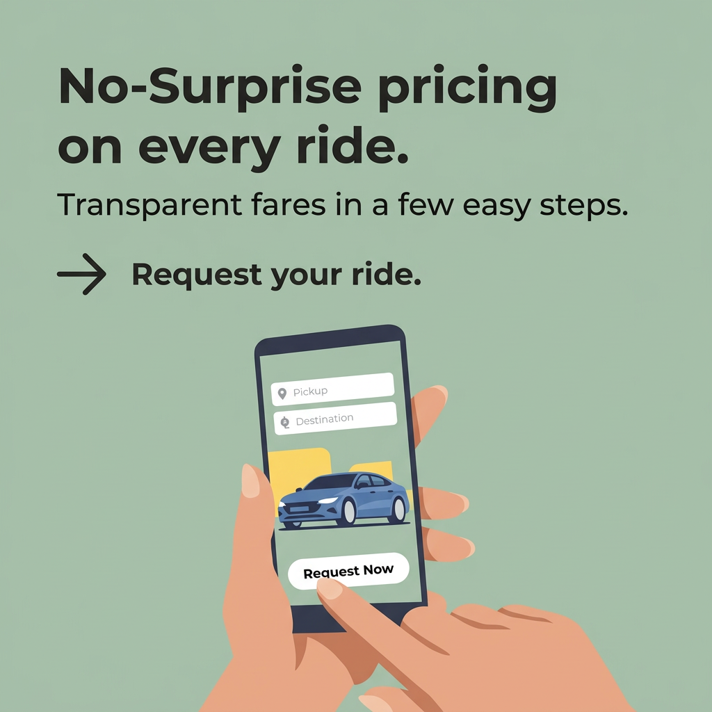
- Format: Illustrated in-app screen with a single pricing promise as the headline.
- Best for: Ride-hailing, taxi, delivery and mobility app installs.
- Hook: Fear of surge pricing, answered with 'no-surprise' fares.
- Reuse it: Show your app's two-step core flow and lead with the frustration you remove.
Available sizes
What is a product shot ad?
A product shot ad puts the product itself at the centre of the frame, usually on a clean or styled background with little text. It works best when the packaging or product is distinctive enough to stop the scroll and the viewer already understands what it does.
See all product shot ads →Why this product shot ad works
- 01
Targets a real frustration
Unexpected fares are one of the most common complaints about ride apps. Naming that pain upfront makes the benefit instantly relevant.
- 02
Shows how easy it is
Two fields and one button make the booking flow look effortless. The viewer can picture using the app before installing it.
- 03
CTA mirrored in the visual
The text CTA and the finger on the button both say 'request'. That repetition reinforces the single action the ad wants.
- 04
Calm, trustworthy palette
Sage green and soft skin tones feel reassuring rather than aggressive. That tone matches a message about honesty and no hidden costs.
Full creative breakdown
Who this ad targets
The ad targets urban smartphone users aged roughly 18–45 who regularly book rides or taxis and have been burned by surge or unclear pricing. It works for commuters, nightlife-goers, travellers arriving in a new city and budget-aware students. Good targeting options include competitor-app users, public transport and nightlife interests, airport and city-centre geofences, and app-install lookalikes. It also suits re-engagement of lapsed riders who left because of price.
Copywriting analysis
'No-Surprise pricing' is a benefit framed as the absence of a negative, which works because the negative is so familiar. The hyphenated phrase reads like a feature name, making it feel official. 'On every ride' adds a promise of consistency. The subline pairs 'transparent fares' with 'a few easy steps', covering trust and ease in one line. 'Request your ride.' is a clear imperative CTA. The copy is short, scannable and benefit-led. Its main gap is the missing brand name: without it, the ad sells the category more than the company. Adding a price comparison or 'see your fare first' proof point would strengthen it.
Visual design
A single sage-green background keeps the design calm and focused. The text sits in the top-left with a clear hierarchy: bold headline, lighter subline, then arrow and CTA. The illustrated hands and phone occupy the lower centre and draw the eye toward the button. Yellow and blue inside the phone are the only accents, guiding attention to the car and the action. The flat style keeps it brand-neutral and easy to localize.
How to adapt this template for your brand
- Identify the biggest frustration in your category and turn its absence into a headline.
- Strip your app's core flow down to two or three on-screen elements and illustrate them.
- Repeat the CTA verb in both the copy and the on-screen button.
- Add your logo and brand colours so the ad builds recall, not just category interest.
- Test a version with a concrete proof point, such as a fare comparison or 'price locked before you book'.
Tips for apps & subscriptions ads on Meta
On Meta and TikTok, run it as an app install campaign with the Download or Install button and test a short screen-recording version alongside the static. On Google, the square works in App campaigns and Display; provide landscape and portrait crops so the system can serve all placements. Use location targeting around city centres and airports, and schedule more budget for Friday and Saturday evenings when ride demand and price sensitivity peak.
About this creative
This square ad for a ride-hailing app sells one idea: no surprises on the price. The entire background is a muted sage green. At the top, a large bold headline in near-black reads 'No-Surprise pricing on every ride.', followed by a lighter line promising transparent fares in a few easy steps. Below sits an arrow pointing to a text CTA, 'Request your ride.', which mirrors the action in the illustration. The lower half shows a flat-style hand holding a smartphone while the other hand's finger taps a 'Request Now' button. The phone screen is a simplified version of the app: two input fields labelled Pickup and Destination, a blue sedan on a yellow map-like shape, and the rounded button. No brand name or logo appears, which makes it a clean template but means the ad itself builds little brand recall. The overall feel is calm, clear and trustworthy.
Meta ad · 1200 × 1200 · Apps & Subscriptions
Ride-Hailing App Ad: No-Surprise Pricing
This square app ad promotes a ride-hailing service built around upfront, transparent fares. A flat illustration shows a hand tapping 'Request Now' inside a simplified booking screen. Use it as a template for mobility, delivery or any app where pricing trust and an easy flow are the main selling points.
Added
All brand names and logos are property of their owners. Adplaylist is not affiliated with or endorsed by these brands.
Details
Ad copy
Primary text
See your fare before you go. Enter your pickup and destination, check the price upfront and request your ride – no surge shocks at the end of the trip. Download the app and book your first ride today.
Description
Upfront, transparent pricing on every trip.
On-image text
No-Surprise pricing on every ride. Transparent fares in a few easy steps. → Request your ride. Pickup. Destination. Request Now.
Headline ideas for this template
- 1See your fare before you book
- 2The price you see is the price you pay
- 3No surge shocks. Just your ride.
- 4Upfront fares, every single trip
- 5Two taps to a fairly priced ride
Meta image ad specs
| Placement | Ratio | Size (px) |
|---|---|---|
| Feed | 1:1 or 4:5 | 1080×1080 / 1080×1350 |
| Marketplace | 1:1 | 1200×1200 |
| Messenger inbox | 1:1 | 1200×1200 |
| Stories & Reels | 9:16 | 1080×1920 |
This template is 1:1. Request 4:5 or 9:16 to cover all placements.