Key takeaways
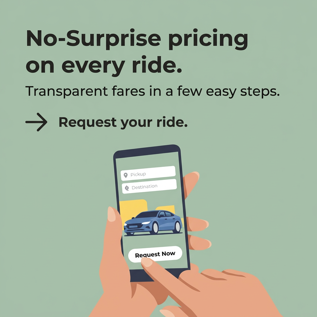
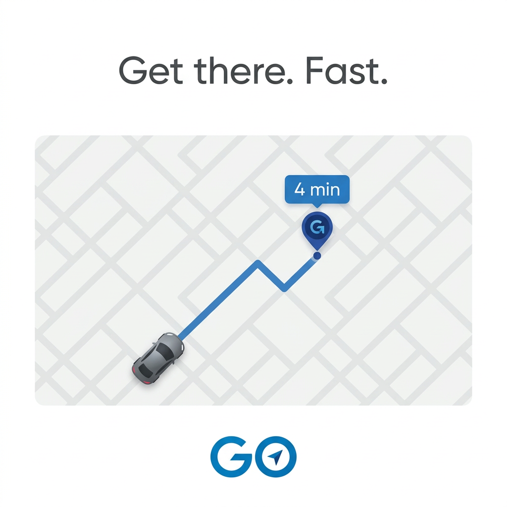
- Format: Simplified app UI illustration with a single ETA number.
- Best for: Ride-hailing, delivery and mobility apps selling speed and convenience.
- Hook: The '4 min' label – a concrete, believable wait time.
- Reuse it: Recreate your app's key screen in flat vector style and highlight your one hero metric.
Available sizes
What is a product shot ad?
A product shot ad puts the product itself at the centre of the frame, usually on a clean or styled background with little text. It works best when the packaging or product is distinctive enough to stop the scroll and the viewer already understands what it does.
See all product shot ads →Why this product shot ad works
- 01
One number, one promise
'4 min' makes 'fast' concrete and believable, which is more persuasive than any adjective.
- 02
Familiar UI language
The map, route and pin mirror what users see in navigation apps, so the ad is understood without reading.
- 03
Extreme simplicity
With only a headline, a map and a logo, the ad is legible at thumbnail size and stands out against cluttered feeds.
- 04
Logo reinforces the action
The navigation arrow inside the 'O' ties the brand name directly to movement and getting somewhere.
Full creative breakdown
Who this ad targets
The ad targets urban commuters, students, nightlife-goers and business travellers aged roughly 18–45 who need quick, on-demand transport in cities. They already use ride-hailing or navigation apps and choose largely on wait time and convenience. It is well suited to geo-targeted app-install campaigns in cities where the service launches, and to re-engagement campaigns for lapsed users. Placements near transport hubs, events and late-night hours can sharpen relevance.
Copywriting analysis
The copy is just three words split into two sentences: 'Get there. Fast.' The full stops create a staccato rhythm that mirrors the speed being promised. 'Get there' focuses on the outcome rather than the ride, while 'Fast' is the differentiator. The '4 min' label is technically UI text but works as the proof line, turning a vague claim into a specific, credible number. The brand name 'GO' is itself a command, so even the logo reads as a call to action. The danger of this brevity is lack of differentiation, so the primary text should add a reason to choose GO over competitors, such as price or a first-ride offer.
Visual design
The design is flat and vector-based with a strictly limited palette: white, light grey and one shade of blue, plus a dark grey car. The rounded map card sits centrally with generous white margins above and below, framed by the headline and logo. The route line leads the eye diagonally from the car to the pin, ending at the blue '4 min' label – the one high-contrast moment. The tilted grid adds subtle perspective and dynamism to an otherwise static, symmetrical composition.
How to adapt this template for your brand
- Identify your app's single hero metric (wait time, delivery time, savings) and make it the visual focal point.
- Recreate the relevant app screen as a flat, simplified illustration using only your brand colour plus greys.
- Use a line or path to lead the eye from the starting point to the hero metric.
- Write a two- to three-word headline split into short sentences for rhythm.
- Place your logo at the bottom centre and add a first-use offer in the primary text to differentiate.
Tips for apps & subscriptions ads on Meta
On Meta, run the square in Feed and animate it for Reels and Stories: the car moving along the route while the ETA counts down. On Google App campaigns and Demand Gen, the simple vector style scales well across sizes, so supply landscape and portrait versions too. Geo-target by city and test copy variations that mention local landmarks. Keep the minimal design and add the offer in the text, not on the image.
About this creative
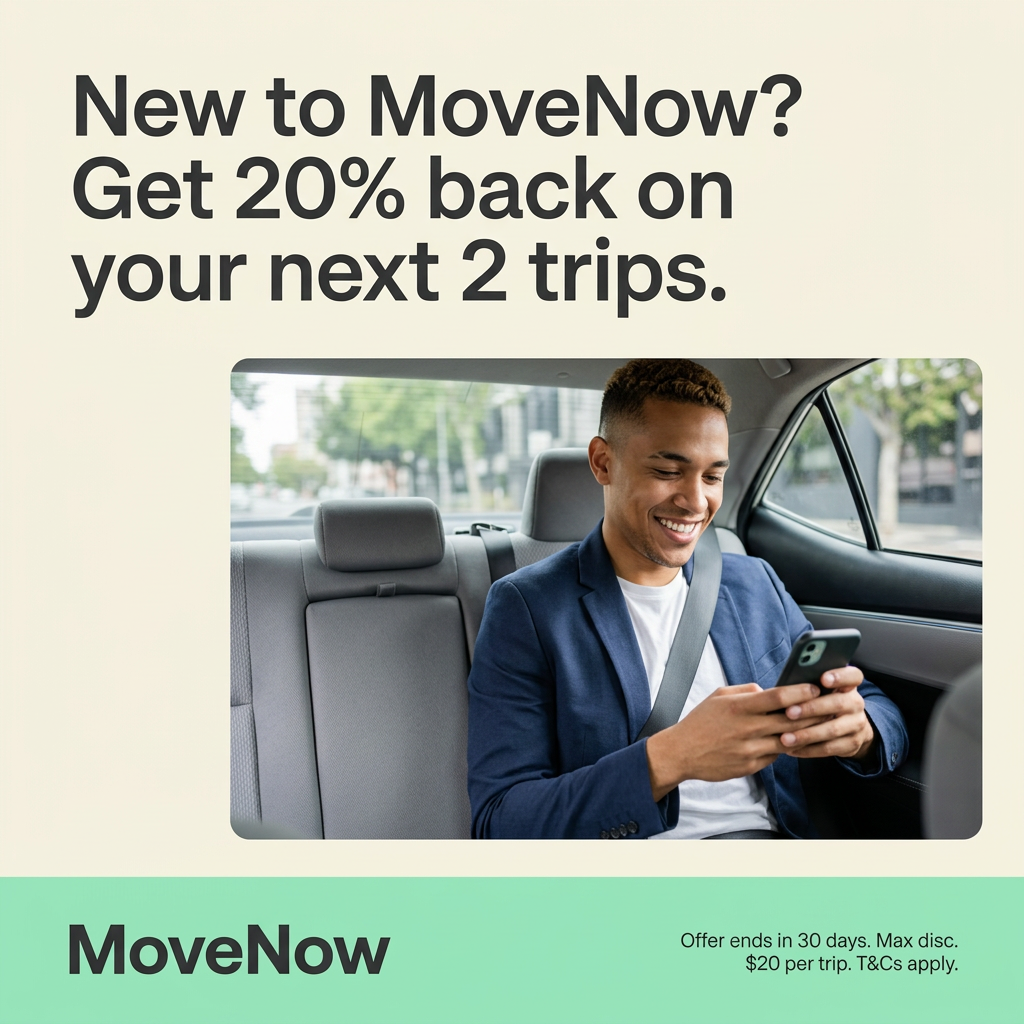
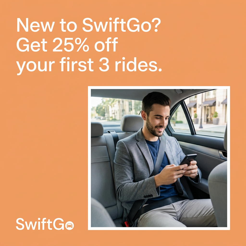
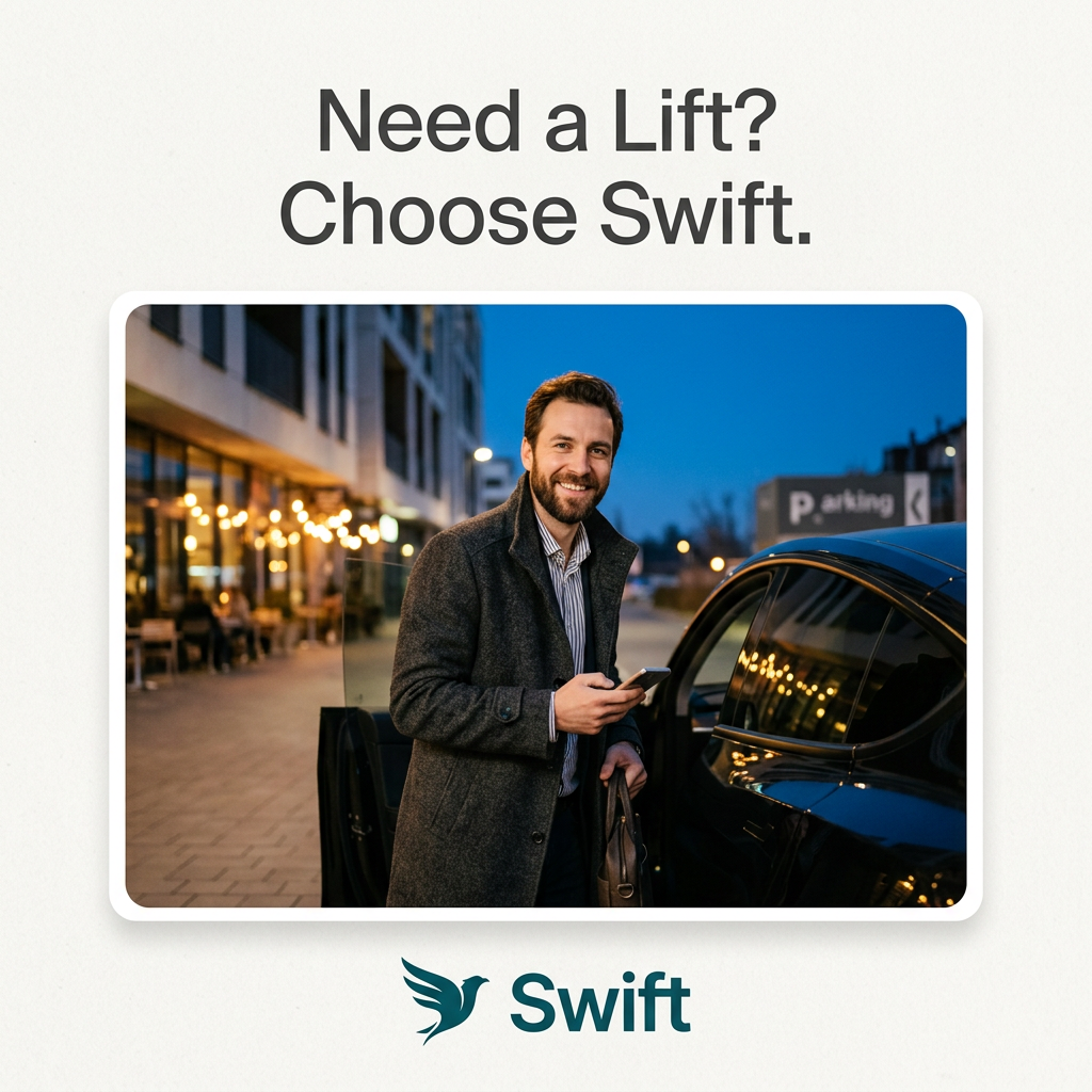
This GO creative strips a ride-hailing app down to its essential promise: speed. On a white canvas, the headline 'Get there. Fast.' sits at the top in dark grey sans-serif. The centre is a rounded card containing a flat, light-grey street grid tilted at an angle. A small grey car in the lower left is connected by a bright blue route line, with a zigzag through the blocks, to a dark blue location pin marked with a 'G'. Above the pin, a blue label reads '4 min', the single most important piece of information in the ad. At the bottom centre, the GO logo appears in bold blue, with the 'O' doubling as a compass holding a navigation arrow. There are no people, prices or extra features. The ad borrows the look of the app interface itself, so viewers instantly recognise what it does, and the clean, almost icon-like style makes it highly legible in a busy feed.
Meta ad · 1200 × 1200 · Apps & Subscriptions
Ride-Hailing App Ad Template: Minimal Map With ETA Pin
This square ad for the GO app shows a simplified street map with a car, a blue route line and a pin labelled '4 min', framed by the headline 'Get there. Fast.' and the GO logo. It is an ultra-minimal template for ride-hailing, delivery and mobility apps that want to sell speed on Meta and Google.
Added
All brand names and logos are property of their owners. Adplaylist is not affiliated with or endorsed by these brands.
Details
Ad copy
Primary text
Your ride is 4 minutes away. Open GO, set your destination and get there fast – no waiting, no hassle.
Description
Rides in minutes, wherever you are
On-image text
Get there. Fast. | 4 min | GO
Headline ideas for this template
- 1Your ride, 4 minutes away.
- 2Tap. Ride. Arrive.
- 3Less waiting, more going.
- 4The fastest way across town.
- 5Need a ride? GO.
Meta image ad specs
| Placement | Ratio | Size (px) |
|---|---|---|
| Feed | 1:1 or 4:5 | 1080×1080 / 1080×1350 |
| Marketplace | 1:1 | 1200×1200 |
| Messenger inbox | 1:1 | 1200×1200 |
| Stories & Reels | 9:16 | 1080×1920 |
This template is 1:1. Request 4:5 or 9:16 to cover all placements.
Browse similar by tag