Key takeaways
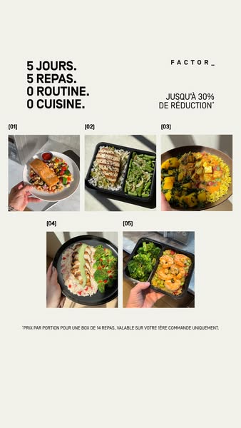
- Format: Numbered listicle grid of five UGC-style meal photos.
- Best for: Meal delivery and food brands that need to prove menu variety.
- Hook: A rhythmic 5–5–0–0 headline that sounds like a promise.
- Reuse it: Replace the five meals with five products, days or use cases, numbered in order.
Available sizes
What is a listicle ad?
A listicle ad presents the product's benefits or reasons to buy as a short numbered list, like an article headline ("5 reasons…"). The list format is easy to scan in a feed and lets one creative answer several objections at once.
See all listicle ads →Why this listicle ad works
- 01
Rhythmic headline
The repeating 5–5–0–0 structure is memorable, scannable and turns a list of benefits into a punchy chant.
- 02
Variety made visible
Five different dishes counter the fear that ready meals are repetitive or boring.
- 03
UGC authenticity
Handheld shots in natural light feel like real customers' photos, building trust over studio imagery.
- 04
Numbered structure
The [01]–[05] labels create a journey through the week and encourage the eye to scan every meal.
Full creative breakdown
Who this ad targets
This ad targets French adults aged roughly 25–45 who work full-time and dislike planning and cooking weekday meals, from young professionals to busy parents eating at home. The emphasis on 'zero routine' also speaks to people who've tried meal prep but got bored eating the same thing. The handheld, sunny photos appeal to an Instagram-savvy audience that values authentic, lifestyle-style content. The 30% first-order discount is aimed at new customers comparing Factor with supermarket ready meals and food delivery apps.
Copywriting analysis
The headline is the star: four short lines in a strict numeric rhythm. The first two lines (5 days, 5 meals) define the scope of the offer, while the last two (0 routine, 0 cooking) list what you get rid of. The contrast between 5 and 0 creates tension and makes the benefit instantly clear. Using numerals rather than words keeps it visual and fast to read. The offer line 'up to 30% off' adds urgency without crowding the hook. The legal footnote is honest about conditions, protecting trust. There is no body copy on the image; the photos carry the rest of the message.
Visual design
The design uses lots of off-white negative space, giving the ad an editorial, magazine feel that contrasts with dark ready-meal competitors. The bold black condensed headline anchors the top left, balanced by the brand and offer top right. The 3+2 grid creates a centred pyramid shape and keeps each photo large enough to read. Thin bracketed numbers act as subtle labels. Food photos are warm, sunny and handheld, adding colour and life against the neutral background.
How to adapt this template for your brand
- Write a four-line numeric headline that contrasts what you get with what you lose.
- Collect five handheld, natural-light photos of different products or variants.
- Arrange them in a 3+2 grid and number each one [01] to [05].
- Place your brand and offer opposite the headline to balance the top of the layout.
- Add a short legal footnote if your discount has conditions.
Tips for ready meals ads on Meta
Designed for Meta Stories and Reels at 9:16 with plenty of space around the edges, so it sits comfortably in safe zones. The grid format also works as a carousel: break each meal into its own card for Feed. On Reels, animate the photos appearing one by one in order. Use a soft CTA like 'Learn more' since the image is already offer-heavy, and test it against the black-background variant.
About this creative
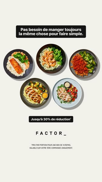
This vertical Factor ad for the French market sits on a clean off-white background. In the top left, a bold black four-line headline reads like a rhythmic chant: five days, five meals, zero routine, zero cooking. Opposite, the FACTOR_ wordmark sits above an offer of up to 30% off with an asterisk. The centre of the ad is a five-image grid, three on the first row and two on the second, each labelled [01] to [05] like a numbered list. Each photo is a handheld, UGC-style shot of a different meal: salmon with roasted vegetables, sliced chicken with rice and green beans, a vegetable curry on yellow rice, a chicken and avocado bowl, and garlic shrimp with broccoli. Hands and natural sunlight make the images feel personal and real. A small legal footnote at the bottom explains the discount applies per portion on a 14-meal box for first orders only.
Meta ad · 338 × 600 · Ready Meals
Factor Ready Meals Ad: 5 Days, 5 Meals, 0 Cooking
This Factor ready meals ad for France uses a numbered listicle grid of five UGC-style meal photos under a rhythmic four-line headline. Built as a 9:16 Meta story, it's a great template for food, meal delivery and subscription brands that want to show variety and a weekly routine in one frame.
Added
All brand names and logos are property of their owners. Adplaylist is not affiliated with or endorsed by these brands.
Details
Ad copy
Primary text
5 jours, 5 repas, zéro cuisine. Découvrez une semaine de plats Factor variés, prêts en quelques minutes. Jusqu'à 30% de réduction sur votre première box.
Description
Jusqu'à 30% de réduction sur votre 1ère box
On-image text
5 JOURS. 5 REPAS. 0 ROUTINE. 0 CUISINE. | FACTOR_ | JUSQU'À 30% DE RÉDUCTION* | [01] [02] [03] [04] [05] | *PRIX PAR PORTION POUR UNE BOX DE 14 REPAS, VALABLE SUR VOTRE 1ÈRE COMMANDE UNIQUEMENT.
Headline ideas for this template
- 15 jours, 5 repas, 0 prise de tête
- 2Une semaine de plats sans cuisiner
- 3Fini la routine, place au goût
- 4Votre semaine de repas, déjà prête
- 5Jusqu'à 30% sur votre première box
Meta image ad specs
| Placement | Ratio | Size (px) |
|---|---|---|
| Feed | 1:1 or 4:5 | 1080×1080 / 1080×1350 |
| Marketplace | 1:1 | 1200×1200 |
| Messenger inbox | 1:1 | 1200×1200 |
| Stories & Reels | 9:16 | 1080×1920 |
This template is 1:1. Request 4:5 or 9:16 to cover all placements.
Browse similar by tag