Key takeaways
- Format: Split layout: portrait on one side, large serif quote on the other.
- Best for: Wellness brands testing a premium, editorial take on testimonials.
- Hook: Direct eye contact paired with a frank first-person quote.
- Reuse it: Swap portrait and quote; keep the 50/50 split and serif typography.
Available sizes
What is a testimonial ad?
A testimonial ad uses a real customer's words, such as a review, quote or comment, as the main message. It answers a buyer's doubts with social proof rather than brand claims, and works especially well when the testimonial is specific about who the customer is and what changed for them.
See all testimonial ads →Why this testimonial ad works
- 01
Eye contact builds trust
A full face looking at the viewer feels like a real person vouching for the product.
- 02
Quote gets its own space
Placing text on a solid panel makes the testimonial highly legible on mobile.
- 03
Editorial typography
Large serif type with an italic accent feels premium and magazine-like.
- 04
Easy A/B partner
Same quote, different layout makes it a clean test against the close-up version.
Full creative breakdown
Who this ad targets
Women aged 25–45 who care about intimate health and prefer brands that feel modern and premium rather than medical. They may have tried other remedies and want a simple daily habit. The editorial style appeals to readers of wellness and lifestyle media who respond to confident, design-led brands. Suitable for prospecting and for retargeting site visitors who need a trust signal.
Copywriting analysis
The copy matches the close-up version: a blunt first-person quote with 'finally' emphasised, signalling relief after a long search. The serif styling makes the same words feel more considered and less shocking, which may help with brand perception. The product label is in caps for quick category recognition. As with version one, the disclaimer phrase about 'generalised interpretations' weakens the authenticity of the testimonial; using a verbatim, verified review and naming the source, such as a verified buyer, would be stronger and safer.
Visual design
A vertical 50/50 split pairs a sage-green photo side with a solid burnt-orange text side. The portrait sits in a rounded rectangle, and thin dark lines on the orange panel create a subtle grid. The quote is a large white serif, left-aligned with an italic accent. A peach-toned disclaimer band runs along the bottom across both halves.
How to adapt this template for your brand
- Pick a real customer quote and a portrait with direct eye contact and the product in use.
- Split the canvas in two: photo on one side, solid brand colour on the other.
- Set the quote in a large serif and italicise the most emotional word.
- Add a small product label and an accurate disclaimer.
- Run it as an A/B test against a close-up variant with the same quote.
Tips for health & fitness ads on Meta
On Meta, avoid copy that addresses the viewer's own condition directly ('Do you have…?'), as this breaks the personal attributes policy. Intimate health ads may face extra review, so keep an alternative with a softer quote. This split layout also works well cropped to 4:5. On TikTok, recreate it as a split-screen video with a creator reading the review aloud.
About this creative
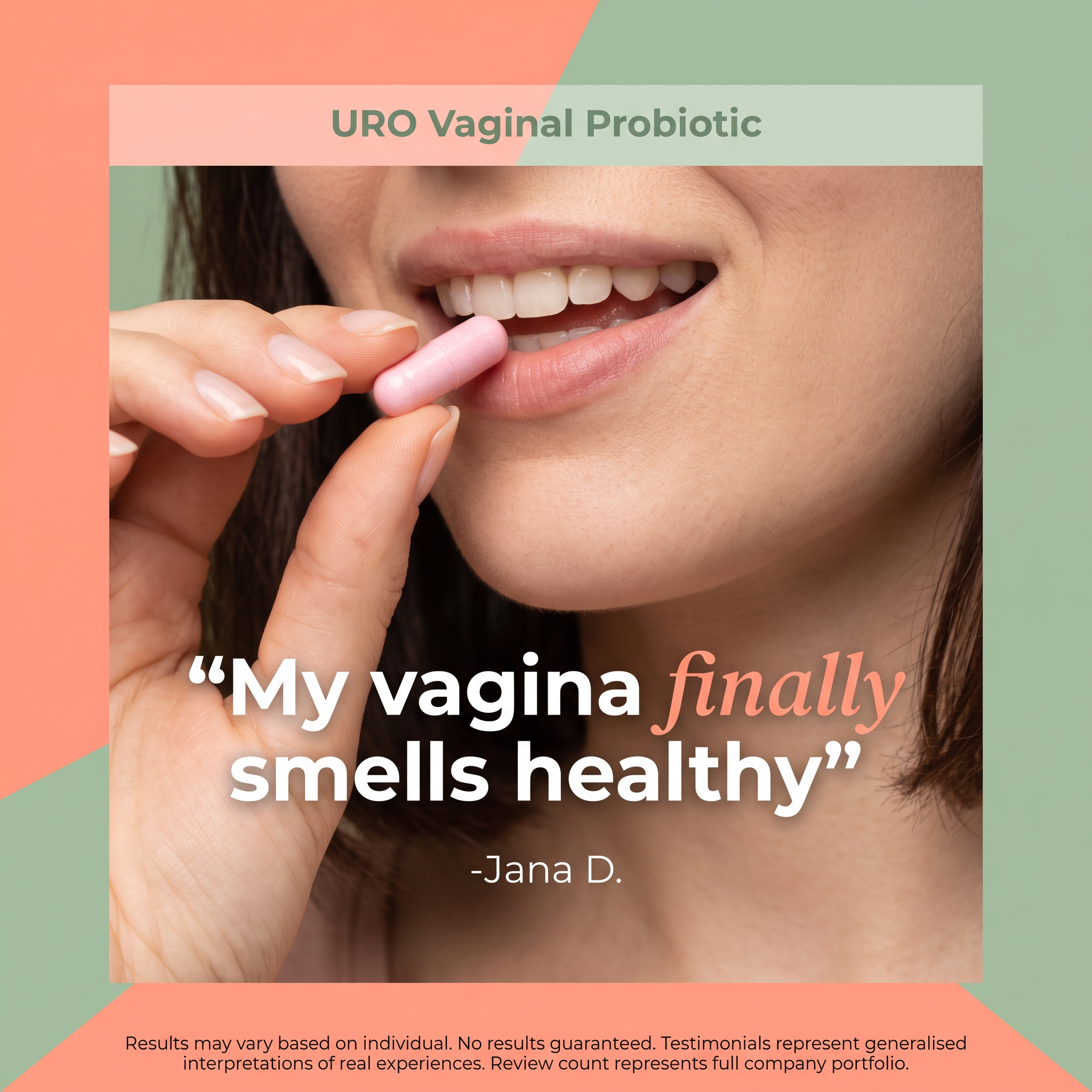
The square is divided vertically. On the left, against a sage-green background, a rounded portrait shows a smiling woman with dark hair holding a pink capsule to her teeth, looking directly at the camera. A burnt-orange label at the top left reads 'URO VAGINAL PROBIOTIC' in dark green capitals. The right half is a solid burnt-orange panel with thin dark grid lines, carrying a large white serif quote, 'My vagina finally smells healthy', with 'finally' in italic, and the attribution '-Jana D.' beneath. A disclaimer strip runs across the bottom. Compared with the close-up version, this layout shows the full face and eye contact, which builds trust and connection, while the quote gets its own clean space, making it easier to read. The serif type and grid lines give it an editorial, almost magazine-cover quality, positioning the brand as premium and confident rather than clinical.
Meta ad · 1200 × 1200 · Health & Fitness
Women's Probiotic Testimonial Ad With Split Layout
This square women's health ad splits the frame between a smiling woman taking a pink capsule and a large serif customer quote on a burnt-orange panel. It is a testimonial format with an editorial magazine feel. It suits supplement brands testing a more premium look on Meta and TikTok.
Added
All brand names and logos are property of their owners. Adplaylist is not affiliated with or endorsed by these brands.
Details
Ad copy
Primary text
Tried everything? URO's daily vaginal probiotic is made to support natural balance and everyday freshness. One capsule a day, no fuss. Results may vary.
Description
Vaginal probiotic for daily feminine health.
On-image text
URO VAGINAL PROBIOTIC | “My vagina finally smells healthy” -Jana D. | Results may vary based on individual. No results guaranteed. Testimonials represent generalised interpretations of real experiences. Review count represents full company portfolio.
Headline ideas for this template
- 1Real women, real results
- 2The daily habit for feeling fresh
- 3Your microbiome, balanced
- 4Confidence you can feel
- 5One capsule. Every day. Finally.
Meta image ad specs
| Placement | Ratio | Size (px) |
|---|---|---|
| Feed | 1:1 or 4:5 | 1080×1080 / 1080×1350 |
| Marketplace | 1:1 | 1200×1200 |
| Messenger inbox | 1:1 | 1200×1200 |
| Stories & Reels | 9:16 | 1080×1920 |
This template is 1:1. Request 4:5 or 9:16 to cover all placements.