Key takeaways
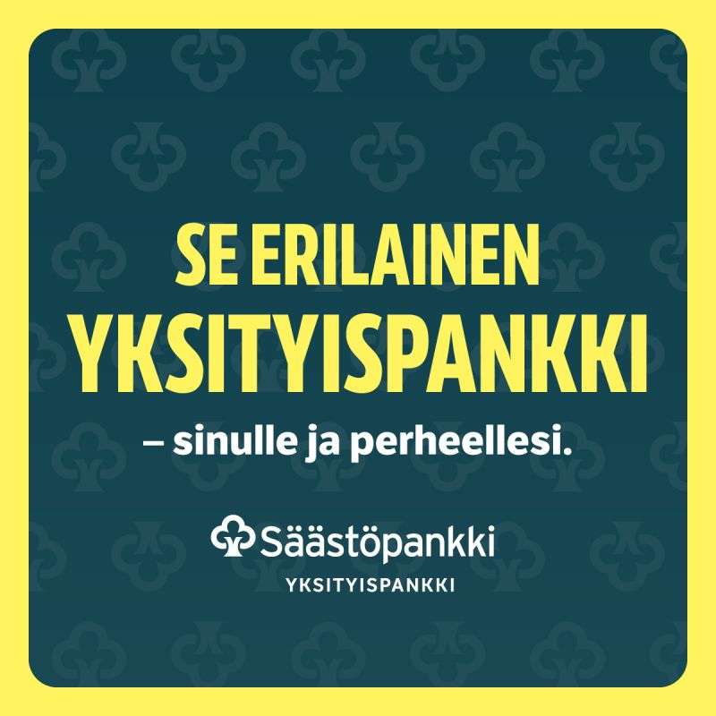
- Format: Typographic brand statement on a patterned brand-colour background.
- Best for: Banks, financial services and brands repositioning a premium service.
- Hook: 'Se erilainen' (the different one) claims a distinct position in one phrase.
- Reuse it: Write one confident positioning line and set it huge on your brand colours and pattern.
Available sizes
What is a feature callout ad?
A feature callout ad is a static image that shows a single product with short text labels pointing to its key features or benefits, usually joined to the product by thin lines. It explains several selling points at a glance without a long caption, which is why it's common for supplements, skincare, electronics and kitchenware.
See all feature callouts ads →Why this feature callouts ad works
- 01
Bold positioning
Calling itself 'the different private bank' invites comparison and suggests an alternative to impersonal big banks.
- 02
Family angle
'Sinulle ja perheellesi' widens private banking from individual wealth to family security and legacy.
- 03
Instant brand recognition
Yellow, teal and the money-tree pattern are unmistakably Säästöpankki even at a glance.
- 04
High contrast
Yellow on dark teal is extremely readable and stands out in LinkedIn's white feed.
Full creative breakdown
Who this ad targets
The ad targets affluent individuals in Finland: business owners, entrepreneurs, executives, senior professionals and families with significant savings or investable assets. They may currently bank with large national banks and want more personal, locally rooted service. The family angle speaks to people thinking about generational wealth, succession planning and long-term security. LinkedIn targeting by seniority and company ownership helps reach this wealthy, professional segment.
Copywriting analysis
The copy is short and confident. 'SE ERILAINEN' uses a colloquial, almost proud Finnish expression meaning 'the different one', which feels friendly rather than elitist. 'YKSITYISPANKKI' names the service clearly. The em-dash line 'sinulle ja perheellesi' softens the premium positioning and adds warmth by including the family. There are no claims about returns or fees, which keeps it compliant and brand-focused. The message relies on curiosity: what exactly makes it different? The landing page needs to answer that promise convincingly.
Visual design
The design is a framed card: yellow border, rounded dark teal panel and tone-on-tone money-tree pattern. Condensed bold capitals fill the width for maximum impact. White is reserved for the subline and logo, creating clear hierarchy: statement, audience, brand. The faint pattern adds texture and brand depth without distracting. Centre alignment gives a stable, trustworthy feel, appropriate for a bank.
How to adapt this template for your brand
- Write a single positioning line that claims how you're different.
- Add a short subline naming who it's for.
- Set the text huge in your brand typeface on a brand-colour background.
- Add a subtle pattern from your logo or symbol for texture.
- Test this typographic version against a photo version with a real advisor.
Tips for banking ads on LinkedIn
On LinkedIn, target business owners, C-level executives and senior professionals in Finland, and consider income or seniority filters. Use the link ad format to send people to a private banking page with an appointment booking. Check financial advertising rules and add required disclaimers in the primary text. Retarget visitors with an advisor-led video or client testimonial to build trust over time.
About this creative
This square LinkedIn link ad from Säästöpankki, a Finnish savings bank group, promotes its private banking service, Yksityispankki. The creative is purely typographic. A dark teal rounded square sits inside a bright yellow border, creating a framed, almost card-like look. The teal background is covered with a subtle repeating pattern of the bank's 'rahapuu' (money tree) symbol, the clover-like tree that appears in the logo. In the centre, massive condensed yellow capitals read 'SE ERILAINEN YKSITYISPANKKI', meaning 'The different private bank'. Below, a white bold line adds '– sinulle ja perheellesi' ('for you and your family'). At the bottom, the white Säästöpankki logo with the money-tree icon sits above 'YKSITYISPANKKI' in spaced capitals. There are no photos, people or product details. The ad relies on brand colour recognition and a confident positioning statement to separate Säästöpankki from larger, more corporate private banks.
LinkedIn ad · 338 × 600 · Banking
Private Banking Ad Example: Säästöpankki Yksityispankki
This Säästöpankki ad positions its private banking service as different and family-focused. The typographic format uses bold yellow capitals on a dark teal background with the bank's money-tree symbol as a pattern. Use it as a template for financial services and brand positioning ads that rely on a strong statement.
Added
All brand names and logos are property of their owners. Adplaylist is not affiliated with or endorsed by these brands.
Details
Ad copy
Primary text
Yksityispankkipalvelut, joissa sinä ja perheesi olette keskiössä. Säästöpankki Yksityispankki tarjoaa henkilökohtaista varainhoitoa ja neuvontaa – lähellä ja pitkäjänteisesti.
Description
Säästöpankki Yksityispankki
On-image text
Se erilainen yksityispankki – sinulle ja perheellesi. Säästöpankki Yksityispankki
Headline ideas for this template
- 1Yksityispankki, joka tuntee perheesi
- 2Varainhoitoa henkilökohtaisesti
- 3Erilainen yksityispankki – lähellä sinua
- 4Varallisuutesi, perheesi tulevaisuus
- 5Tutustu Säästöpankin yksityispankkiin