Key takeaways
- Format: Side-by-side 'you vs competitor' comparison.
- Best for: Agencies selling ranking or visibility improvements.
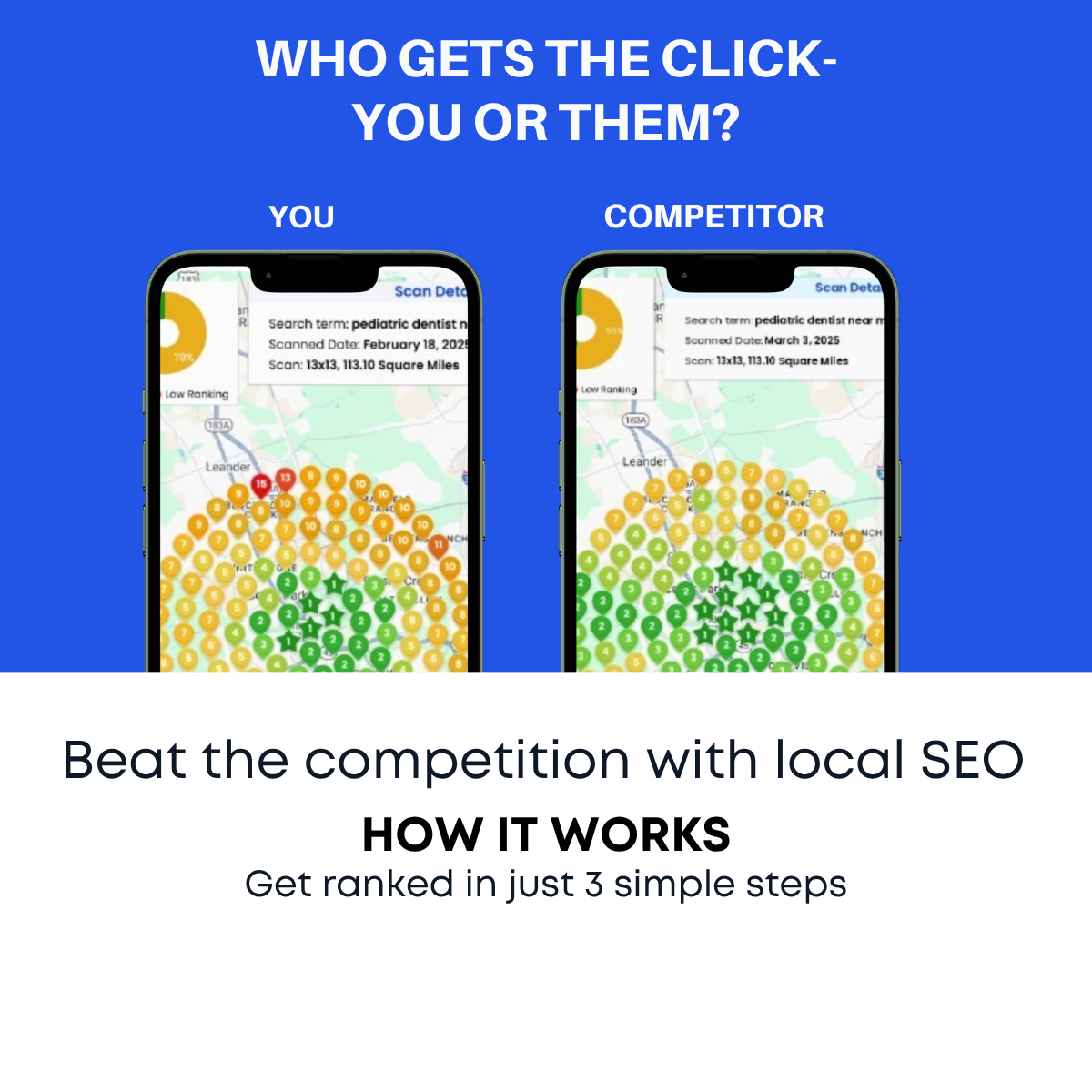
- Hook: 'Who gets the click – you or them?' triggers competitive pride.
- Reuse it: Compare your audience's current state to their best competitor's.
Available sizes
What is a comparison ad?
A comparison ad sets the product against an alternative, such as a competitor, the old way of doing things or a cheaper option, usually in a two-column layout or table. It helps buyers who are already weighing options see quickly why this one is the better choice.
See all comparison ads →Why this comparison ad works
- 01
Personal competitive frame
Labelling the losing phone 'You' makes the viewer feel personally behind their rivals.
- 02
Traffic-light colour logic
Red #11 and green #1 are understood instantly, with no reading required.
- 03
Direct question headline
Asking 'you or them?' invites self-reflection and pulls the viewer into the story.
- 04
Built-in next step
'How it works' and '3 simple steps' tease a clear process, encouraging a click or swipe.
Full creative breakdown
Who this ad targets
This ad targets competitive local business owners in crowded categories, such as dentists, lawyers, contractors, salons, gyms and restaurants, who know rivals nearby and keep an eye on them. It especially appeals to owners who have searched for their own service and noticed a competitor ranking higher. The direct comparison also works for marketing managers who need to justify SEO budget internally by showing competitive gaps.
Copywriting analysis
The headline "WHO GETS THE CLICK- YOU OR THEM?" is a direct question that forces the viewer to choose a side, and nobody wants to be 'them' losing. 'The click' keeps the language simple and outcome-focused. The labels YOU and COMPETITOR personalise the visual. "Beat the competition with local SEO" introduces the solution with an active verb. The how-it-works line adds a low-effort promise. A small typo-style issue, a hyphen instead of a dash after CLICK, could be tidied up for polish.
Visual design
The frame is split into a blue top two-thirds and a white bottom third. Two identical phone mockups sit side by side, so the only difference is the pin colour and number, which makes the comparison pop. The large red and green pins are the focal points. White bold uppercase text on blue gives strong contrast, while the white bottom section uses dark type in a rounded geometric font for the solution message.
How to adapt this template for your brand
- Choose one clear metric your audience is judged on, such as ranking, reviews or speed.
- Show two identical mockups side by side labelled You and Competitor.
- Use red for the viewer's weak result and green for the competitor's strong result.
- Write a direct question headline that asks who wins.
- Add a short solution line and a process teaser in a contrasting bottom band.
Tips for saas ads on Meta
On Meta, use this as the opening card of a carousel, followed by your three-step process and a free scan offer. It works well for cold prospecting to small business owners in competitive verticals. On LinkedIn, run it as Sponsored Content targeting owners and marketing roles at local businesses. Test a version personalised by industry, such as 'You vs the dentist down the street', and create a 9:16 version for Stories.
About this creative
This creative uses a direct you-versus-them comparison to sell local SEO. The top half is a bright royal-blue panel with the white uppercase question "WHO GETS THE CLICK- YOU OR THEM?". Below, two phones show Google-style city maps side by side. The left phone, labelled YOU, displays a large red map pin with the number 11, signalling a poor local ranking. The right phone, labelled COMPETITOR, shows a green pin with the number 1, the top spot. The red and green instantly communicate bad versus good. The bottom white section carries the solution: "Beat the competition with local SEO", followed by a bold "HOW IT WORKS" and "Get ranked in just 3 simple steps", suggesting this is the first frame of a carousel or a teaser for a process explanation. The ad taps into competitive pride and fear of losing customers to rivals, which are powerful motivators for local business owners.
Meta ad · 1200 × 1200 · SaaS
Local SEO Ad Example: Who Gets the Click – You or Them?
This square local SEO ad places two phones side by side: one labelled You with a red #11 map pin, one labelled Competitor with a green #1 pin. It turns competitive anxiety into a clear visual, making it a strong comparison template for agencies selling Google Maps ranking to local businesses on Meta and LinkedIn.
Added
All brand names and logos are property of their owners. Adplaylist is not affiliated with or endorsed by these brands.
Details
Ad copy
Primary text
When someone searches nearby, the #1 spot gets the click. Right now, are you #11 or #1? We help local businesses climb Google Maps in 3 simple steps.
Description
Beat the competition with local SEO
On-image text
WHO GETS THE CLICK- YOU OR THEM? | YOU | COMPETITOR | 11 | 1 | Beat the competition with local SEO | HOW IT WORKS | Get ranked in just 3 simple steps
Headline ideas for this template
- 1Are You #1 or #11 on Google Maps?
- 2Your Competitor Is Getting Your Clicks
- 3Win the Local Search Race
- 4See How You Rank vs Competitors
- 5Move From Page Two to Top Three
Meta image ad specs
| Placement | Ratio | Size (px) |
|---|---|---|
| Feed | 1:1 or 4:5 | 1080×1080 / 1080×1350 |
| Marketplace | 1:1 | 1200×1200 |
| Messenger inbox | 1:1 | 1200×1200 |
| Stories & Reels | 9:16 | 1080×1920 |
This template is 1:1. Request 4:5 or 9:16 to cover all placements.
Browse similar by tag