Key takeaways
- Format: Pain-point equation headline with a problem visual.
- Best for: Agencies selling to phone-driven local service businesses.
- Hook: 'Missed calls = missed customers' makes lost revenue tangible.
- Reuse it: Swap 'missed calls' for the lost metric your audience cares about.
Available sizes
What is a feature callout ad?
A feature callout ad is a static image that shows a single product with short text labels pointing to its key features or benefits, usually joined to the product by thin lines. It explains several selling points at a glance without a long caption, which is why it's common for supplements, skincare, electronics and kitchenware.
See all feature callouts ads →Why this feature callouts ad works
- 01
Tangible pain
Missed call notifications are a feeling every business owner knows, so the problem lands instantly.
- 02
Equation headline
The '=' structure makes cause and effect obvious and easy to remember.
- 03
Problem vs solution colour
Alarming red for the problem and confident blue for the solution create visual tension.
- 04
Revenue framing
Linking ranking to revenue speaks to owners who care about money, not SEO jargon.
Full creative breakdown
Who this ad targets
This ad targets owners and managers of local businesses that depend on inbound calls, such as plumbers, electricians, HVAC companies, dentists, law firms, auto repair shops and restaurants. They may not care about SEO itself but care deeply about the phone ringing and bookings coming in. The ad suits owners who have noticed a slowdown in leads or see competitors winning more local customers, and who respond to direct, outcome-focused messaging.
Copywriting analysis
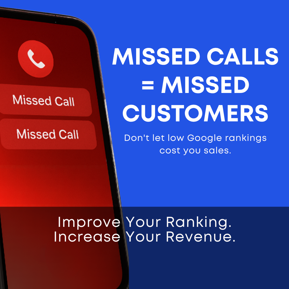
The headline "MISSED CALLS = MISSED CUSTOMERS" uses an equation to compress cause and effect into four words, and the repetition of 'missed' adds rhythm. The subline "Don't let low Google rankings cost you sales" bridges the gap, connecting a visible symptom to the hidden cause. The bottom line uses two parallel imperatives, Improve Your Ranking and Increase Your Revenue, which create a clear promise. The copy avoids jargon entirely. Adding a specific number, such as how many searches a business misses, could strengthen credibility.
Visual design
The layout splits the frame diagonally: a red-glowing phone on the left and a saturated royal-blue panel on the right. Large white uppercase sans-serif headline text creates maximum contrast and legibility. A navy band at the bottom anchors the solution message and visually separates problem from promise. The red-on-blue colour clash is eye-catching in feeds. Rounded geometric fonts keep it modern and approachable.
How to adapt this template for your brand
- Identify the visible symptom your audience feels, such as missed calls, empty tables or no bookings.
- Show that symptom as a phone or app screen, styled in an alarming colour like red.
- Write an equation headline that links the symptom to lost revenue in four to six words.
- Add a subline naming the hidden cause your service fixes.
- Close with two parallel benefit statements in a contrasting band at the bottom.
Tips for saas & tech ads on Meta
On Meta, run this for cold prospecting to small business owners using interests like small business and specific trades, with a lead form or free audit offer. On Google Display and Demand Gen, the bold colours stand out in placements beside content. Add a logo before launch for brand recall. Create a 9:16 version with the phone on top and text below for Stories. Test it against a softer benefit-led ad to see which framing drives more leads.
About this creative
This creative sells local SEO by turning a technical problem into a money problem. The left side shows a tilted smartphone with a glowing red screen, a red phone icon and two "Missed Call" notification bars. The right side is a bold royal-blue panel with large white uppercase text: "MISSED CALLS = MISSED CUSTOMERS". A smaller line below explains the link: low Google rankings can cost you sales. A darker navy band across the bottom carries the solution in two short sentences: Improve Your Ranking. Increase Your Revenue. The red and blue colour clash creates tension between problem and solution. The equation format is quick to read and easy to remember. There is no logo or button on the image, so the CTA must come from the ad's primary text and button. The ad works for cold and warm audiences of phone-dependent local businesses who measure success by calls and bookings.
Meta ad · 1200 × 1200 · SaaS & Tech
Local SEO Ad Example: Missed Calls = Missed Customers
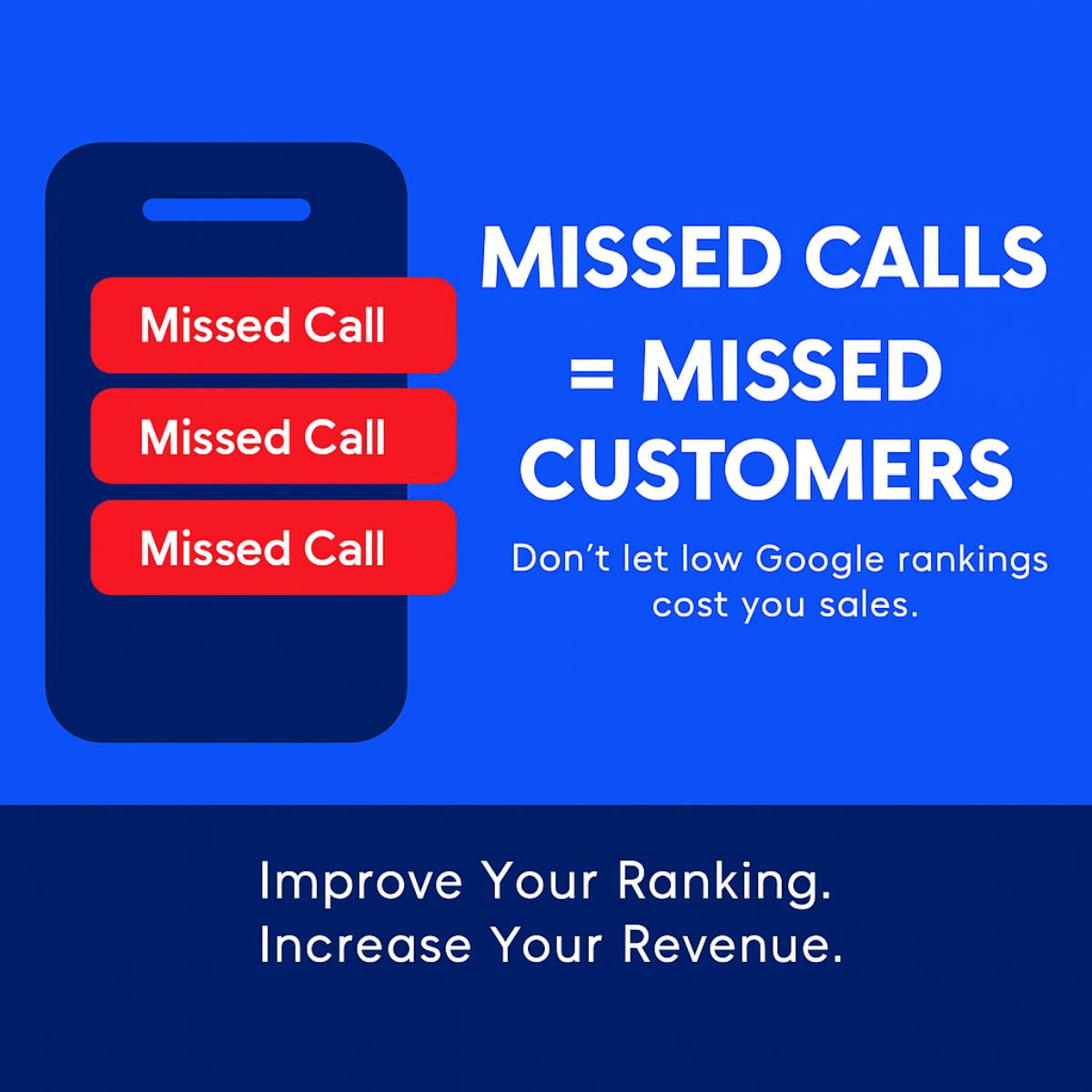
This square local SEO ad uses a red phone screen full of missed-call notifications against a bold blue background to link low Google rankings with lost revenue. It is a strong pain-point template for agencies selling to phone-driven local businesses such as trades, clinics and restaurants on Meta and Google Display.
Added
All brand names and logos are property of their owners. Adplaylist is not affiliated with or endorsed by these brands.
Details
Ad copy
Primary text
Every missed call is a customer who found someone else. If your business isn't showing up on Google, your phone stays quiet. Let's fix your ranking and get it ringing again.
Description
Improve your Google ranking
On-image text
Missed Call | Missed Call | MISSED CALLS = MISSED CUSTOMERS | Don't let low Google rankings cost you sales. | Improve Your Ranking. Increase Your Revenue.
Headline ideas for this template
- 1Is Your Phone Ringing Enough?
- 2Low Rankings Are Costing You Calls
- 3Turn Searches Into Phone Calls
- 4Stop Losing Customers to Competitors
- 5More Calls Start With Better Rankings
Meta image ad specs
| Placement | Ratio | Size (px) |
|---|---|---|
| Feed | 1:1 or 4:5 | 1080×1080 / 1080×1350 |
| Marketplace | 1:1 | 1200×1200 |
| Messenger inbox | 1:1 | 1200×1200 |
| Stories & Reels | 9:16 | 1080×1920 |
This template is 1:1. Request 4:5 or 9:16 to cover all placements.
Browse similar by tag