Key takeaways
- Format: Three-column comparison with crosses vs ticks
- Best for: SaaS features that replace a manual or built-in process
- Hook: A familiar choice framed as a form you can tick
- Reuse it: Swap the columns for your two weakest alternatives and your product
Available sizes
What is a comparison ad?
A comparison ad sets the product against an alternative, such as a competitor, the old way of doing things or a cheaper option, usually in a two-column layout or table. It helps buyers who are already weighing options see quickly why this one is the better choice.
See all comparison ads →Why this comparison ad works
- 01
Asymmetric scoring
Two crosses-only columns next to five ticks makes the choice obvious without a single claim of superiority.
- 02
Includes the 'free' option
Naming WordPress's own auto-updates pre-empts the 'I already have this' objection.
- 03
Risk-free offer
The 'Free for 30 days' pill lowers the barrier right where the eye lands last.
- 04
UI-native look
Radio-button cards feel like a settings screen, which suits a technical audience.
Full creative breakdown
Who this ad targets
WordPress site owners, freelancers and agencies who manage plugin updates themselves and have been burned by an update breaking a site. They know what plugins and themes are, have probably tried native auto-updates, and care about uptime and speed more than price. Likely already on a hosting plan and looking for less maintenance, which makes a 30-day free add-on an easy yes.
Copywriting analysis
The headline is neutral – 'your options' – which invites comparison instead of pushing a sale. Each negative bullet is a short, concrete fear: breaking, slow, time-consuming, can't pinpoint. The Kinsta column switches to verbs that describe a process (check, create, compare, rollback, notify), showing the tool doing the work for you. Numbers stay minimal; the only offer is 'free for 30 days'. The footer tagline 'Simply better hosting' anchors the brand without competing with the comparison. The CTA 'Learn more' is soft, matching an audience that will read before committing.
Visual design
Warm off-white background, a large thin serif headline and sans-serif body give an editorial, premium tone. Three equal white cards with subtle borders keep the layout fair-looking, so the tick count does the work. Red-orange crosses and bright green ticks provide the only strong colour besides the orange CTA. The black footer bar grounds the composition and repeats Kinsta's brand colours. Plenty of whitespace keeps it readable in a feed at small size.
How to adapt this template for your brand
- List the two most common alternatives your audience uses today, including the free or default one
- Write 2–3 short pain points for each alternative using concrete fears
- List 4–5 process verbs that describe what your product does automatically
- Add one risk-reducer badge (free trial, money-back) to your column
- Keep your brand and CTA in a separate footer bar so the comparison stays clean
Tips for web hosting ads on Meta
Works best in Meta and LinkedIn feeds where technical decision makers scroll; the square format fits both. The text density means it needs a stop-and-read moment, so pair it with a short primary text that names the pain. On Google Display, simplify to two columns. Retarget visitors of WordPress maintenance or update content with this creative, as they are already problem-aware.
About this creative
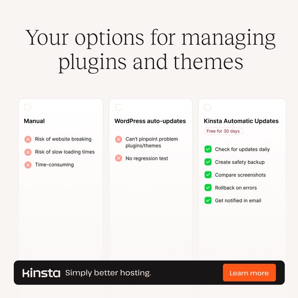
A light, off-white square ad with a large serif headline asking the viewer to consider their options for managing WordPress plugins and themes. Below sit three equal cards styled like selectable radio options. The first, Manual, lists three pain points with red cross icons: risk of the site breaking, slower loading times and wasted time. The second, WordPress auto-updates, has two red crosses: you can't pinpoint the problem plugin and there's no regression test. The third card, Kinsta Automatic Updates, carries a small red 'Free for 30 days' pill and five green ticks covering daily checks, safety backups, screenshot comparison, automatic rollback and email notifications. A black footer bar holds the Kinsta wordmark, the 'Simply better hosting' tagline and an orange 'Learn more' button. The design looks like a product UI, making the decision feel like ticking a box rather than reading an ad, and the unequal number of ticks does the persuading.
Meta ad · 338 × 600 · Web Hosting
Kinsta Comparison Ad: Manual vs Auto vs Automatic Updates
This Kinsta ad uses a clean three-column comparison to sell its Automatic Updates add-on for WordPress sites. Two weak options get red crosses, Kinsta gets five green ticks. Use it as a template for any SaaS feature that replaces a manual chore or a basic built-in alternative.
Added
All brand names and logos are property of their owners. Adplaylist is not affiliated with or endorsed by these brands.
Details
Ad copy
Primary text
Manual updates break sites. WordPress auto-updates can't tell you what went wrong. Kinsta Automatic Updates checks daily, backs up first, compares screenshots and rolls back on errors. Try it free for 30 days.
Description
Kinsta Automatic Updates – free for 30 days
On-image text
Your options for managing plugins and themes | Manual: Risk of website breaking, Risk of slow loading times, Time-consuming | WordPress auto-updates: Can't pinpoint problem plugins/themes, No regression test | Kinsta Automatic Updates – Free for 30 days: Check for updates daily, Create safety backup, Compare screenshots, Rollback on errors, Get notified in email | kinsta Simply better hosting. | Learn more
Headline ideas for this template
- 1Stop letting plugin updates break your site
- 2Three ways to update WordPress. Only one is safe.
- 3Updates that test themselves
- 4Your WordPress updates, on autopilot
- 5Backup, update, compare, rollback – automatically
Meta image ad specs
| Placement | Ratio | Size (px) |
|---|---|---|
| Feed | 1:1 or 4:5 | 1080×1080 / 1080×1350 |
| Marketplace | 1:1 | 1200×1200 |
| Messenger inbox | 1:1 | 1200×1200 |
| Stories & Reels | 9:16 | 1080×1920 |
This template is 1:1. Request 4:5 or 9:16 to cover all placements.
Browse similar by tag