Key takeaways
- Format: Feature callouts with a floating product shot in 4:5
- Best for: Premium tech or medical device launches building awareness
- Hook: A category claim: 'A new standard in hearing'
- Reuse it: Replace the claim and the three feature words with your product's top benefits
Available sizes
What is a feature callout ad?
A feature callout ad is a static image that shows a single product with short text labels pointing to its key features or benefits, usually joined to the product by thin lines. It explains several selling points at a glance without a long caption, which is why it's common for supplements, skincare, electronics and kitchenware.
See all feature callouts ads →Why this feature callouts ad works
- 01
Category-leadership claim
'A new standard' positions the product as the benchmark, which signals quality without listing specs.
- 02
Three-word rhythm
'Intelligent. Automatic. Premium.' is easy to scan and memorable, and each word answers a common hearing aid worry.
- 03
Products look like tech, not medicine
Floating the devices on a pastel gradient makes hearing aids feel modern and desirable, reducing stigma.
- 04
Launch sticker
The peeling 'NEW' sticker adds novelty and guides the eye to the end of the layout.
Full creative breakdown
Who this ad targets
This ad targets US adults aged roughly 50–75 with mild to moderate hearing loss who are considering their first hearing aids or upgrading an older pair. They value discretion and modern design and dislike anything that feels clinical or 'old'. It also reaches tech-savvy buyers who compare features and want a premium product that works automatically without constant adjusting.
Copywriting analysis
The copy works on three levels. The headline makes a big positioning claim in five words, giving the brand authority. The italic line delivers three benefits in three words: 'Intelligent' suggests smart sound processing, 'Automatic' removes the fear of fiddly controls, and 'Premium' justifies the price. The final line names the product clearly so viewers can search for it later. The tone is confident and calm, avoiding medical jargon and any mention of hearing loss itself, which keeps it positive and compliant. Adding a short proof point or a soft CTA such as 'Try it risk-free' could help move viewers from interest to action.
Visual design
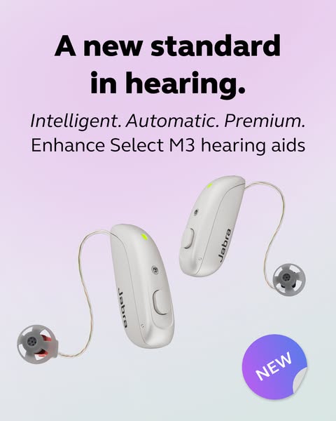
The layout is centred and top-heavy, with bold black headline type followed by lighter italic and regular lines, creating a clear typographic hierarchy. The white devices contrast gently with the lilac-to-mint gradient and cast soft shadows for depth. The diagonal placement adds movement, and the gradient 'NEW' sticker repeats the background colours in a stronger tone to tie the design together.
How to adapt this template for your brand
- Write a short headline that claims a position in your category.
- Add three one-word benefits in italics that answer your buyers' main objections.
- Name the product clearly on its own line so viewers can find it later.
- Show the product floating at an angle on a soft gradient that fits your brand palette.
- Add a 'NEW' sticker or badge in a corner if you are launching.
Tips for hearing care ads on Meta
Best in Meta feed placements at 4:5, where it takes up maximum screen height. As a hearing care ad, avoid copy that implies the viewer has hearing loss to stay within Meta's personal attributes policy. Run it as a launch awareness ad with broad 50+ targeting, then retarget engagers with an offer or trial version. A short carousel or video showing the devices on the ear can complement it.
About this creative
This 4:5 Jabra ad introduces the Enhance Select M3 hearing aids with a confident headline: 'A new standard in hearing.' Set in heavy black type at the top, it makes a category-leadership claim straight away. Below it, three italic words, 'Intelligent. Automatic. Premium.', act as compact feature callouts, followed by the product name in regular weight. The two receiver-in-ear hearing aids float diagonally across the centre, angled to show their slim shape, buttons and wires, which makes them look light and modern rather than medical. The background is a soft gradient from lilac to pale mint, giving a calm, fresh, almost consumer-tech mood. In the bottom-right corner, a peeling purple-to-blue 'NEW' sticker adds a playful launch signal and draws the eye to complete the reading path. There is no price or offer; the ad relies entirely on product appeal and positioning, which suits a premium launch aimed at building awareness and consideration.
Meta ad · 338 × 600 · Hearing Care
Jabra Hearing Aid Ad: A New Standard in Hearing
This Jabra ad launches the Enhance Select M3 hearing aids with a bold claim and three one-word feature callouts. It is a 4:5 portrait product ad on a soft pastel gradient, useful as a template for premium medical device, hearing care and tech product launches on Meta feeds.
Added
All brand names and logos are property of their owners. Adplaylist is not affiliated with or endorsed by these brands.
Details
Ad copy
Primary text
Meet Enhance Select M3, our new premium hearing aids. Intelligent sound that adjusts automatically, so you can simply enjoy every conversation.
Description
Intelligent. Automatic. Premium. Enhance Select M3.
On-image text
A new standard in hearing. | Intelligent. Automatic. Premium. | Enhance Select M3 hearing aids | NEW | Jabra
Headline ideas for this template
- 1Hearing aids that think for you
- 2Premium sound, zero adjusting
- 3The new standard in everyday hearing
- 4Smart hearing that adapts automatically
- 5Meet the hearing aids that do it all
Meta image ad specs
| Placement | Ratio | Size (px) |
|---|---|---|
| Feed | 1:1 or 4:5 | 1080×1080 / 1080×1350 |
| Marketplace | 1:1 | 1200×1200 |
| Messenger inbox | 1:1 | 1200×1200 |
| Stories & Reels | 9:16 | 1080×1920 |
This template is 1:1. Request 4:5 or 9:16 to cover all placements.