Key takeaways
- Format: Four-panel colour-block product grid
- Best for: Home goods brands showing a range of products across rooms
- Hook: “Simplify Your Space” promises calm with a single word
- Reuse it: Give each product its own coloured panel and keep the headline to three words
Available sizes
What is a product shot ad?
A product shot ad puts the product itself at the centre of the frame, usually on a clean or styled background with little text. It works best when the packaging or product is distinctive enough to stop the scroll and the viewer already understands what it does.
See all product shot ads →Why this product shot ad works
- 01
Range in one image
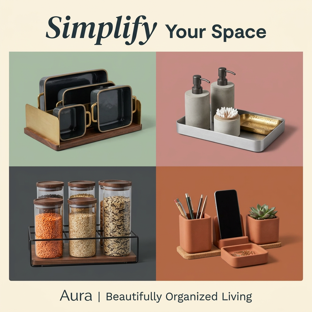
Four rooms, four products: kitchen, bath, pantry and desk. Viewers see the breadth of the collection without swiping.
- 02
Colour-block panels
Each muted background colour separates the products and matches their materials, creating an Instagram-worthy, curated look.
- 03
Tactile materials
Brass, walnut, concrete, glass and terracotta signal quality and justify a premium price. The textures almost invite touch.
- 04
Calm, minimal headline
Three words with an elegant italic accent match the promise of order. The copy is as uncluttered as the product.
Full creative breakdown
Who this ad targets
This ad targets design-conscious homeowners and renters, mostly women aged 25–45, who love organised, aesthetic interiors and follow home and lifestyle content on Instagram and Pinterest. They are often in new homes, small apartments or doing a seasonal declutter and want storage that looks good on display. They value natural materials and a cohesive look over cheap plastic bins. Gift shoppers for housewarmings are a secondary audience.
Copywriting analysis
The copy is restrained. “Simplify Your Space” is a clear benefit headline, with the italic “Simplify” giving a calming, editorial tone. The footer tagline “Beautifully Organized Living” connects function with aesthetics, which is the brand's core promise. The ad relies almost fully on visuals, with no offer, price or product names. That works for awareness but limits conversion, so the primary text should name the pieces, mention materials and add an offer. Product labels in each panel could also help shoppers find what they want.
Visual design
A balanced two-by-two grid gives each product equal weight. Background colours of sage, dusty pink, charcoal and terracotta form a warm, earthy palette that matches the product materials. Studio lighting with soft shadows feels premium and consistent. The cream border and serif-sans headline pairing add a magazine feel. The terracotta panel cleverly uses the same colour for product and background, creating a monochrome moment that stands out.
How to adapt this template for your brand
- Pick four bestsellers from different rooms or use cases
- Assign each a muted background colour that matches its material
- Shoot all products with the same lighting and angle
- Write a three-word benefit headline with one italic accent word
- Add product names or an offer in the primary text or panel labels
Tips for home organization ads on Meta
On Meta, use this as a static Feed ad and turn each panel into a carousel card linking to its product page. Pinterest-style aesthetics also perform well in Instagram Explore. On Google, use the individual panels as Performance Max and Shopping images. Run around New Year and spring cleaning when declutter intent peaks, and test adding a small price tag per panel.
About this creative
A square product-grid ad for Aura, a home organisation brand. A warm cream border frames the composition. At the top, the headline Simplify Your Space pairs an italic serif for “Simplify” with a clean sans-serif for the rest. Below sits a two-by-two grid of colour-block panels. Top left, on sage green: a walnut-based rack with a brass divider holding black enamel bakeware with gold rims. Top right, on dusty pink: a brushed steel tray with two concrete soap dispensers, a cotton swab holder and a hammered brass dish. Bottom left, on charcoal: glass storage jars with wooden lids filled with lentils, grains and wild rice on a black metal and walnut stand. Bottom right, on terracotta: a matching terracotta pen cup, phone stand, succulent pot and paperclip tray on cork. The footer reads Aura | Beautifully Organized Living. The ad feels curated, premium and calm.
Meta ad · 1200 × 1200 · Home Organization
Home Organization Ad Template: Aura Four-Panel Product Grid
This Aura ad shows four home organisers in a colour-block grid: a brass bakeware rack, a concrete bath set, glass pantry jars and a terracotta desk set. A short headline promises a simpler space. Use it as a template for home goods brands that want to show a range across rooms in one image.
Added
All brand names and logos are property of their owners. Adplaylist is not affiliated with or endorsed by these brands.
Details
Ad copy
Primary text
Clutter, meet calm. Aura organisers bring order to your kitchen, bathroom and desk with brass, concrete, glass and terracotta pieces that look as good as they work. Explore the collection.
Description
Beautifully organised living for every room
On-image text
Simplify Your Space. Aura | Beautifully Organized Living
Headline ideas for this template
- 1A Place for Everything, Beautifully
- 2Organise Every Room in Style
- 3Calm Starts with Clear Counters
- 4Storage You'll Want to Show Off
- 5Less Clutter, More Calm
Meta image ad specs
| Placement | Ratio | Size (px) |
|---|---|---|
| Feed | 1:1 or 4:5 | 1080×1080 / 1080×1350 |
| Marketplace | 1:1 | 1200×1200 |
| Messenger inbox | 1:1 | 1200×1200 |
| Stories & Reels | 9:16 | 1080×1920 |
This template is 1:1. Request 4:5 or 9:16 to cover all placements.