Key takeaways
- Format: Feature callout with kinetic, scattered typography over a seasonal photo.
- Best for: Seasonal feature promos for apps that want a playful brand voice.
- Hook: Words tumbling like falling leaves – motion in a still image.
- Reuse it: Scatter your headline words around one product card, with themed icons floating between.
Available sizes
What is a feature callout ad?
A feature callout ad is a static image that shows a single product with short text labels pointing to its key features or benefits, usually joined to the product by thin lines. It explains several selling points at a glance without a long caption, which is why it's common for supplements, skincare, electronics and kitchenware.
See all feature callouts ads →Why this feature callouts ad works
- 01
Typography as motion
Rotated, scattered words mimic falling leaves and make a static ad feel animated.
- 02
One card, one feature
The single app card makes the actual product benefit clear amid the playful design.
- 03
Native social tone
Slang and emojis help it blend into feeds and feel like organic content.
- 04
Clear value attribution
'Included in an AllTrails Plus membership' links the seasonal fun to the subscription.
Full creative breakdown
Who this ad targets
Fun-loving outdoor fans, families and casual hikers in the US who enjoy autumn outings, plus free AllTrails users who may upgrade to Plus for the foliage map. The playful style is likely to resonate with younger audiences (roughly 20–40) on Instagram Stories and Reels. Targeted around September and October with interest in hiking, road trips, photography and fall travel. It also suits families planning weekend outings.
Copywriting analysis
The campaign headline, 'Find the best trails for leaf peeping', is reused across the series but broken into floating fragments so it reads as a playful moment. The bottom copy uses informal slang ('popping off') and emojis, then delivers a concrete benefit (eight-week forecast) and the business message (included in Plus). This structure – fun first, value second, offer last – walks the viewer from attention to understanding to the upgrade without feeling salesy. The tone matches the visuals, so word and image tell one consistent, cheerful story.
Visual design
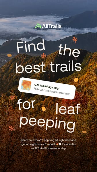
A warm, saturated orange palette dominates, with misty blue-grey clouds at the top adding depth. White type and the white app card provide strong contrast. The scattered layout breaks the usual centred grid, creating energy. Small leaf icons in orange add texture and seasonal cues. The app card sits at the visual centre, anchoring the chaos and drawing the eye to the feature.
How to adapt this template for your brand
- Pick a vivid seasonal background photo with space for text.
- Break your headline into words and scatter them with slight rotations.
- Add small themed icons (leaves, snowflakes, sparks) between the words.
- Place one clean product card in the centre as the anchor.
- Finish with one line of benefit copy that names the plan it's included in.
Tips for hiking ads on Meta
Ideal for Meta Stories and Reels; animating the words drifting into place would make a strong 3–5 second hook. Keep the bottom copy above the Stories UI overlay. Use 'Subscribe' or 'Learn More' for upgrade campaigns targeting free users, and test against the cleaner phone-UI version to see which style performs better. Refresh the creative as foliage peaks move across regions.
About this creative
A lively vertical AllTrails ad for the fall foliage map, included with Plus. The background is an aerial photo of an autumn mountain ridge glowing orange and amber, with clouds and mist rolling through valleys behind. The green AllTrails logo sits near the top. The headline words – 'Find', 'the', 'best trails', 'for', 'leaf', 'peeping' – are scattered and slightly rotated across the frame in large white type, like leaves blowing in the wind. Small orange and amber leaf illustrations and dots float between the words. In the middle, a white rounded card lifted straight from the app reads 'U.S. fall foliage map – Fall color changes and forecast' with a colourful map thumbnail. At the bottom, small white copy reads 'See where they're popping off right now and get an eight-week forecast 🍁👀 Included in an AllTrails Plus membership.' The ad feels joyful and native to social, while the app card ties the fun back to a concrete product feature.
Meta ad · 338 × 600 · Hiking
AllTrails Plus Ad: Find the Best Trails for Leaf Peeping
This vertical AllTrails ad scatters the words 'Find the best trails for leaf peeping' across a misty autumn mountain, with floating leaf icons and a single fall foliage map card from the app. It is an energetic seasonal feature-callout format – a good template for brands that want a playful twist on a feature promo.
Added
All brand names and logos are property of their owners. Adplaylist is not affiliated with or endorsed by these brands.
Details
Ad copy
Primary text
Peak foliage, on your schedule 🍂 See where the leaves are popping off right now and get an eight-week forecast with the U.S. fall foliage map – included in AllTrails Plus.
Description
Fall foliage map included with AllTrails Plus.
On-image text
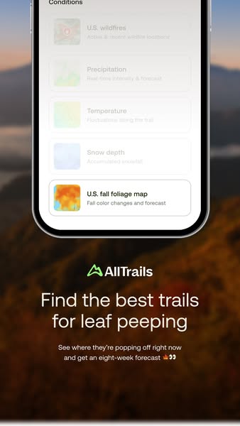
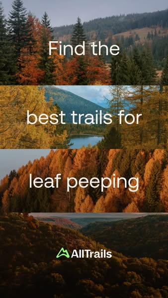
AllTrails | Find the best trails for leaf peeping | U.S. fall foliage map – Fall color changes and forecast | See where they're popping off right now and get an eight-week forecast 🍁👀 Included in an AllTrails Plus membership.
Headline ideas for this template
- 1Catch peak colors before they fall
- 2Leaves are turning – are you going?
- 3Your 8-week fall foliage forecast is here
- 4Plan your leaf peeping like a pro
- 5Fall colors, found – with AllTrails Plus
Meta image ad specs
| Placement | Ratio | Size (px) |
|---|---|---|
| Feed | 1:1 or 4:5 | 1080×1080 / 1080×1350 |
| Marketplace | 1:1 | 1200×1200 |
| Messenger inbox | 1:1 | 1200×1200 |
| Stories & Reels | 9:16 | 1080×1920 |
This template is 1:1. Request 4:5 or 9:16 to cover all placements.