Key takeaways
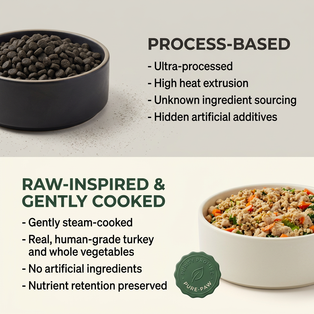
- Format: Stacked old vs. new comparison with matching bullet lists.
- Best for: Brands positioning against a traditional category.
- Hook: Old food vs. new food.
- Reuse it: Show the old way dark and the new way bright.
Available sizes
What is a comparison ad?
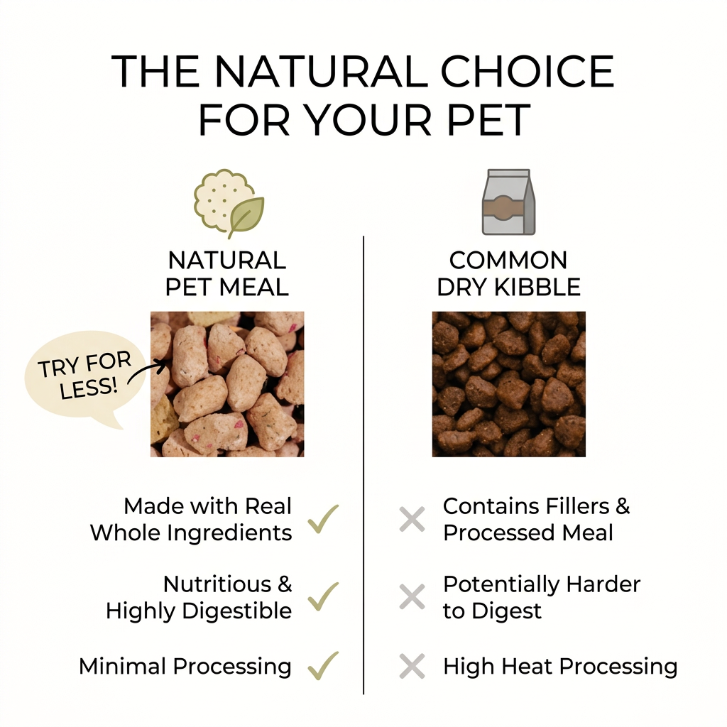
A comparison ad sets the product against an alternative, such as a competitor, the old way of doing things or a cheaper option, usually in a two-column layout or table. It helps buyers who are already weighing options see quickly why this one is the better choice.
See all comparison ads →Why this comparison ad works
- 01
Simple framing
'Old' versus 'new' makes switching feel like natural progress.
- 02
Dark vs. light
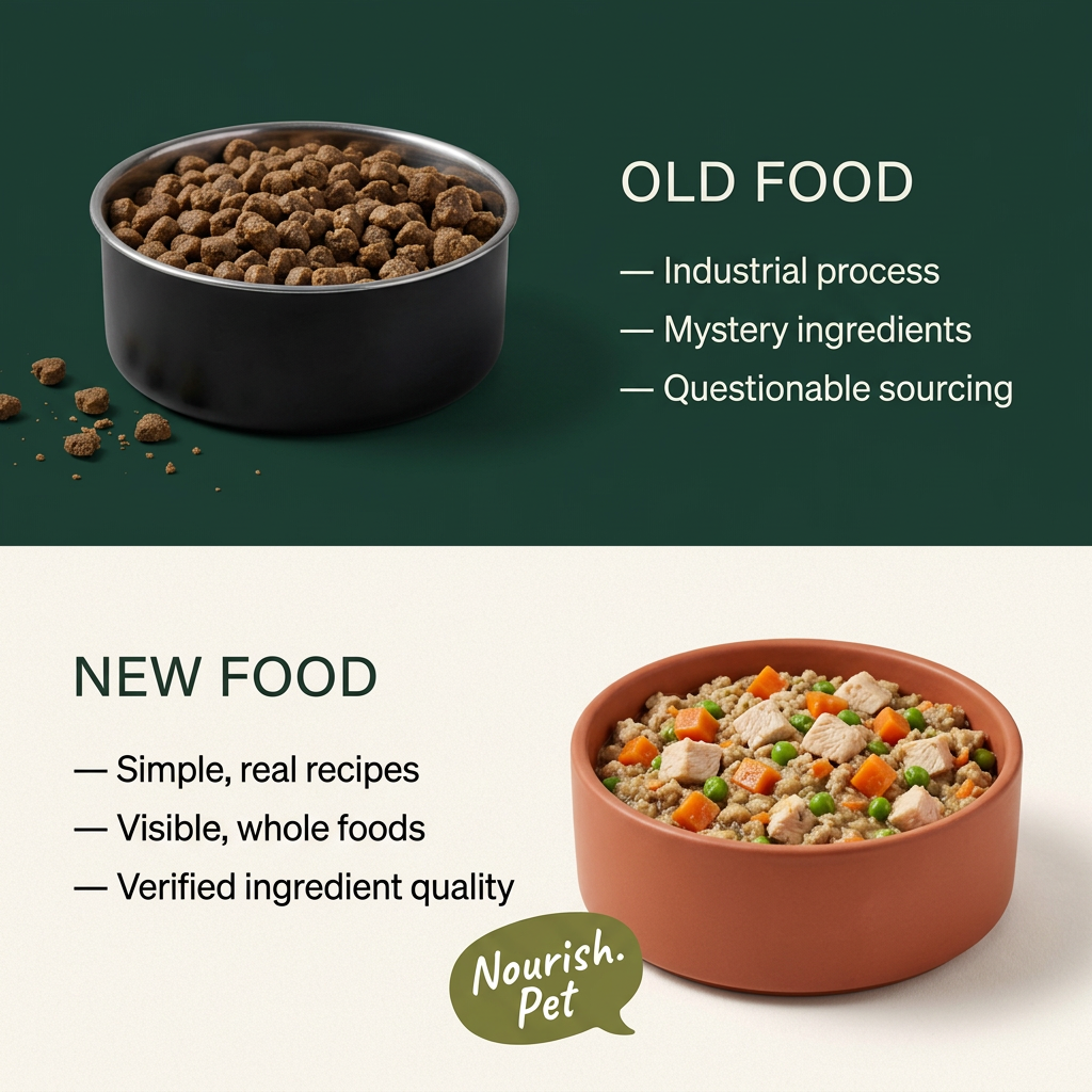
The gloomy top panel and bright bottom panel reinforce bad versus good.
- 03
Visible ingredients
Chunks of chicken, peas and carrots prove 'visible whole foods' instantly.
- 04
Matching bullets
Three problems above face three answers below, making the case logical.
Full creative breakdown
Who this ad targets
Dog and cat owners aged 25–50 who feed kibble but have started questioning what's in it. They value transparency, like to see real ingredients and are drawn to modern, design-led brands. They respond to clear, confident messaging and are open to switching if a brand feels honest and trustworthy. Many discover new pet brands on Instagram and Facebook and usually buy on mobile.
Copywriting analysis
The copy is minimal and parallel. 'Mystery ingredients' and 'questionable sourcing' are punchy but are generalisations about competitors, so they should be framed carefully. The 'new food' bullets answer each concern with transparency: real recipes, visible foods and verified quality. 'Verified' would be stronger with details on who verifies. There's no offer or call to action on the image, so the primary text and button must drive action. Testing one or two alternative headlines would help find the strongest angle.
Visual design
Forest green and cream create a premium, natural palette. The black bowl on dark green feels heavy and closed, while the terracotta bowl on cream feels warm and inviting. Spaced capitals and em-dash bullets give an editorial, magazine-like tone. The playful script logo in a speech bubble adds personality and softens the clean layout. The overall effect is clean, calm and easy to read on a small screen.
How to adapt this template for your brand
- Split the canvas into a dark top and light bottom panel.
- Show the old product in the dark panel.
- Show your product in the light panel.
- Write three problems and three matching answers.
- Add a playful logo near your product.
Tips for pets ads on Meta
This comparison works on Meta Feed and Instagram, and the stacked layout already suits Stories. For Reels, start on the old food panel, then slide down to reveal the new food. Keep claims about competitors general and fair. Add an introductory offer in the primary text to give viewers a reason to act now. Track click-through and cost per purchase to judge whether the angle is working.
About this creative
A two-panel layout split horizontally. The top half has a deep forest-green background. On the left, a matte black bowl with a steel rim is full of brown kibble, with a few crumbs scattered beside it. On the right, white spaced capitals read 'Old food', followed by three dash points: industrial process, mystery ingredients and questionable sourcing. The bottom half has a warm cream background. On the left, dark green capitals read 'New food', with three dash points: simple, real recipes, visible whole foods and verified ingredient quality. On the right, a terracotta bowl holds fresh food with chunks of chicken, diced carrot and green peas. A small olive-green speech-bubble logo in a playful script reads Nourish.Pet, overlapping the edge of the bowl. The design is clean, modern and confident, letting the contrast between the dull kibble and the colourful fresh food do most of the persuading.
Meta ad · 1200 × 1200 · Pets
Old Food vs. New Food Comparison Ad
This comparison ad for Nourish.Pet stacks a dark 'Old Food' panel with a bowl of kibble above a light 'New Food' panel with a bowl of fresh chicken, peas and carrots. Use it as a template for any brand positioning itself as the modern, transparent alternative to a traditional category.
Added
All brand names and logos are property of their owners. Adplaylist is not affiliated with or endorsed by these brands.
Details
Ad copy
Primary text
Out with the old food, in with the new. Nourish.Pet makes simple, real recipes with visible whole foods and verified ingredient quality – so you always know exactly what's in your pet's bowl.
Description
Simple, real recipes you can see
On-image text
OLD FOOD — Industrial process — Mystery ingredients — Questionable sourcing | NEW FOOD — Simple, real recipes — Visible, whole foods — Verified ingredient quality | Nourish.Pet
Headline ideas for this template
- 1Old Food vs. New Food
- 2Upgrade to Food You Can See
- 3No More Mystery Ingredients
- 4Real Recipes, Real Transparency
- 5Make the Switch to Real Food
Meta image ad specs
| Placement | Ratio | Size (px) |
|---|---|---|
| Feed | 1:1 or 4:5 | 1080×1080 / 1080×1350 |
| Marketplace | 1:1 | 1200×1200 |
| Messenger inbox | 1:1 | 1200×1200 |
| Stories & Reels | 9:16 | 1080×1920 |
This template is 1:1. Request 4:5 or 9:16 to cover all placements.
Browse similar by tag