Key takeaways
- Format: Event schedule list with logo header and mascot visual
- Best for: Multi-city tours, pop-up schedules and roadshows
- Hook: Viewers scan for their own campus name in the list
- Reuse it: Replace dates and locations, keep the two-column layout
Available sizes
What is a listicle ad?
A listicle ad presents the product's benefits or reasons to buy as a short numbered list, like an article headline ("5 reasons…"). The list format is easy to scan in a feed and lets one creative answer several objections at once.
See all listicle ads →Why this listicle ad works
- 01
Self-selection
People naturally look for their own school, so each viewer finds a personal reason to keep looking.
- 02
Scannable layout
Short dates and aligned names make the schedule easy to read on a phone in a couple of seconds.
- 03
Shareable utility
A full schedule is the kind of post students screenshot or send to friends to plan a visit.
- 04
Memorable truck visual
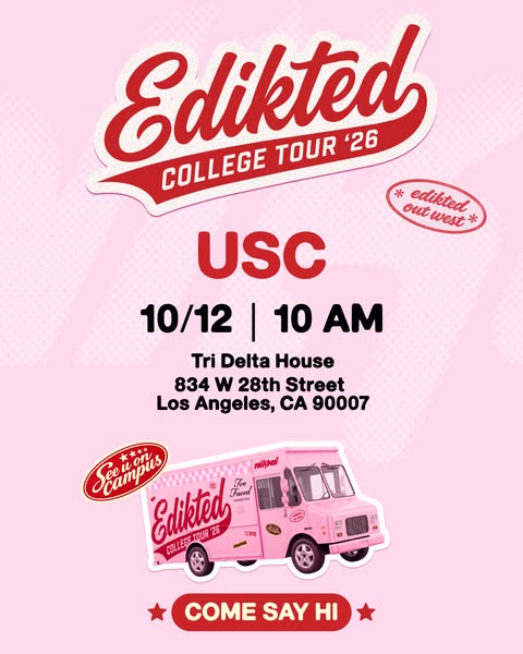
The pink truck shows what to look for on campus and hints at the partner brands on board.
Full creative breakdown
Who this ad targets
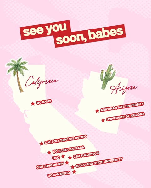
It targets female students and recent high-school grads, mostly 18 to 23, attending or living near the ten listed universities in California and Arizona. They are trend-driven fast-fashion shoppers who enjoy campus events, freebies and beauty brands. The ad suits people who already saw the teaser and now want the practical details of when and where.
Copywriting analysis
The on-image copy is almost entirely data: dates and campus names. That restraint is the point; the ad acts as a reference card rather than a pitch. Writing full official names like "California State University, Long Beach" alongside short forms like "CSU Fullerton" mirrors how students actually refer to their schools, helping recognition. The logo carries the brand message, so no extra headline is needed. In the primary text, the hook can stay light and practical, pointing people to find their school. The consistent chronological order also tells a story of a road trip moving south and east, which adds to the sense of an event in motion.
Visual design
The consistent pink halftone background ties it to the rest of the campaign. A centered logo anchors the top, and a thin white divider creates a tidy table without heavy boxes. Bold black capitals give strong contrast and legibility. The illustrated truck in the bottom corner adds personality and balances the text-heavy upper area, while red stars echo the logo colour.
How to adapt this template for your brand
- Put your event or campaign logo at the top as the anchor.
- List dates and locations in two aligned columns in chronological order.
- Use location names your audience actually uses, adding city names where needed.
- Add one fun visual, like a vehicle, mascot or product, in a corner.
- Run it after a teaser and pair it with location-specific ads near each date.
Tips for fast fashion ads on Meta
On Meta, this works well as the second card in a carousel after a teaser, or as a standalone Feed post to save and share. Keep text sizes large for mobile; ten rows is around the maximum before readability drops. Build a 9:16 Story version and add a link sticker to an event page. Geo-target each campus, and refresh the creative as stops pass, removing finished dates to keep it relevant.
About this creative
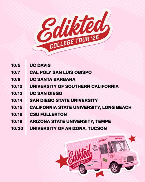
This portrait 4:5 image keeps the pink halftone background from the tour campaign. The red-and-white Edikted varsity script logo with the "College Tour '26" banner sits at the top center. Below it is a clean two-column schedule separated by a thin white vertical line: dates on the left and campus names on the right, all in bold black capitals. The list runs from 10/5 UC Davis through Cal Poly San Luis Obispo, UC Santa Barbara, USC, UC San Diego, San Diego State, CSU Long Beach and CSU Fullerton, to Arizona State University in Tempe and the University of Arizona in Tucson on 10/20. In the bottom right corner sits an illustrated pink food-truck sticker wrapped in Edikted branding, with partner logos such as Too Faced and UNOVE visible on its side, flanked by red stars. The layout is practical and scannable, turning a tour schedule into a shareable save-the-date graphic.
Meta ad · 338 × 600 · Fast Fashion
Edikted College Tour '26 Tour Dates Ad
This Edikted ad lists every stop of the College Tour '26 in a simple date-and-campus schedule. It is a listicle-style image with the varsity logo on top and an illustrated pink truck below, used on Meta to help students find their campus date and plan to attend.
Added
All brand names and logos are property of their owners. Adplaylist is not affiliated with or endorsed by these brands.
Details
Ad copy
Primary text
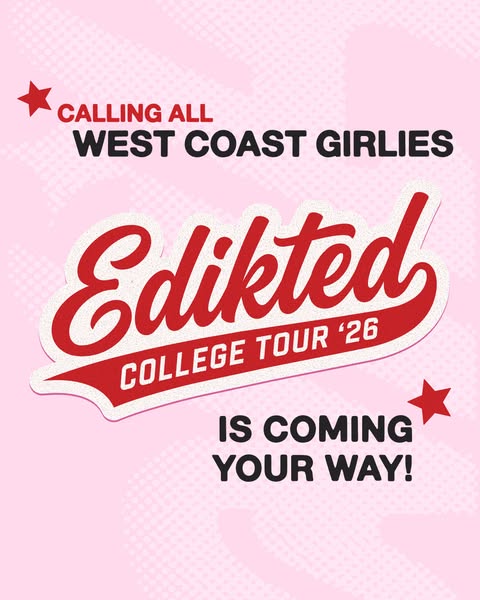
The dates are in 📍 Edikted College Tour '26 is visiting 10 campuses across California and Arizona this October. Find your school and come say hi to the pink truck 💕
Description
10 campuses · Oct 5–20
On-image text
Edikted COLLEGE TOUR '26 · 10/5 UC DAVIS · 10/7 CAL POLY SAN LUIS OBISPO · 10/9 UC SANTA BARBARA · 10/12 UNIVERSITY OF SOUTHERN CALIFORNIA · 10/13 UC SAN DIEGO · 10/14 SAN DIEGO STATE UNIVERSITY · 10/15 CALIFORNIA STATE UNIVERSITY, LONG BEACH · 10/16 CSU FULLERTON · 10/19 ARIZONA STATE UNIVERSITY, TEMPE · 10/20 UNIVERSITY OF ARIZONA, TUCSON · (truck: Edikted, Too Faced, UNOVE, Starface)
Headline ideas for this template
- 1Is your campus on the list?
- 210 campuses. 16 days. One pink truck.
- 3Edikted College Tour '26: all the dates
- 4Mark your calendar, West Coast
- 5Find out when we hit your campus
Meta image ad specs
| Placement | Ratio | Size (px) |
|---|---|---|
| Feed | 1:1 or 4:5 | 1080×1080 / 1080×1350 |
| Marketplace | 1:1 | 1200×1200 |
| Messenger inbox | 1:1 | 1200×1200 |
| Stories & Reels | 9:16 | 1080×1920 |
This template is 1:1. Request 4:5 or 9:16 to cover all placements.