Key takeaways
- Format: Portrait split-screen comparison with four matched rows
- Best for: Services replacing a frustrating DIY habit, especially insurance-covered care
- Hook: Relatable DIY failures like starting over every Monday
- Reuse it: Swap the four pain points and benefits while keeping the row-by-row match
Available sizes
What is a comparison ad?
A comparison ad sets the product against an alternative, such as a competitor, the old way of doing things or a cheaper option, usually in a two-column layout or table. It helps buyers who are already weighing options see quickly why this one is the better choice.
See all comparison ads →Why this comparison ad works
- 01
Relatable pain points
Lines like starting over every Monday and TikTok nutrition advice feel personal and slightly funny, so viewers see themselves in the ad.
- 02
One-to-one row matching
Each problem has a matching solution in the same row, making the value of the service instantly clear.
- 03
Brand color contrast
The muted DIY side versus the bright orange brand side visually tells viewers which choice is better.
- 04
Insurance as the closer
Ending on covered by insurance removes the cost objection and sets up a low-friction CTA.
Full creative breakdown
Who this ad targets
This ad targets US adults who have tried dieting on their own and feel stuck, often women aged 25–55 juggling busy lives. They follow nutrition content on social media, feel overwhelmed by conflicting advice and are open to expert help if it is affordable. Because the closer is insurance coverage, the ad works best for people with employer or commercial health plans who don't realize dietitian visits may be covered.
Copywriting analysis
The copy uses a classic problem-solution comparison. The DIY side is written in vivid, everyday language, "wandering aimlessly" and "starting over every Monday", which makes the struggle feel real and a little funny. The Nourish side answers with concrete features rather than vague promises: meal plans, 1:1 video visits, an app and insurance coverage. Parallel structure across rows keeps it easy to scan. Quoting "healthy" adds a touch of sarcasm about diet culture. The CTA, "Check if you're covered today", is low commitment and ties directly to the strongest benefit, cost, making the next step feel easy and risk-free.
Visual design
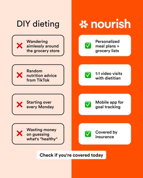
The layout splits into a pale peach left half and a saturated orange right half, using color to signal bad versus good. Rounded cards in each column hold the rows, with black outlines on the DIY side and solid white cards on the Nourish side. Red cross and green check emojis give instant meaning. The Nourish wordmark sits large at the top right. A white pill CTA bridges both halves at the bottom, pulling the eye down.
How to adapt this template for your brand
- Pick the DIY or competitor habit your service replaces and write it as the left title.
- List four specific, relatable frustrations in casual language.
- Match each frustration with a concrete feature or benefit in the same row.
- Use a muted color on the problem side and your brand color on the solution side.
- End with a low-commitment CTA tied to your strongest benefit, such as cost or speed.
Tips for telehealth ads on Meta
On Meta, this 4:5 creative works well in Feed, and a 9:16 version with stacked rows can run in Stories. Comparison ads are ideal for mid-funnel audiences who already know the problem. Health-related ads on Meta should avoid implying personal attributes, so keep the copy about the habit, not the viewer's body. Test different pain point sets to see which resonates most.
About this creative
This portrait comparison creative from Nourish contrasts "DIY dieting" with its telehealth dietitian service. The canvas is split vertically: the left half is soft peach with a plain black "DIY dieting" title, while the right half is bold orange with the white Nourish logo. Each side holds four stacked cards. On the DIY side, red crosses mark relatable frustrations: wandering the grocery store, random TikTok nutrition advice, starting over every Monday and wasting money guessing what's healthy. On the Nourish side, green checkmarks answer each one directly with personalized meal plans and grocery lists, 1:1 video visits with a dietitian, a mobile app for goal tracking and insurance coverage. The rows line up so the eye moves across each problem to its solution. A white pill at the bottom reads "Check if you're covered today", turning the insurance benefit into the call to action. The humor and honesty of the pain points make it highly relatable.
Meta ad · 338 × 600 · Telehealth
Dietitian Telehealth Comparison Ad Template
This Nourish ad compares DIY dieting with working with a registered dietitian through telehealth. A split layout lists four pain points with red crosses against four benefits with green checks. The 4:5 portrait format suits Meta feeds and works for any service replacing a frustrating do-it-yourself habit.
Added
All brand names and logos are property of their owners. Adplaylist is not affiliated with or endorsed by these brands.
Details
Ad copy
Primary text
Tired of starting over every Monday? Nourish connects you with a registered dietitian for 1:1 video visits, personalized meal plans and goal tracking – and it's covered by insurance. Check if you're covered today.
Description
Check if you're covered today
On-image text
DIY dieting | ✗ Wandering aimlessly around the grocery store | ✗ Random nutrition advice from TikTok | ✗ Starting over every Monday | ✗ Wasting money on guessing what's "healthy" | nourish | ✓ Personalized meal plans + grocery lists | ✓ 1:1 video visits with dietitian | ✓ Mobile app for goal tracking | ✓ Covered by insurance | Check if you're covered today
Headline ideas for this template
- 1DIY dieting vs a dietitian who's actually covered
- 2Stop starting over every Monday
- 3Your dietitian might already be covered
- 4Swap TikTok advice for a real dietitian
- 5Meal plans, video visits and $0 copays
Meta image ad specs
| Placement | Ratio | Size (px) |
|---|---|---|
| Feed | 1:1 or 4:5 | 1080×1080 / 1080×1350 |
| Marketplace | 1:1 | 1200×1200 |
| Messenger inbox | 1:1 | 1200×1200 |
| Stories & Reels | 9:16 | 1080×1920 |
This template is 1:1. Request 4:5 or 9:16 to cover all placements.
Browse similar by tag